library(lubridate)
library(zoo)
library(reshape2)
setwd('/Users/jond/git/notebook')
source("common/functions.r")11 Time series
Almost all the data we use here is associated with a particular point in time, like the price of a stock on a given day. That is called a time series. However, it is not easy to work with time series as one has to keep track of the day, month and year and know about leap years, time zones, holidays and other market closures. For intra day we also have content with time zones and summer time. Consequently, it is best to work with data as if it were not a time series and only turn it into a time series when needed, typically for plotting, reporting and aggregation.
Most financial applications involve working with dates. These can be monthly, weekly, daily, or even intraday data. Storing data as text is not helpful since we cannot easily order or subset it.
R has a specific data type called Date. In this section, we will explore some packages that help us work with Date objects.
11.1 Data and libraries
data=ProcessRawData()
sp500=data$sp500
sp500tr=data$sp500tr
Price=data$Price
Return=data$Return
UnAdjustedPrice=data$UnAdjustedPrice
Ticker=data$Ticker
11.2 Plotting time series
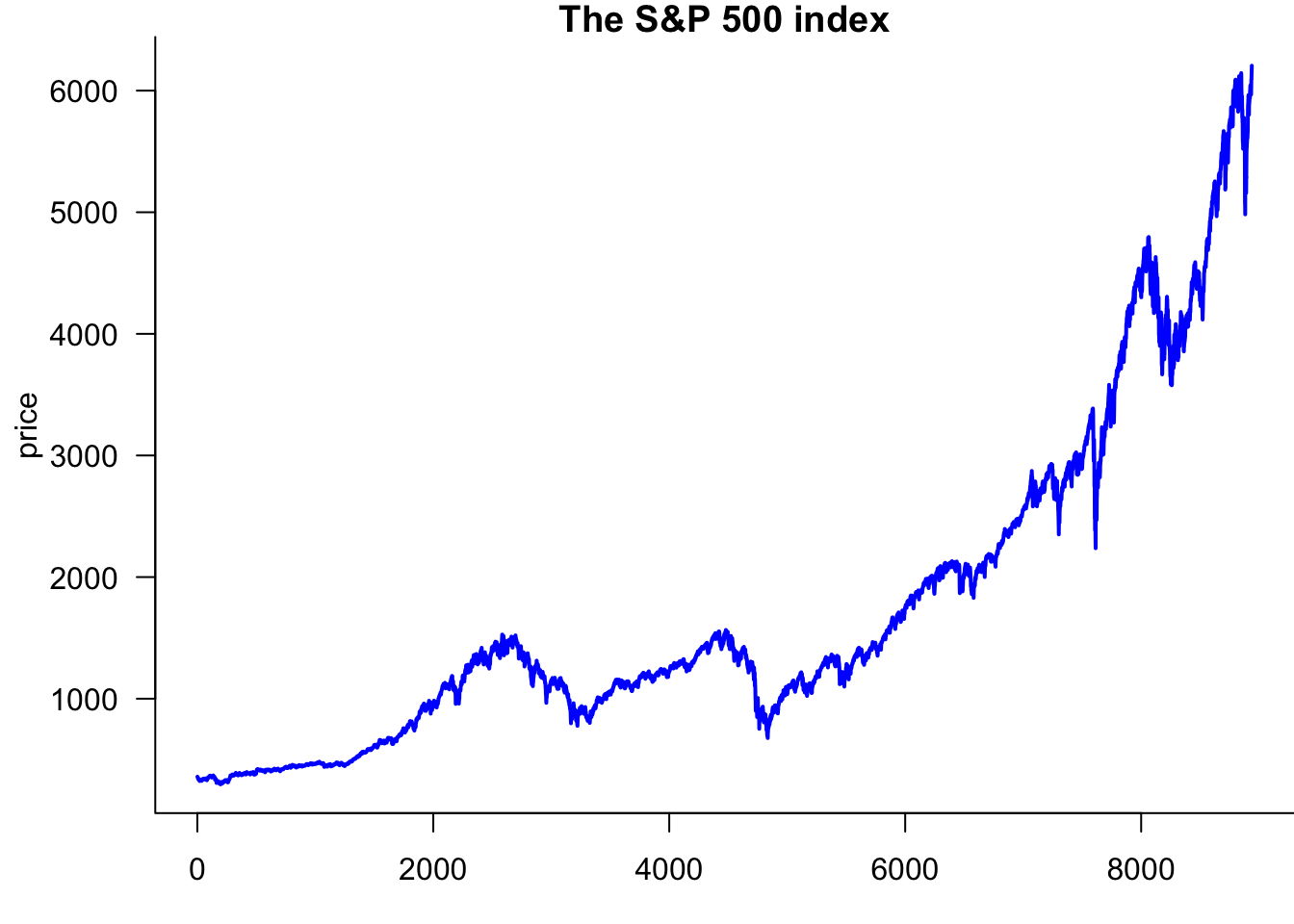
Start by plotting the S&P 500 with the improvements from Section Section 10.2.2:
par(mar=c(3,4.2,1,0))
plot(sp500$price,
 type='l',
 lwd=2,
 col='blue',
 las=1,
 bty='l',
 xlab="day",
 ylab='price',
 main="The S&P 500 index"
)
11.3 lubridate
We use the lubridate package to convert numbers and strings into dates. ymd() stands for year-month-day. If we have data with the American date convention, we can use mdy(), and in some cases we have ymd() formatted dates.
lubridate handles both string labels, JAN and integer 01.
ymd(20200110)[1] "2020-01-10"ymd("20200110")[1] "2020-01-10"class(ymd("20200110"))[1] "Date"ymd("2015JAN11")[1] "2015-01-11"class(ymd("20200110"))[1] "Date"ymd("04-MAR-5")[1] "2004-03-05"class(ymd("04MAR5"))[1] "Date"dmy("1/june/2019")[1] "2019-06-01"class(dmy("1/june/2019"))[1] "Date"dmy("28-december-14")[1] "2014-12-28"class(dmy("28-december-14"))[1] "Date"We can use lubridate to make a proper date column for the S&P 500.
sp500$date.ts=ymd(sp500$date)
tail(sp500,2)| date | price | y | date.ts | y.ts | |
|---|---|---|---|---|---|
| 8938 | 20250627 | 6173.07 | 0.0052054 | 2025-06-27 | 0.005205431 |
| 8939 | 20250630 | 6204.95 | 0.0051511 | 2025-06-30 | 0.005151078 |
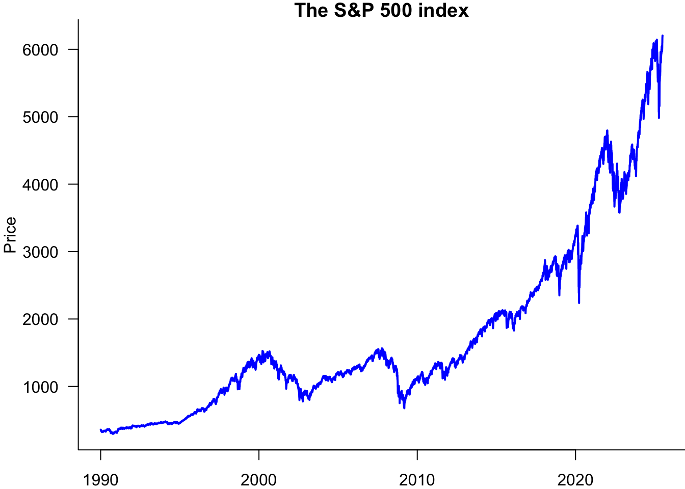
11.4 Plotting with dates
Now, we can make a time series plot. Note that in sp500$date.ts,sp500$price, we use sp500$date.ts for the x-axis and sp500$price for the y-axis.
par(mar=c(2,4,1,0))
plot(sp500$date.ts,sp500$price,
 type='l',
 lwd=2,
 col='blue',
 las=1,
 bty='l',
 xlab="Day",
 ylab='Price',
 main="The S&P 500 index"
)
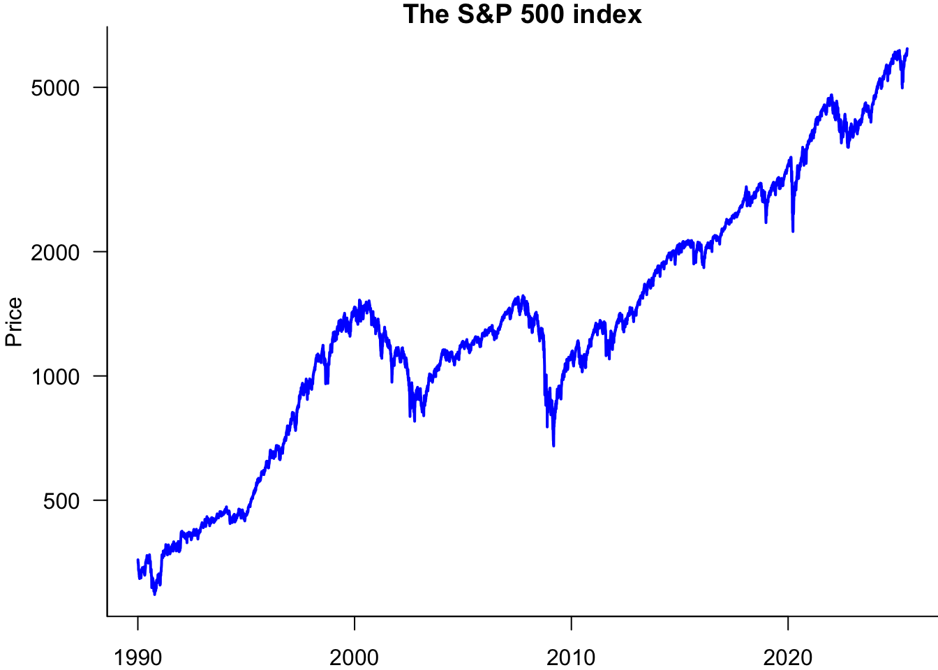
You can make it a log plot by adding the log='y' parameter:
par(mar=c(2,4,1,0))
plot(sp500$date.ts,sp500$price,
 type='l',
 lwd=2,
 col='blue',
 las=1,
 bty='l',
 xlab="Day",
 ylab='Price',
 main="The S&P 500 index",
 log='y'
)
We can customise this a bit more and add sub-tickmarks.
par(mar=c(2,4,1,0))
plot(sp500$date.ts,sp500$price,
 type='l',
 lwd=2,
 col='blue',
 las=1,
 bty='l',
 xlab="Day",
 ylab='Price',
 main="The S&P 500 index"
)
w=seq(ymd(20000101),ymd(20300101),by='year')
axis(1,at=w,label=FALSE,tcl=-0.3)
11.5 The zoo package
What we did above was plot a price vector against a date vector. We can also directly associate dates to prices with the zoo package, which allows us to work with ordered date-indexed observations. That allows many useful operations.
11.5.1 Make a zoo
sp500$y.ts = zoo(sp500$y, order.by = sp500$date.ts)
sp500$price.ts = zoo(sp500$price, order.by = sp500$date.ts)
class(sp500$y.ts)
[1] "zoo"head(sp500$y.ts) 1990-01-03 1990-01-04 1990-01-05 1990-01-08 1990-01-09 1990-01-10
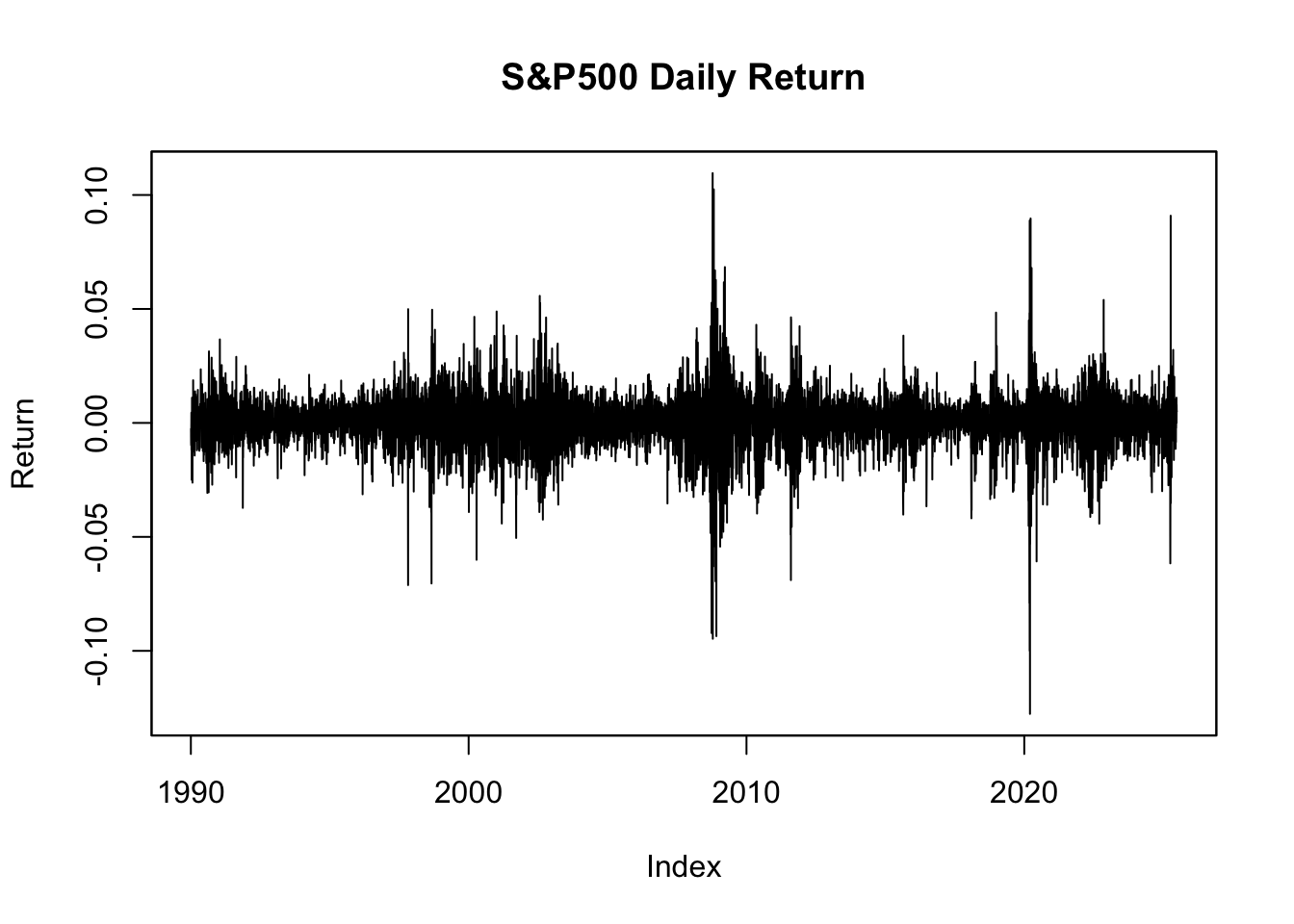
-0.002588908 -0.008650307 -0.009804139 0.004504321 -0.011856666 -0.006629097 Then, we can plot it directly as a time series.
plot(sp500$y.ts,
 main="S&P500 Daily Return",
 ylab="Return"
)
We can do useful things with zoo data.
11.5.2 lag function
This function allows us to take the lag or leads of a time series object. The syntax is: lag(x, k, na.pad = F), where:
- x, a time series object to lag
- k, number of lags (in units of observations); could be positive or negative (if negative, k is the number of forward lags)
na.pad, addsNAsfor missing observations ifTRUE
head(sp500$y.ts) 1990-01-03 1990-01-04 1990-01-05 1990-01-08 1990-01-09 1990-01-10
-0.002588908 -0.008650307 -0.009804139 0.004504321 -0.011856666 -0.006629097 head(lag(sp500$y.ts, k = 2)) 1990-01-03 1990-01-04 1990-01-05 1990-01-08 1990-01-09 1990-01-10
-0.009804139 0.004504321 -0.011856666 -0.006629097 0.003506557 -0.024984596 11.5.3 diff function
Takes the lagged difference of a time series. Syntax: diff(x, lag, differences, na.pad = F), where:
- x = a time series object
- lag = number of lags(in unit of observations)
- differences = the order of the difference
head(diff(sp500$y.ts, lag = 1, na.pad = TRUE)) 1990-01-03 1990-01-04 1990-01-05 1990-01-08 1990-01-09 1990-01-10
NA -0.006061398 -0.001153832 0.014308459 -0.016360987 0.005227569 11.5.4 The window function
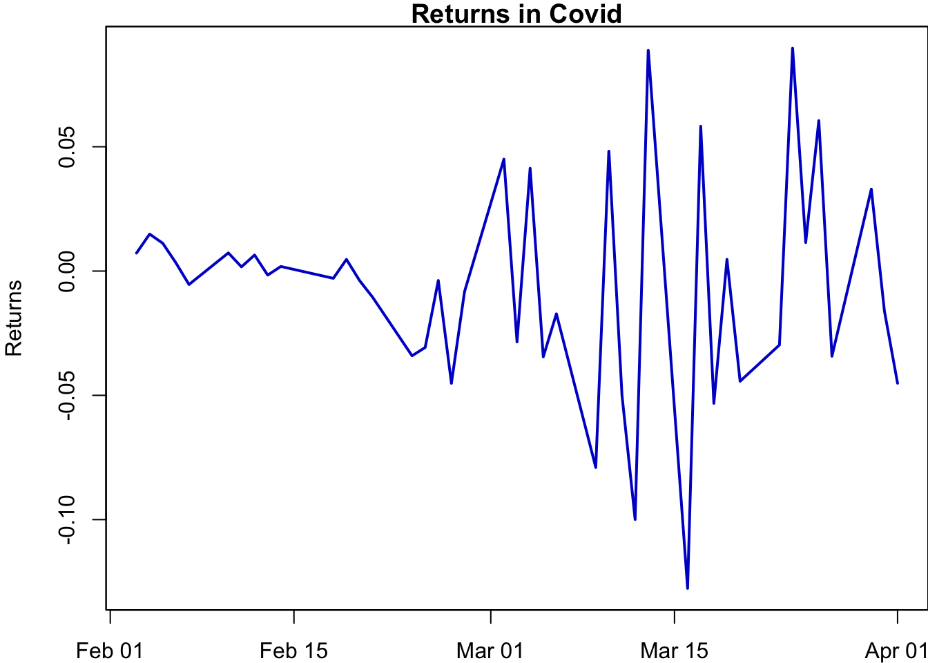
We can use the window() function to subset a zoo object to a given time period. For example, suppose we are interested in the returns during the Covid-19 crisis:
par(mar=c(2,4,1,0))
sub_y.ts = window(sp500$y.ts, start = ymd("20200201"), end = ymd("20200401"))
plot(sub_y.ts,
 main = "Returns in Covid",
 xlab = "Date",
 ylab = "Returns",
 col = "mediumblue",
 lwd=2
)
11.5.5 Aggregate
We often need to aggregate time series data. For example, we may want to calculate end-of-month prices or realised monthly variance. The aggregate function makes that easy.
p.monthly=aggregate(sp500$price.ts,as.yearmon,tail,1)
head(p.monthly,5)
Jan 1990 Feb 1990 Mar 1990 Apr 1990 May 1990
329.08 331.89 339.94 330.80 361.23 realized.variance=aggregate(sp500$y.ts,as.yearmon,sd)
head(realized.variance,5) Jan 1990 Feb 1990 Mar 1990 Apr 1990 May 1990
0.010561799 0.007468453 0.006909350 0.007005099 0.006865567 p.monthly.mean=aggregate(sp500$y.ts,as.yearmon,mean)par(mar=c(4,4,1,0.6))
plot(p.monthly.mean,realized.variance,
bty='l',
main="S&P 500 monthly mean and volatility",
col='red',
pch=16,
xlab="mean",
ylab="volatility",
xaxt='n',
yaxt='n'
)
w=pretty(p.monthly.mean)
axis(1,w,label=paste0(100*w,"%"))
w=pretty(realized.variance)
axis(2,w,label=paste0(100*w,"%"),las=1)
regression_line=lm(realized.variance ~ p.monthly.mean)
abline(regression_line,col='green',lwd=3)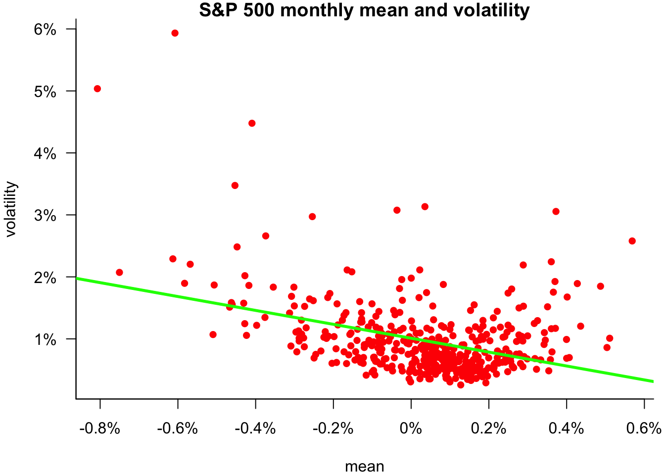
11.6 Multivariate plots
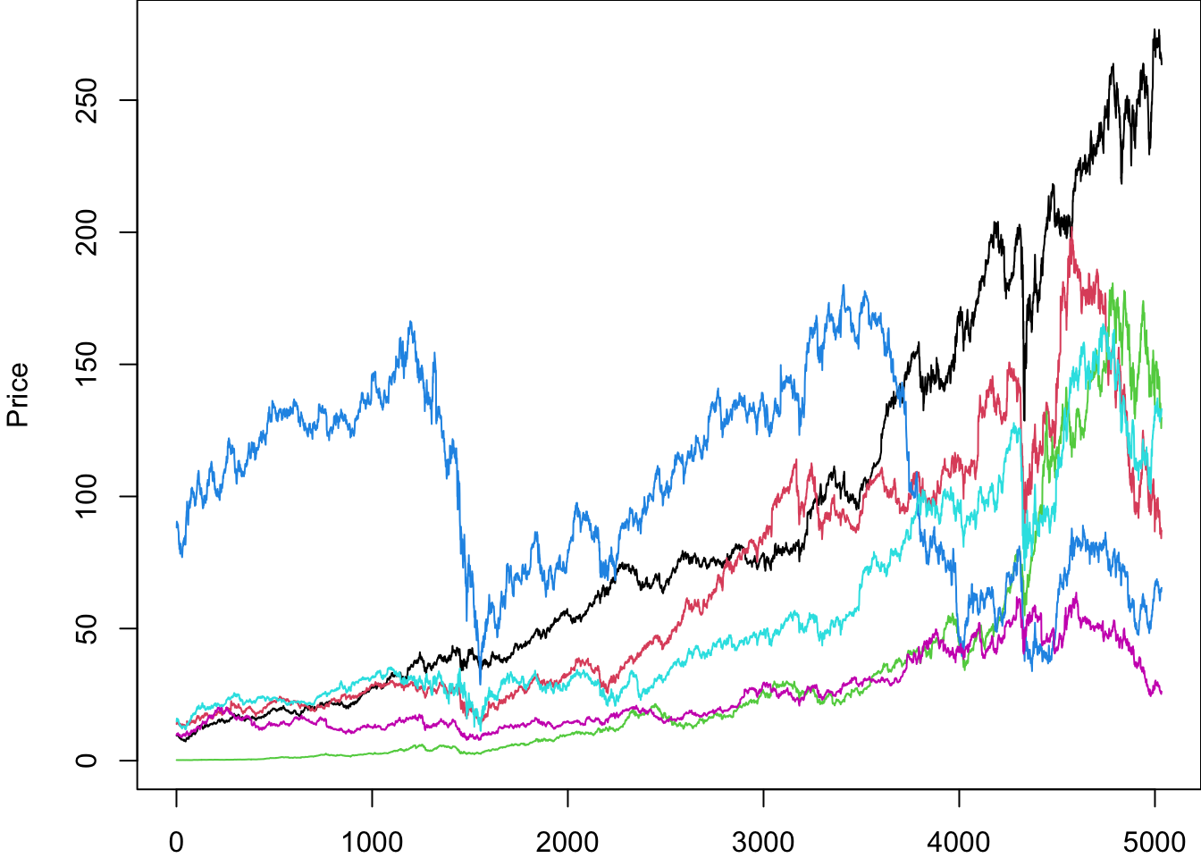
We use the matplot command for many assets. Call the list of assets Assets:
par(mar=c(2,4,0,0))
matplot(Price[,Ticker])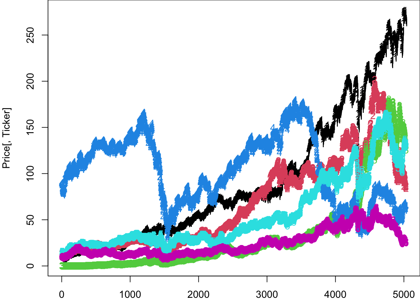
This plot can be improved with better formatting.
par(mar=c(2,4,0,0))
matplot(
 Price[,Ticker],
 type='l',
 lty=1,
 ylab='Price'
)
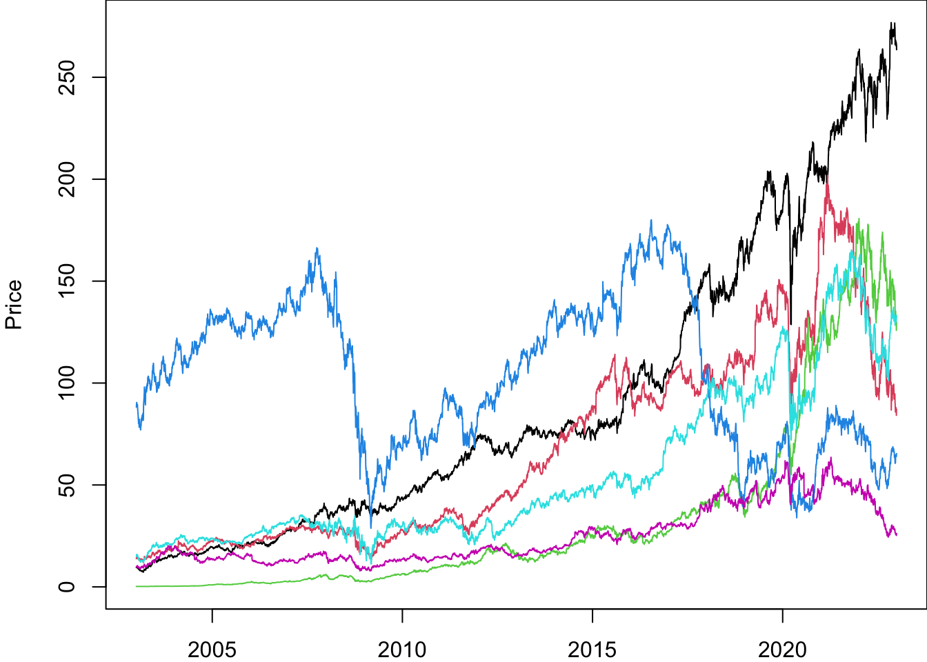
We can add a date to it the same way we did before.
Price$date.ts=ymd(Price$date)
Return$date.ts=ymd(Return$date)
UnAdjustedPrice$date.ts=ymd(UnAdjustedPrice$date)par(mar=c(2,4,0,0))
matplot(
Price$date.ts,
Price[,Ticker],
type='l',
lty=1,
ylab='Price'
)
We can put a legend on the plot.
par(mar=c(2,4,0,0))
matplot(
 Price$date.ts,
 Price[,Ticker],
 type='l',
 lty=1,
 ylab='Price',
 col=1:6,
 las=1
)
legend("topleft",legend=Ticker,lty=1,col=1:6,bty='n',ncol=2)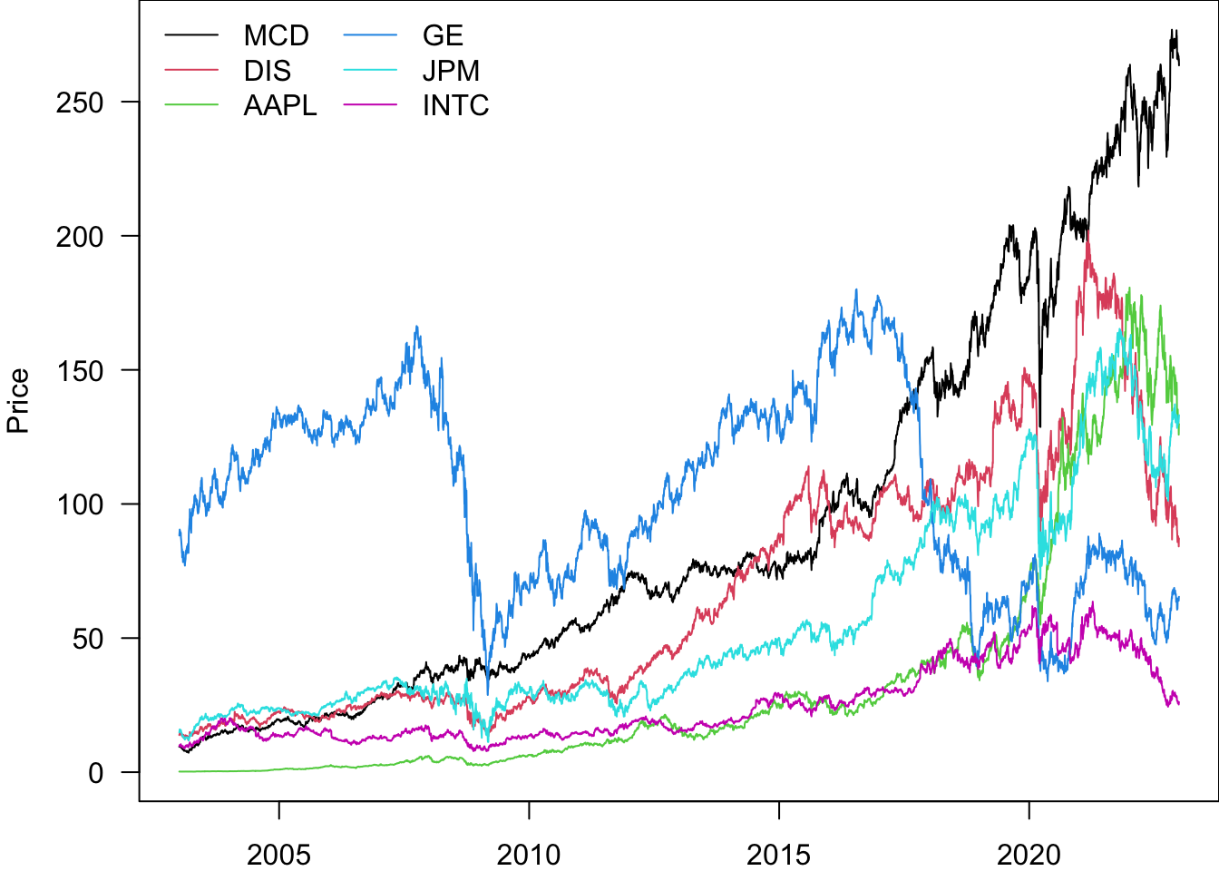
In order to compare the performance of the stocks, we can re-normalise them to start at 1
par(mar=c(2,4,0,0))
pn=Price
for(i in Ticker){
 pn[[i]]=pn[[i]]/pn[[i]][1]
}
matplot(
 pn$date.ts,
 pn[,Ticker],
 type='l',
 lty=1,
 ylab='Price',
 col=1:6,
 las=1
)
legend("topleft",legend=Ticker,lty=1,col=1:6,bty='n',ncol=2)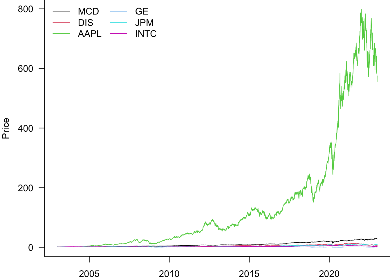
rbind(head(pn,2),tail(pn,1))| date | AAPL | DIS | GE | INTC | JPM | MCD | date.ts | |
|---|---|---|---|---|---|---|---|---|
| 2 | 20030103 | 1.0000 | 1.000000 | 1.0000000 | 1.000000 | 1.000000 | 1.000000 | 2003-01-03 |
| 3 | 20030106 | 1.0000 | 1.051263 | 1.0255903 | 1.038697 | 1.078639 | 1.032873 | 2003-01-06 |
| 5035 | 20221230 | 572.7678 | 6.279998 | 0.7411147 | 2.692354 | 8.998689 | 27.909514 | 2022-12-30 |
Log scaling the y-axis can be more informative.
par(mar=c(2,4,0.5,0))
pn=Price
for(i in Ticker){
 pn[[i]]=pn[[i]]/pn[[i]][1]
}
matplot(
 pn$date.ts,
 pn[,Ticker],
 type='l',
 lty=1,
 ylab='Price',
 col=1:6,
 las=1,
 log='y'
)
legend("topleft",legend=Ticker,lty=1,col=1:6,bty='n',ncol=2)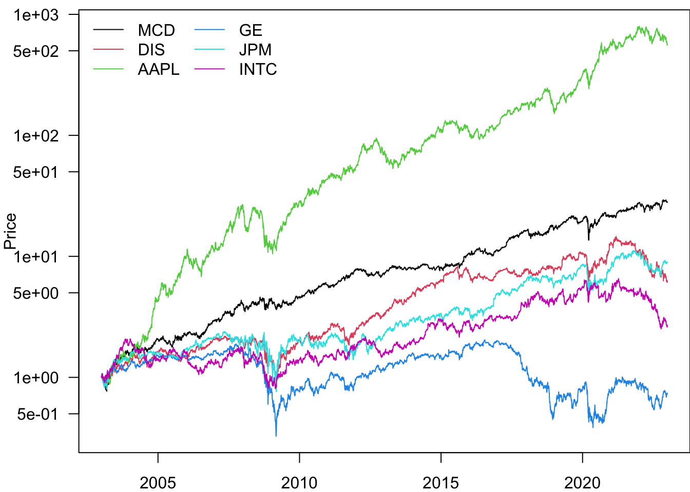
We can also add gridlines to make the plot easier to read.
par(mar=c(2,4,0.5,0))
pn=Price
for(i in Ticker){
 pn[[i]]=pn[[i]]/pn[[i]][1]
}
matplot(
 pn$date.ts,
 pn[,Ticker],
 type='l',
 lty=1,
 ylab='Price',
 col=1:6,
 las=1,
 log='y'
)
for(i in c(0.5,1,5,10,50,100,500,1000))
 segments(pn$date.ts[1]-days(500),i,tail(pn$date.ts,1)+days(500),i,col="lightgray")

legend("topleft",legend=Ticker,lty=1,col=1:6,bty='n',ncol=2)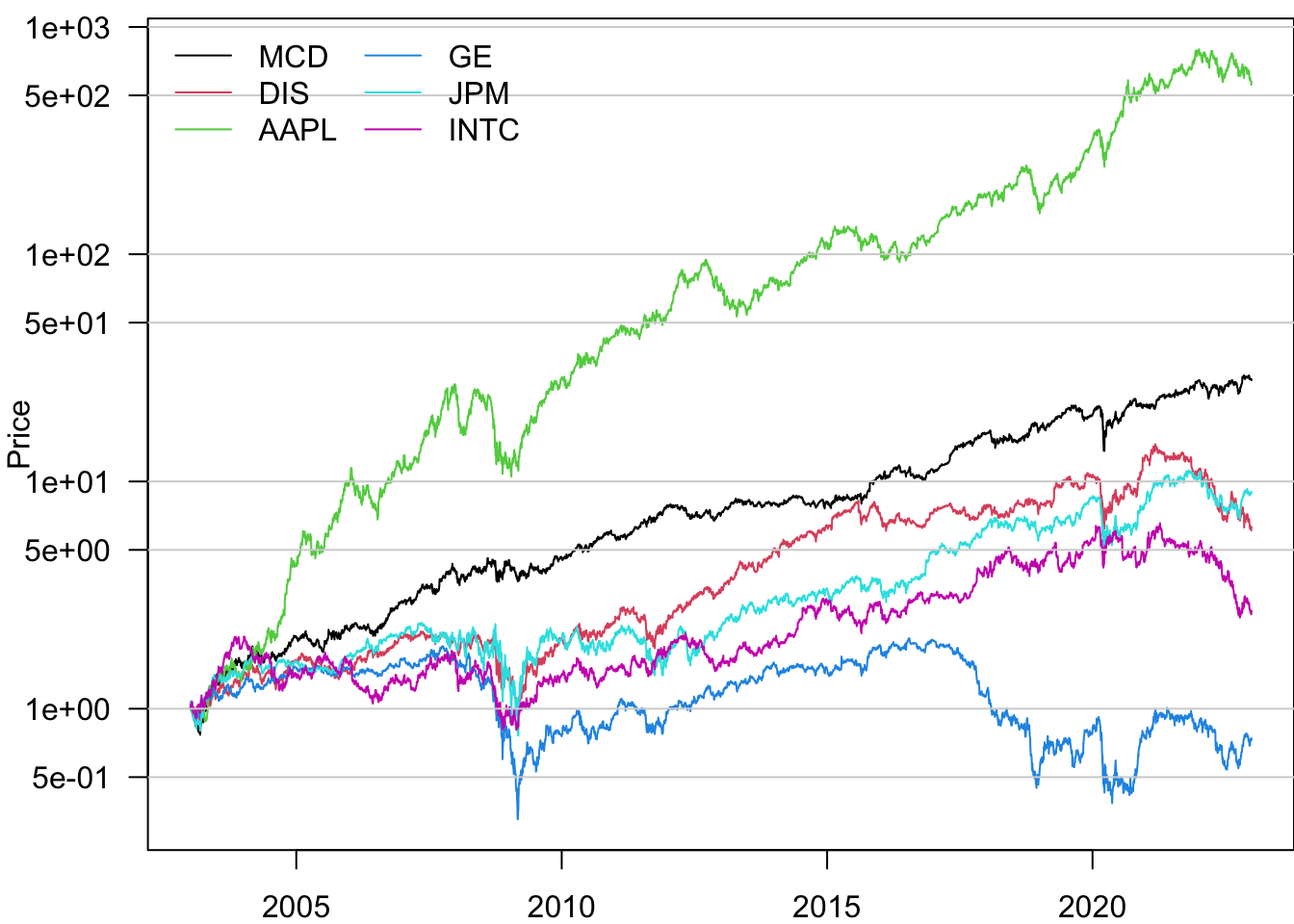
Based on this, the best-performing stock is AAPL.