Registered S3 method overwritten by 'quantmod':
  method            from
as.zoo.data.frame zoo 14 Presentations and reports
In financial analysis, creating reproducible reports is important for several reasons. Regulatory requirements often demand that analysis can be replicated and verified by third parties. Investment committees need consistent formatting and methodology when reviewing risk assessments. Client presentations require professional output that can be updated automatically as new data becomes available.
There are two main approaches to creating reports from R analysis: the traditional copy-and-paste method using familiar software, or integrated reporting systems that combine code and output directly.
Many integrated approaches are based on Markdown, a lightweight markup language that uses plain text formatting syntax. Unlike Word’s complex formatting system, markdown files are readable as plain text and can be easily version-controlled. Quarto is a markdown implementation that works well with R, Python and Julia, allowing us to embed our analysis directly into reports. This ensures that calculations, plots and statistics are always consistent with the underlying data, reducing errors from manual copying and making it easier to update reports when new data arrives.
Markdown-based reporting systems like Quarto are also becoming important in automated systems and AI workflows. Many AI tools can generate and process markdown documents, making it easier to integrate human analysis with automated reporting systems.
14.1 Data and Libraries
library(reshape2)
library(lubridate)
library(zoo)
library(tseries)
source("common/functions.r",chdir=TRUE)data=ProcessRawData()
y=tail(data$sp500$y,500)
p=tail(data$sp500$p,500)
Prices=tail(data$Price,500)
Returns=tail(data$Return,500)
tickers=names(Returns)[2:length(names(Returns))]14.2 Word and PowerPoint vs. Quarto
14.2.1 Word and PowerPoint
Most people use Microsoft Word or PowerPoint to make reports and presentations, copying the output from R into the document. Usually that is the best way, but there is an alternative that can be useful.
The benefit of using Word or PowerPoint is that one works in software one is familiar with and knows how to design a document to a specific need. In this case, it is important to be careful about how content is copied from RStudio to Word or PowerPoint. For tables, it is usually best to start by either copying the numbers from RStudio into Excel or exporting them as CSV and then importing them into Excel. From there, go to Word or PowerPoint. For figures, the usual best way is to export them to an SVG file within RStudio and then import that file into Word or PowerPoint.
The downside of this workflow is that one has to copy all the output from one piece of software to another, which takes time and allows for plenty of errors to emerge.
When following this approach, it is important to maintain professional standards in how content is transferred between applications.
One thing one should never do is to use a screenshot to get an image out of R into Word or PowerPoint. It will look rather unprofessional. Either copy the image directly or export it.
14.2.2 Quarto
Quarto is a publishing system that allows you to mix markdown and R code in the same document. If you are familiar with Jupyter, it is quite similar.
When you write a document in Quarto, RStudio can directly export it to an HTML page or a PDF, Word or PowerPoint file. You can also export to all four formats if needed. If you export to a Word or PowerPoint file, you can edit the files there. However, perhaps the best way is to use Quarto to write a PDF report or presentation, as it can make high-quality presentation slides and reports directly.
Markdown-based reporting systems like Quarto are also becoming important in automated systems and AI workflows. Many AI tools can generate and process markdown documents, making it easier to integrate human analysis with automated reporting systems.
RStudio will need additional libraries for Quarto files and will give you an installation option when you start using Quarto.
14.3 Setting up Quarto
To start using Quarto for your financial reports, you need to create a new Quarto document. In RStudio, go to File → New file → Quarto Document or Quarto Presentation. This will create a new file with a .qmd extension that combines markdown text with executable R code chunks.
Save the file to the same directory where your data is located, as this makes it easier to load your datasets and reference files. Once created, you can write your analysis using a mix of narrative text and R code, then render the document to produce a polished report in your chosen format.
14.3.1 YAML headers for different output formats
All Quarto files start with a YAML header that controls how the document is processed and formatted. YAML (Yet Another Markup Language) is a human-readable data format that uses indentation and simple syntax to define configuration options.
The YAML header is enclosed between three dashes (---) at the very beginning of your document and three dashes at the end. This section must come before any content and specifies essential information like the title, output format and author.
The headers below are minimal examples for different output formats. Choose HTML for web-based reports and presentations, PDF for professional documents and printed reports, Word for documents that need further editing, and PowerPoint for presentations that require additional customisation.
14.3.1.1 HTML file
HTML output is ideal for interactive viewing and sharing reports online. It is also useful when working in RStudio as it renders quickly and allows you to test your document structure.
---
title: "Title"
format: html
author: "Me"
---
14.3.1.2 PDF file
PDF output creates professional documents suitable for printing and formal reports.
---
title: "Title"
format: pdf
author: "Me"
---
14.3.1.3 Word file
Word output allows further editing and customisation in Microsoft Word.
---
title: "Title"
format: docx
author: "Me"
---
14.3.1.4 PDF presentation file
Beamer creates professional PDF slides for academic and business presentations.
---
title: "Title"
format: beamer
author: "Me"
---
14.3.1.5 PowerPoint file
PowerPoint output enables editing and customisation in Microsoft PowerPoint.
---
title: "Title"
format: pptx
author: "Me"
---
14.3.1.6 Interactive presentation file
RevealJS creates web-based interactive presentations with animations and transitions.
---
title: "Title"
format: revealjs
author: "Me"
---
14.3.2 Quarto and PDF files
If you want to make PDF files directly from Quarto files in RStudio, you need additional software. In particular, RStudio uses a software package called LaTeX for that. If you are making PDF files on your university computers, chances are LaTeX is already installed, so you do not have to do anything. Otherwise, you have to install it.
You have two options to install LaTeX. You can either search for it and install the full LaTeX package.
Alternatively, and what I normally recommend, is to use a package called tinytex provided by some of the creators of RStudio. That has two advantages. The file you install is much smaller, and secondly, everything is handled almost automatically inside RStudio. Go to the webpage for tinytex yihui.org/tinytex/ for more details.
Do the following in the R console:
install.packages('tinytex')
library(tinytex)
tinytex::install_tinytex()
14.4 Running code in Quarto
When you click the Render button, a document will be generated that includes both content and the output of embedded code. You can embed code in chunks or inline.
14.4.1 Code chunks
If your Quarto document contains a code chunk like this:
```r
a = 34
b = 0.4
c = a^b
print(c)
```
You get:
a = 34
b = 0.4
c = a^b
print(c)
[1] 4.098185You get the code and its output displayed in your report.
14.4.2 Hiding code
You can hide the code but show the output using #| echo: false:
```r
#| echo: false
tickers_temp = names(Returns)
tickers_temp = tickers_temp[2:length(tickers_temp)]
cat("The firms we have are:")
for(i in tickers_temp) cat(i, ", ")
cat("\n")
```
The firms we have are:AAPL , DIS , GE , INTC , JPM , MCD , 14.4.3 Inline code
Then you can put these results inside text. Suppose you write:
If we start with `r a` and raise it to the power of `r b`,
we get `r c`, rounded as `r round(c,2)`.
It comes out as formatted text with the calculated values embedded.
If we start with 34 and raise it to the power of 0.4, we get 4.0981851, rounded as 4.1.
14.4.4 Suppressing library messages
When loading libraries in reports, startup messages can clutter the output. Use suppressPackageStartupMessages() to create cleaner documents:
```{r}
#| echo: false
suppressPackageStartupMessages(library(lubridate))
suppressPackageStartupMessages(library(moments))
suppressPackageStartupMessages(library(knitr))
```
This ensures professional presentation whilst still loading required packages for your analysis.
14.5 Working with financial data in reports
14.5.1 Basic dynamic text with calculations
We can make our reports dynamic by embedding calculations directly in the text. First, select a stock to analyse:
```{r}
use = "AAPL"
```
use = "AAPL"Now we can write text that automatically updates with our data:
If we take `r use`, we have `r length(Returns[[use]])`
observations. The mean return is
`r mean(Returns[[use]])*100`%, and on the best day
the return was `r round(max(Returns[[use]])*100,1)`%.
If we take AAPL, we have 500 observations. The mean return is 0.0075791%, and on the best day the return was 8.5%.
14.5.2 Finding specific dates
We can also find specific dates using the lubridate library:
That happened on
If we take `r use`, we have `r length(Returns[[use]])`
observations. The mean return is
`r mean(Returns[[use]])*100`%, and on the best day
the return was `r round(max(Returns[[use]])*100,1)`%.
If we take AAPL, we have 500 observations. The mean return is 0.0075791%, and on the best day the return was 8.5%.
14.5.3 Finding specific dates
We can also find specific dates using the ymd() from the lubridate library:
best_date = format(
  ymd(Returns$date[Returns[[use]] == max(Returns[[use]])]),
  "%d %B %Y"
)
That happened on `r best_date`.That happened on 10 November 2022.
worst_date = format(ymd(Returns$date[Returns[[use]]==min(Returns[[use]])]), "%d %B %Y")Similarly for the worst day:
The worst day in `r use`'s history happened on
`r worst_date`
when it fell by `r round(min(Returns[[use]])*100,1)`%.
The worst day in AAPL’s history happened on 13 September 2022 when it fell by -6%.
14.6 Creating plots in reports
14.6.1 Basic plots
Basic plots are straightforward:
```{r}
plot(Prices$AAPL)
```plot(Prices$AAPL)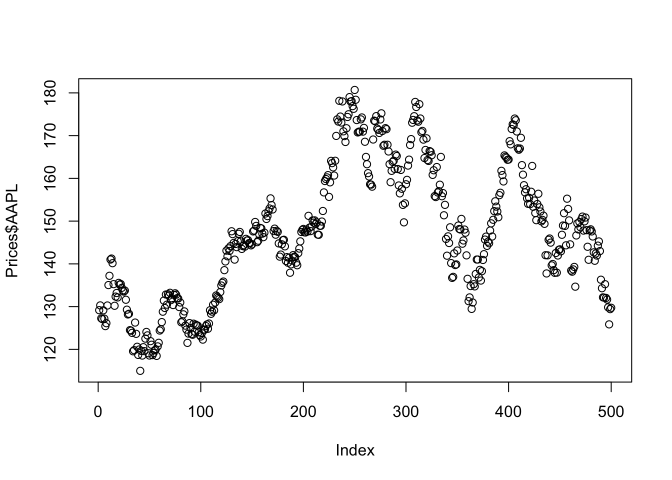
14.6.2 Improved plots with dates
We can improve plots by formatting dates properly:
```{r}
plot(ymd(Prices$date), Prices$AAPL, type='l', log='y')
```plot(ymd(Prices$date), Prices$AAPL, type='l', log='y')
This creates a much nicer plot with dates on the x-axis and log scale on the y-axis.
14.7 Creating tables
14.7.1 Basic text output
For multiple assets, we can create summary statistics programmatically:
```{r}
for(i in tickers){
  x = Returns[[i]]
  cat(i, mean(x), sd(x), min(x), max(x), "\n")
}
```for(i in tickers){
x = Returns[[i]]
cat(i, mean(x), sd(x), min(x), max(x), "\n")
}AAPL 7.57915e-05 0.01938223 -0.06047152 0.08523644
DIS -0.001447056 0.02002874 -0.1411393 0.06106026
GE -0.0001475656 0.02115154 -0.1091013 0.06849588
INTC -0.001189113 0.02225266 -0.1241865 0.1012781
JPM 0.0001358066 0.01624583 -0.06343371 0.06003264
MCD 0.0005341925 0.01112385 -0.04990829 0.04006227 14.7.2 Formatted tables
For better formatting, we can create proper tables using kable():
```{r}
library(knitr)

df = matrix(ncol=4, nrow=length(tickers))
for(i in 1:length(tickers)){
  x = Returns[[tickers[i]]]
  df[i,] = c(mean(x), sd(x), min(x), max(x))
}

df = as.data.frame(df)
df = cbind(tickers, df*100)
names(df) = c("Asset", "Mean", "SD", "Min", "Max")

kable(df, digits=3, caption="Sample statistics (in %)")
```library(knitr)
df = matrix(ncol=4, nrow=length(tickers))
for(i in 1:length(tickers)){
x = Returns[[tickers[i]]]
df[i,] = c(mean(x), sd(x), min(x), max(x))
}
df = as.data.frame(df)
df = cbind(tickers, df*100)
names(df) = c("Asset", "Mean", "SD", "Min", "Max")
kable(df, digits=3, caption="Sample statistics (in %)")| Asset | Mean | SD | Min | Max |
|---|---|---|---|---|
| AAPL | 0.008 | 1.938 | -6.047 | 8.524 |
| DIS | -0.145 | 2.003 | -14.114 | 6.106 |
| GE | -0.015 | 2.115 | -10.910 | 6.850 |
| INTC | -0.119 | 2.225 | -12.419 | 10.128 |
| JPM | 0.014 | 1.625 | -6.343 | 6.003 |
| MCD | 0.053 | 1.112 | -4.991 | 4.006 |
14.8 Statistical analysis in reports
14.8.1 Basic statistics and tests
We can perform statistical tests and embed the results:
```{r}
library(moments)
y = Returns$GE
mean(y)
sd(y)
skewness(y)
kurtosis(y)
jarque.bera.test(y)
Box.test(y, type = "Ljung-Box")
Box.test(y^2, type = "Ljung-Box")
```library(moments)
y = Returns$GE
mean(y)[1] -0.0001475656sd(y)[1] 0.02115154skewness(y)[1] -0.368728kurtosis(y)[1] 4.885274jarque.bera.test(y)
    Jarque Bera Test

data:  y
X-squared = 85.377, df = 2, p-value < 2.2e-16Box.test(y, type = "Ljung-Box")
    Box-Ljung test

data:  y
X-squared = 0.57121, df = 1, p-value = 0.4498Box.test(y^2, type = "Ljung-Box")
    Box-Ljung test

data:  y^2
X-squared = 1.0016, df = 1, p-value = 0.3169
14.8.2 Autocorrelation plots
To visualise autocorrelation:
```{r}
acf(y, main = "Autocorrelation of returns")
```acf(y, main = "Autocorrelation of returns")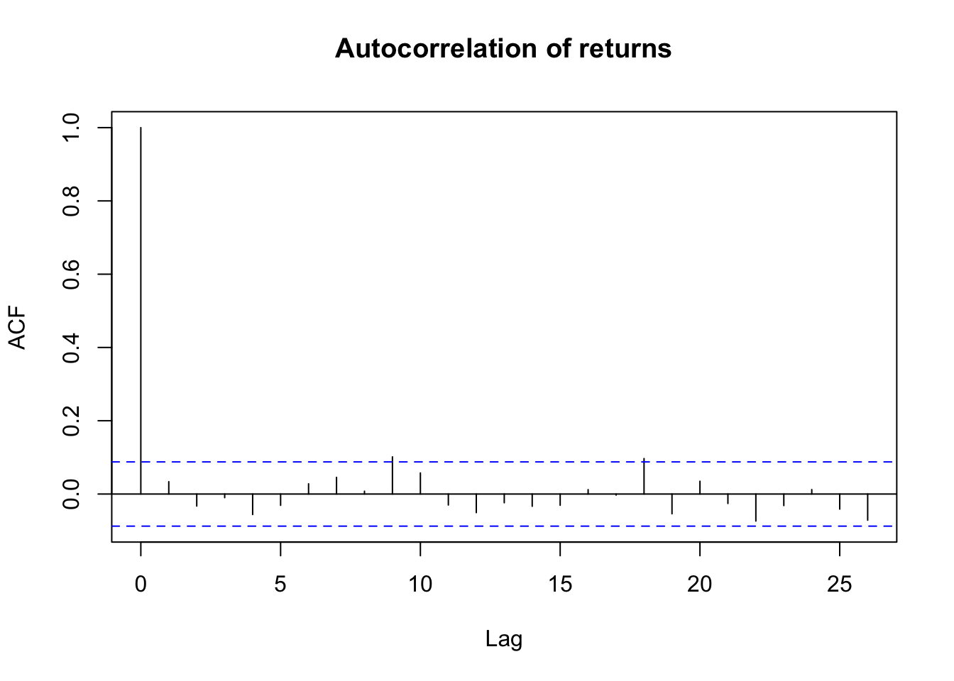
For squared returns (to check for volatility clustering):
```{r}
acf(y^2, main = "Autocorrelation of returns squared")
```acf(y^2, main = "Autocorrelation of returns squared")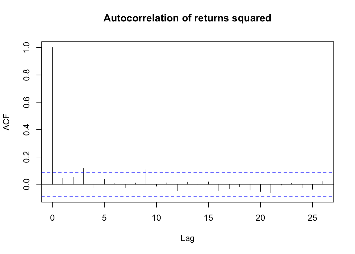
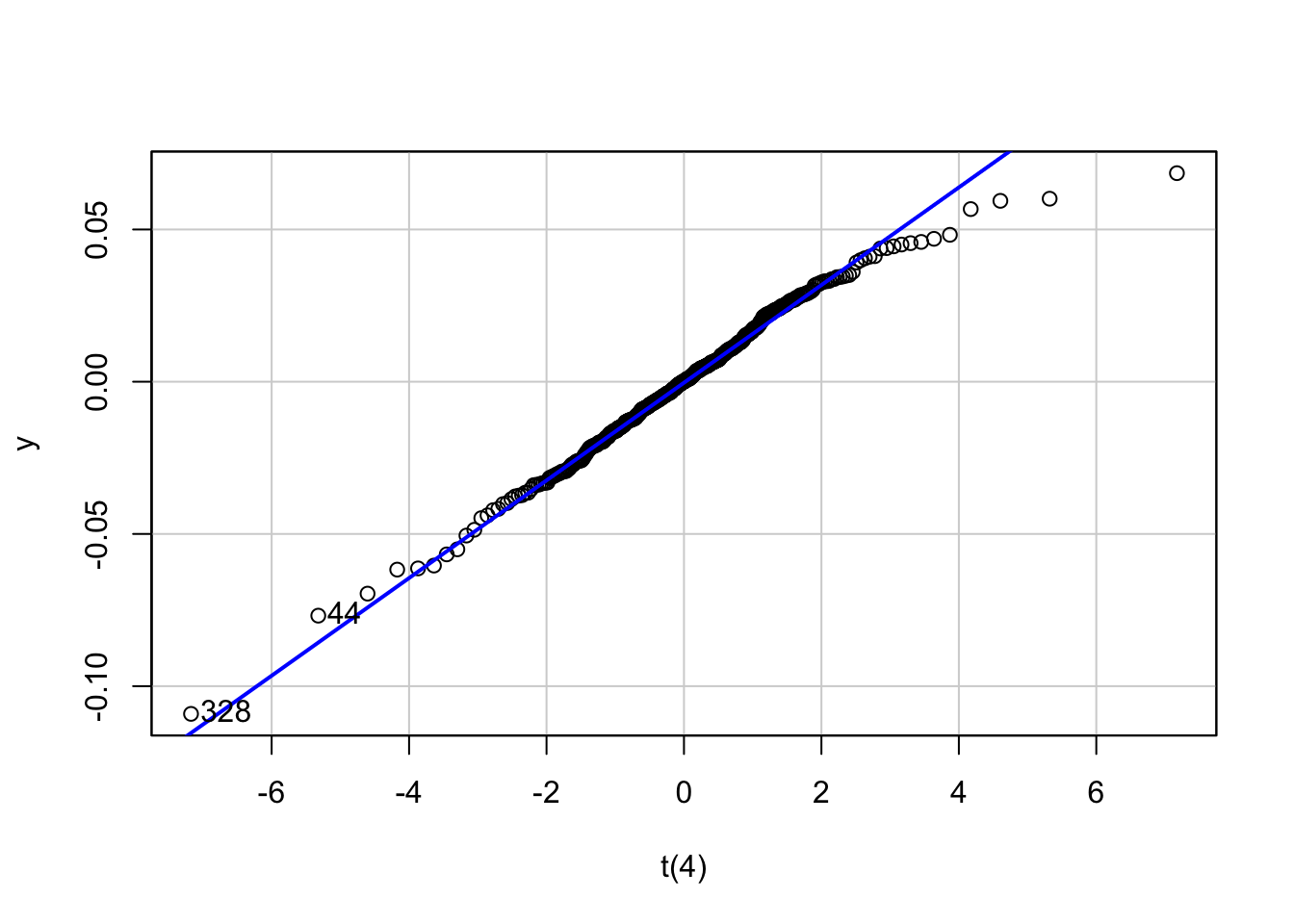
14.8.3 QQ plots
We can create multiple QQ plots to assess distributional fit:
```{r}
#| echo: false
library(car)
x = qqPlot(y, distribution = "norm", envelope = FALSE,
           xlab="Normal", main="QQ plot")
x = qqPlot(y, distribution = "t", df = 4, envelope = FALSE,
           xlab="t(4)")
x = qqPlot(y, distribution = "t", df = 3.5, envelope = FALSE,
           xlab="t(3.5)")
x = qqPlot(y, distribution = "t", df = 3, envelope = FALSE,
           xlab="t(3)")
```
Loading required package: carData
14.9 Complete example
Here is how a complete Quarto file might look:
---
title: "Financial Analysis Report"
format: html
author: "Analyst"
---

## Summary

```{r}
#| echo: false
library(lubridate)
load('Returns.RData')
use = "AAPL"
```

This report analyses `r use` stock returns from our dataset containing
`r length(Returns[[use]])` observations.

## Key Statistics

The mean return is `r round(mean(Returns[[use]])*100,2)`% with a
standard deviation of `r round(sd(Returns[[use]])*100,2)`%.

The best day was `r format(ymd(Returns$date[Returns[[use]]==max(Returns[[use]])]), "%d %B %Y")`
with a return of `r round(max(Returns[[use]])*100,1)`%.

## Plot

```{r}
plot(ymd(Returns$date), Returns[[use]], type='l',
     main=paste(use, "Returns"), ylab="Return", xlab="Date")
```