library(ggplot2)9 Plots
A key strength of R is the quality of the plots one can make with it. It comes with a powerful built-in plotting platform, known as base plots, but one can also install very powerful plotting libraries such as ggplot2.
With these packages, you can generate infinitely many good-looking plots. For more examples with reproducible codes, visit R Graph Gallary, a collection of hundreds of beautiful plots created with R.
We don’t do time series plots here, leaving them to Chapter 10.
9.1 Libraries
9.2 Data
The data we use is processed and returned on the S&P500 index, and for convenience, we put them into variables y and p. We also use the last 500 observations of the stock prices.
data=ProcessRawData()

y=tail(data$sp500$y,500)
p=tail(data$sp500$p,500)

Price=tail(data$Price,500)
Return=tail(data$Return,500)
9.3 Base plots
9.3.1 Simple plot
The simplest possible plot we can make is by just calling the plot() command.
plot(p)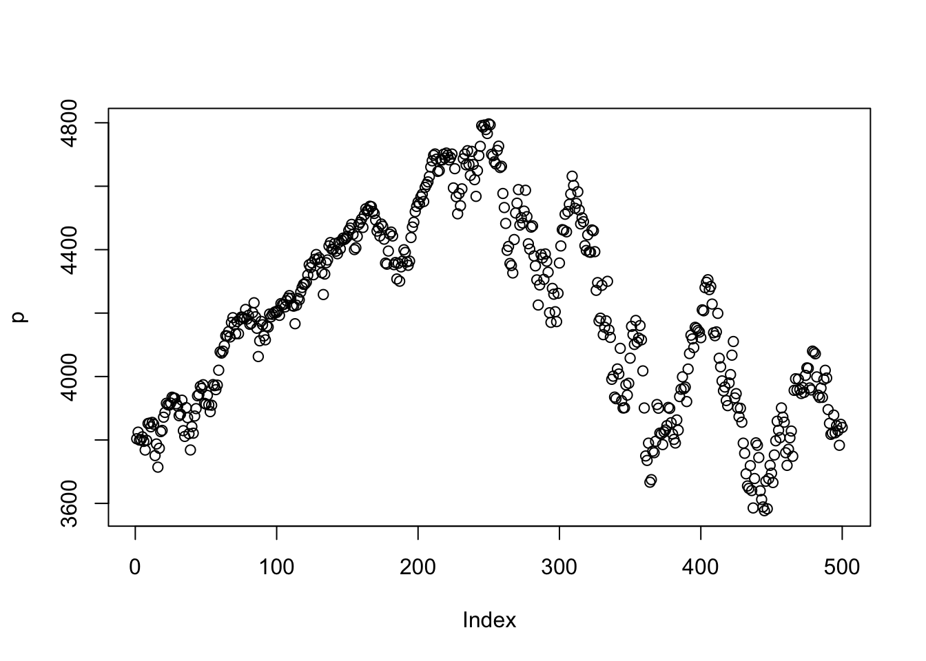
The ggplot2 version is below. Need to convert p to a data frame for ggplot2.
# Create a data frame for ggplot2
df = data.frame(day = 1:length(p), price = p)
ggplot(df, aes(x = day, y = price)) +
geom_line(color = "red", linewidth = 1) 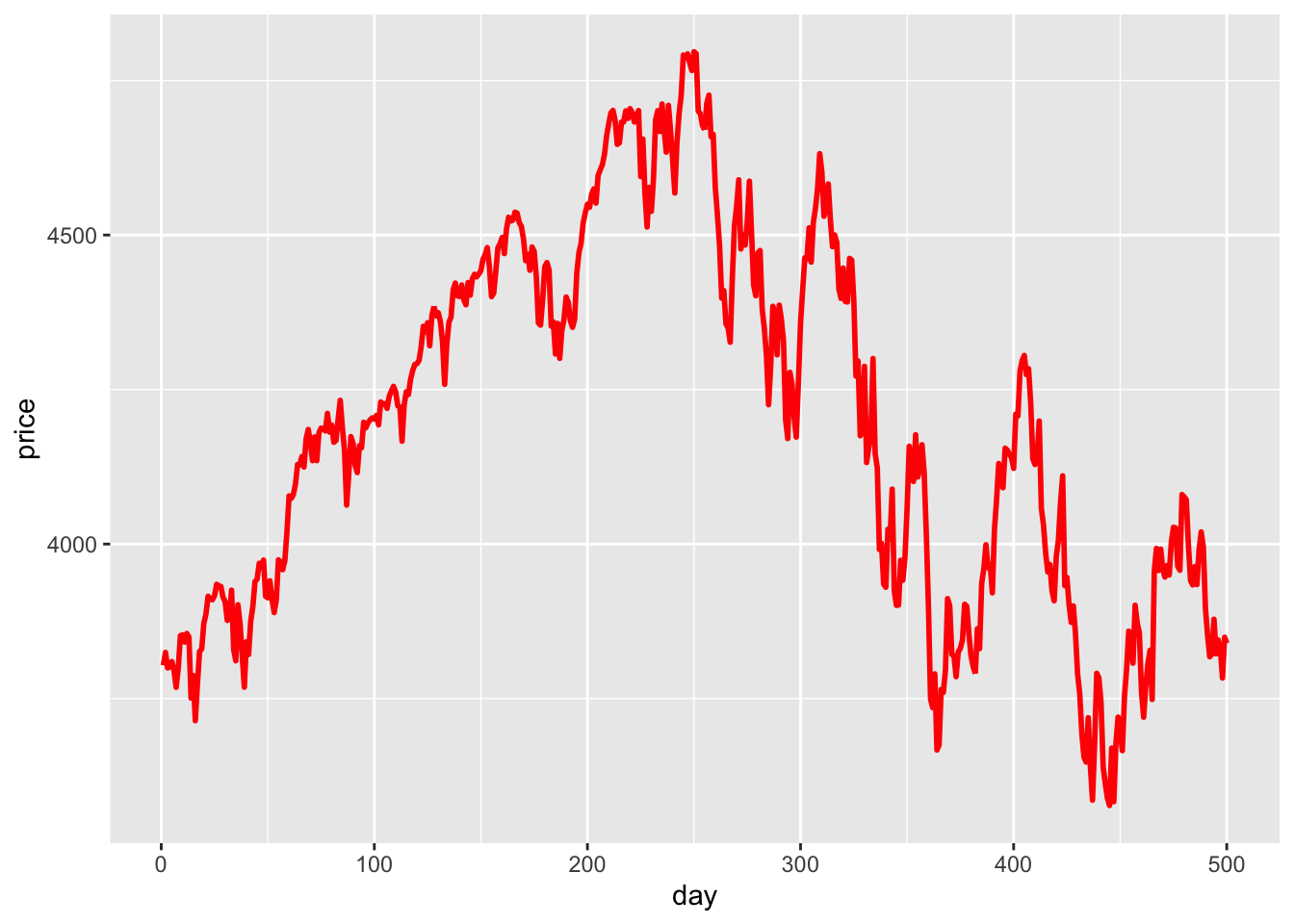
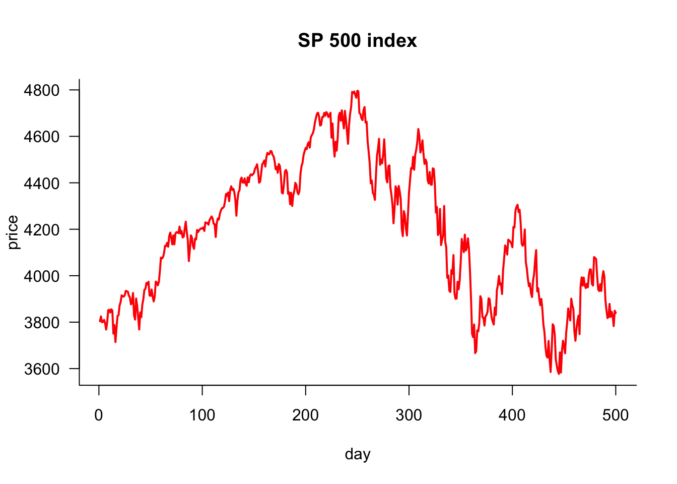
9.3.2 Simple plot improved
This plot could be more attractive, but it can be easily improved. We want to do the following:
- plot lines, not dots (circles)
- use a different colour
- change the thickness of the line
- change the labels on the X and Y axis
- make the axis L-shaped
- give it a title
- rotate the labels on the y-axis
plot(p,
     type='l',            # line plot
     col='red',           # colour of line
     lwd=2,               # width of line
     xlab="day",          # x axis label
     ylab='price',        # y axis label
     main="SP 500 index", # main plot label
     las=1,               # rotate y-axis text
     bty='las'            # use a L shaped frame
)
The ggplot2 version is below. Need to convert p to a data frame for ggplot2.
# Create a data frame for ggplot2
df = data.frame(day = 1:length(p), price = p)
ggplot(df, aes(x = day, y = price)) +
  geom_line(color = "red", linewidth = 1) +                # Use linewidth instead of size
  labs(title = "SP 500 index", x = "day", y = "price") +   # Axis labels and title
  theme_minimal() +                                        # Minimal theme for cleaner look
  theme(
    axis.text.y = element_text(angle = 0),                 # Equivalent to las = 1 (horizontal y-axis text)
    plot.title = element_text(hjust = 0.5),                # Center align title
    panel.border = element_rect(color = "black", fill = NA) # Add a border around the plot
  )
9.3.3 Plotting parameters
If we want to control the plot’s layout, we need to set plotting parameters that stay fixed until they are changed. The command to do that is par().
9.3.4 Plot two variables
If we want to plot two variables side-by-side, use themfrow= argument to par():
par(mfrow=c(1,2))
plot(p)
plot(y)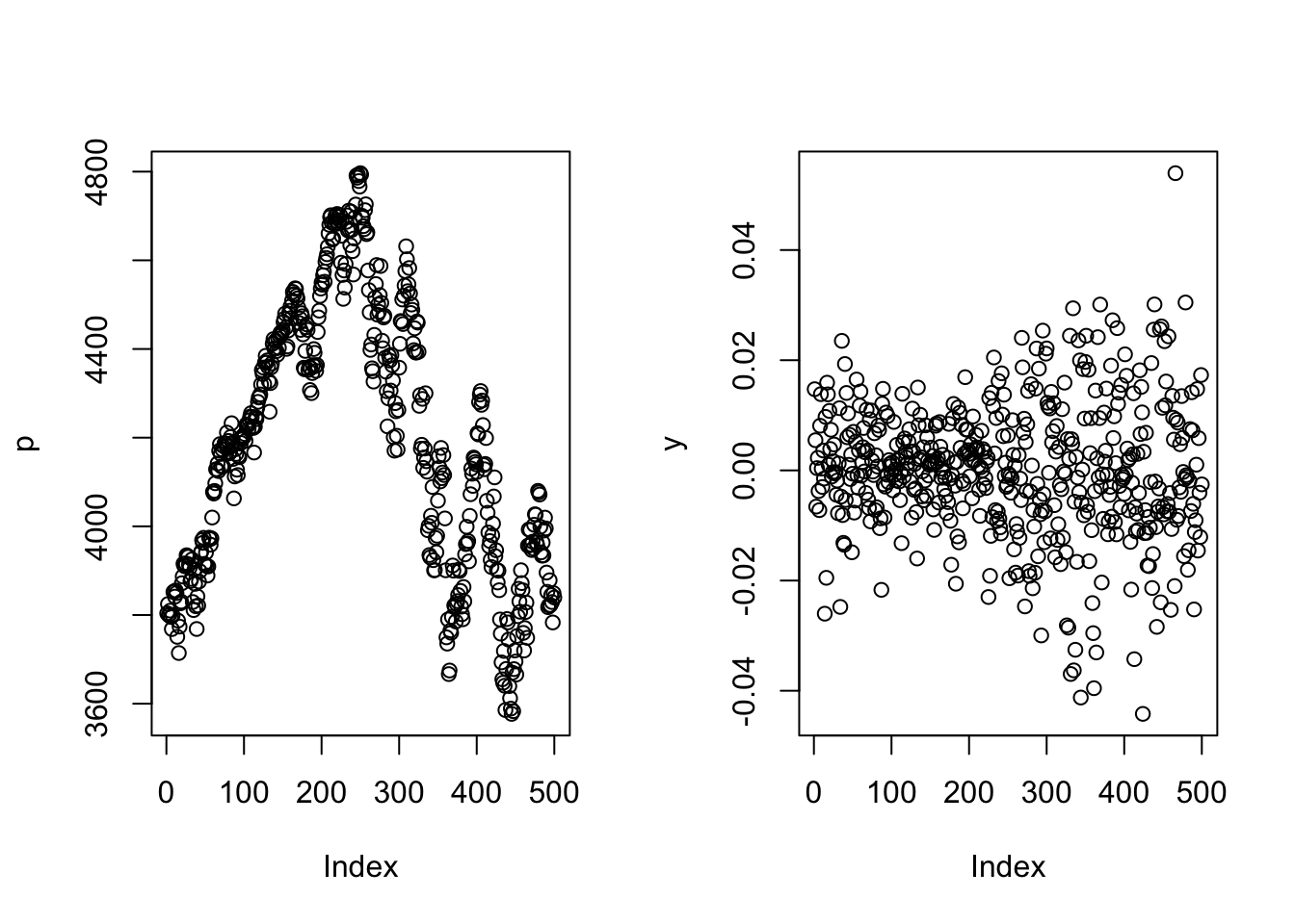
And one above the other:
par(mfrow=c(2,1))
plot(p)
plot(y)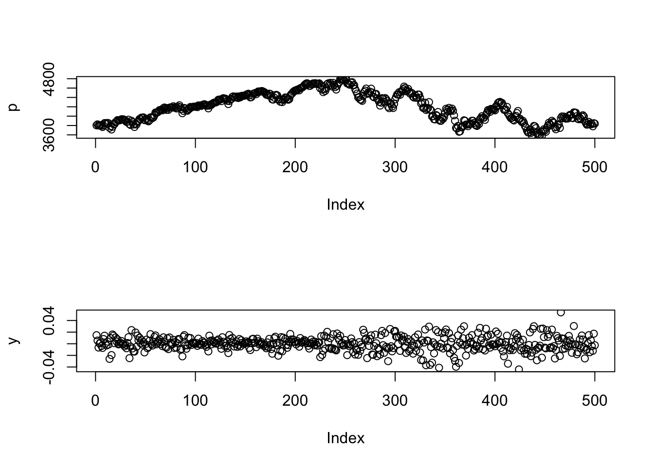
and even a \(2\times 2\):
par(mfrow=c(2,2))
plot(p)
plot(y)
plot(cos(p))
plot(sin(seq(0,2*pi,length=100)))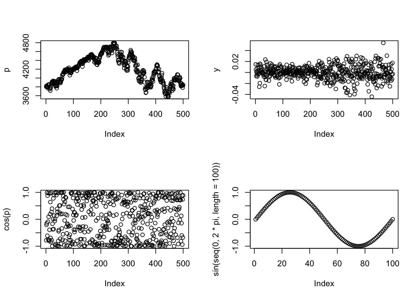
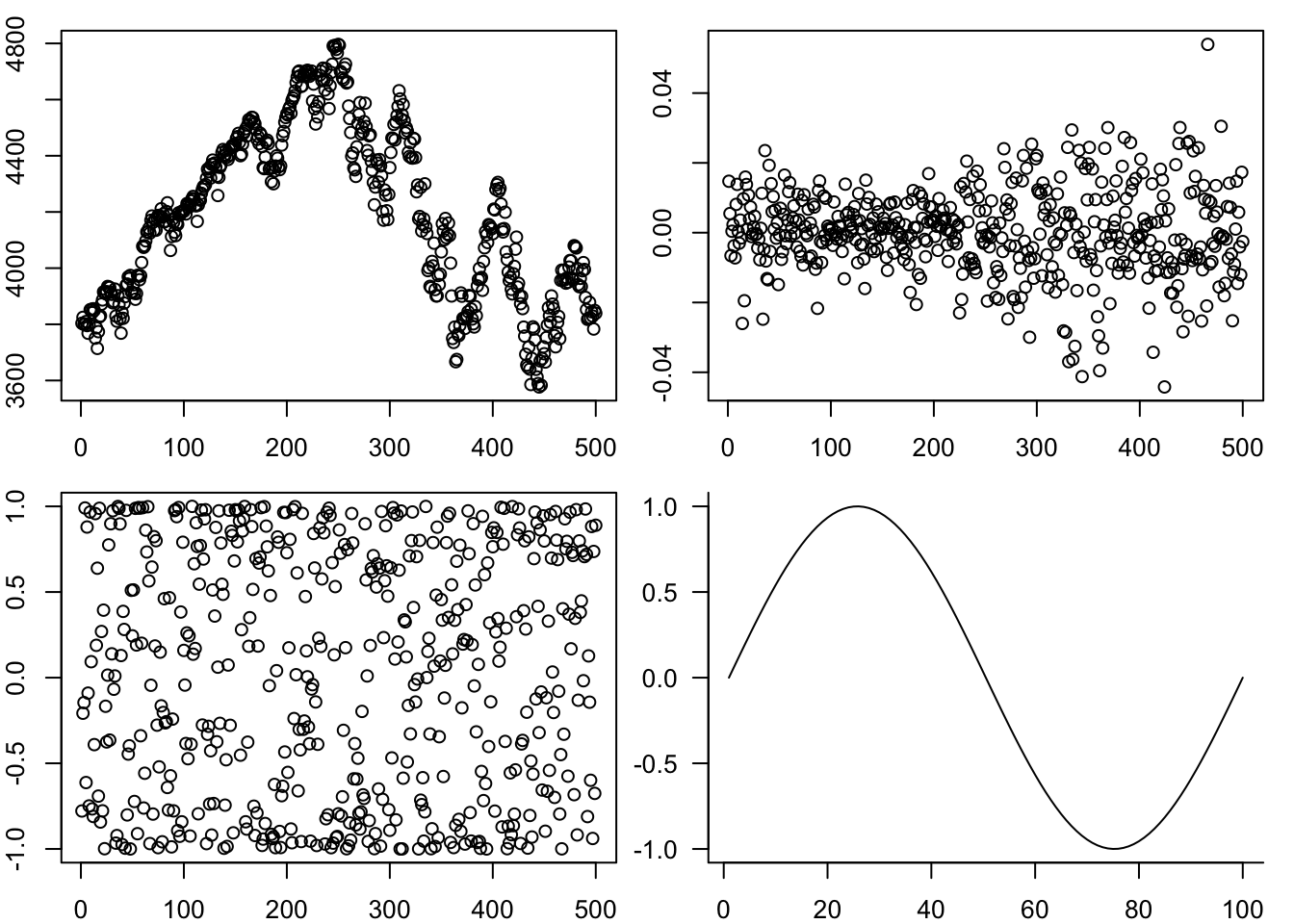
One way to customise this is to change the space between the plots by the margin argument, mar
par(mfrow=c(2,2),mar=c(2,2,1,1))
plot(p)
plot(y)
plot(cos(p))
plot(sin(seq(0,2*pi,length=100)),
     type='l',
     las=1,
     xlab="",
     ylab="",
     bty='l'
)
9.3.5 Labelling plots with text, lines and arrows
We often put text labels, lines and arrows onto a plot. This is easy to do.
par(mar=c(3,3,2,0))
plot(p,
     type='l',            # line plot
     col='red',           # colour of line
     lwd=2,               # width of line
     xlab="day",          # x axis label
     ylab='price',        # y axis label
     main="SP 500 index", # main plot label
     las=1,               # rotate y-axis text
     bty='las'            # use a L shaped frame
)
text(1,4600,"The highest price",pos=4)
arrows(100,4650,230,4800)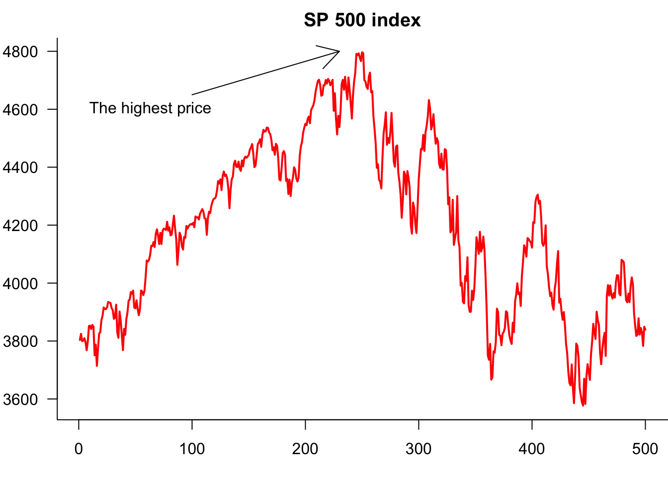
9.3.6 Legends
If the plot has more than one variable, we usually want to add legends using the legend() command. Note that the first argument is the location, which can either be a string, as shown below, or coordinates.
Note that we are actually creating one plot with the plot() and then separately adding a line to it.
par(mar=c(3,3,2,0))
plot(Price$AAPL,
     type='l',            # line plot
     col='red',           # colour of line
     lwd=2,               # width of line
     xlab="day",          # x axis label
     ylab='price',        # y axis label
     main="Stock prices", # main plot label
     las=1,               # rotate y-axis text
     bty='las'            # use a L shaped frame
)
lines(Price$JPM,col="blue")
legend(
     "topleft",
     legend=c("Apple","JP Morgan"),
     col=c("red","blue"),
     lty=1,
     bty='n'
)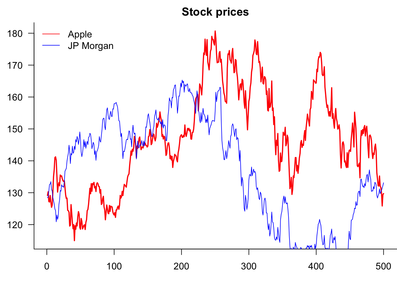
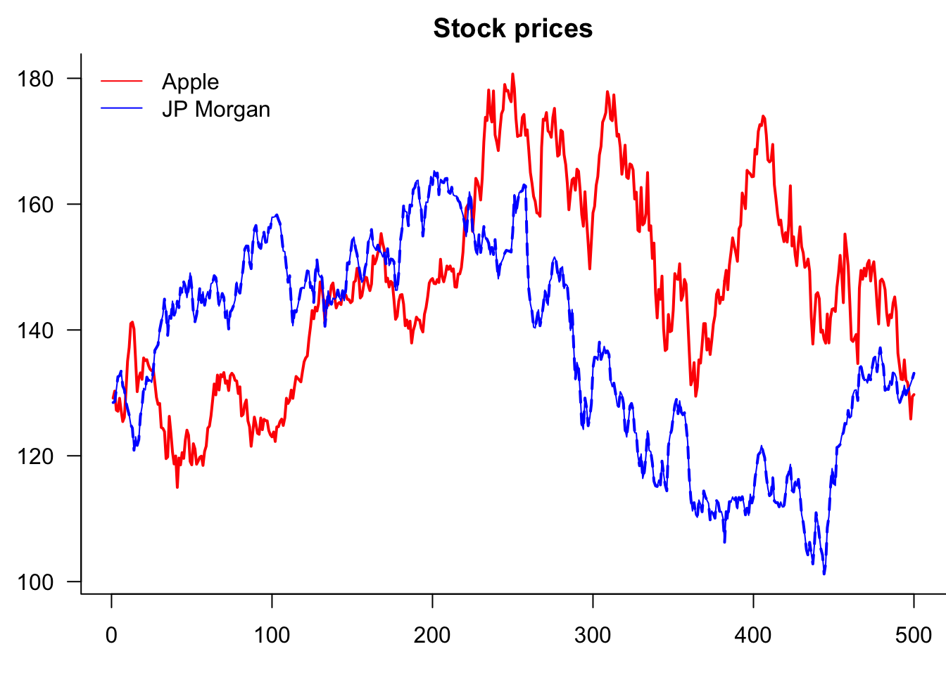
So why is it clipping JPM? Because AAPL decides the y-axis. Two ways to fix this. Use ylim= or matplot()
par(mar=c(3,3,2,0))
matplot(Price[,c("AAPL","JPM")],
     type='l',            # line plot
     col=c("red","blue"),           # colour of line
     lwd=2,               # width of line
     xlab="day",          # x axis label
     ylab='price',        # y axis label
     main="Stock prices", # main plot label
     las=1,               # rotate y-axis text
     bty='las'            # use a L shaped frame
)
lines(Price$JPM,col="blue")
legend(
     "topleft",
     legend=c("Apple","JP Morgan"),
     col=c("red","blue"),
     lty=1,
     bty='n'
)
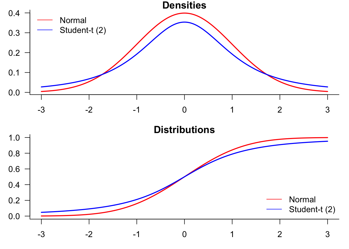
9.3.7 Plotting distributions
We start by generating a plot comparing normal and t-distributions. T-distributions are heavy-tailed and convenient when we need fat-tailed distributions. The following plot highlights the difference between normal and t-distributions.
x=seq(-3,3,0.01)
x=seq(-3,3,length=500)par(mfrow=c(2,2),mar=c(3,3,1,1))
plot(x,dnorm(x),type="l", lty=1, lwd=2, main="Normal pdf",
xlab="x", ylab="Probability") # normal density
plot(x,dt(x,df=2),type="l", lty=1, lwd=2, main="Student t(2) pdf",
xlab="x", ylab="Probability") # normal density
plot(x,pnorm(x),type="l", lty=1, lwd=2, main="Normal cdf",
xlab="x", ylab="Probability") # normal density
plot(x,pt(x,df=2),type="l", lty=1, lwd=2, main="Student t(2) cdf",
xlab="x", ylab="Probability") 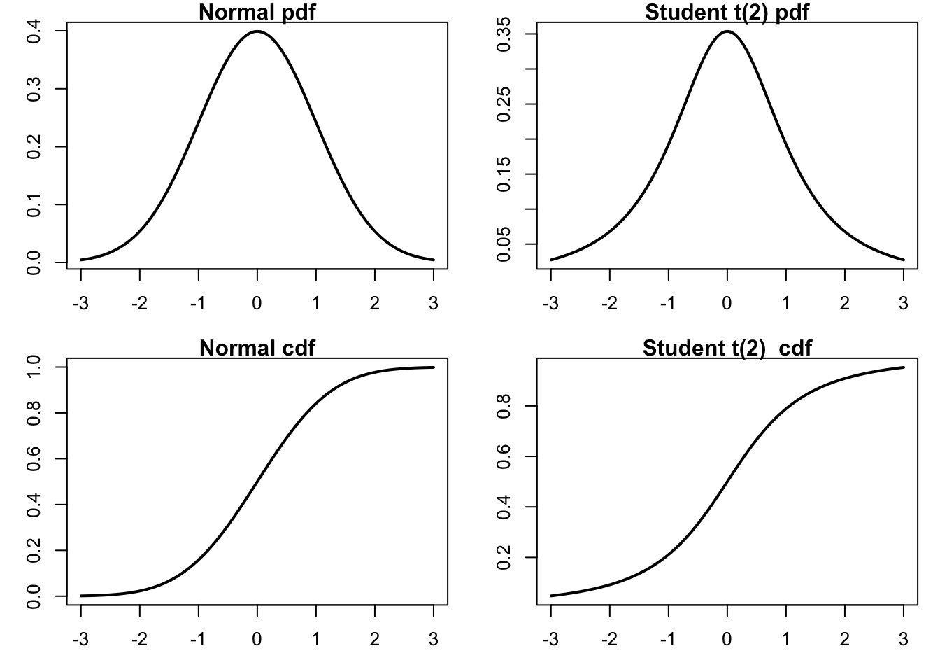
To compare the distributions, it might be better to plot them both in the same figure.
par(mfrow=c(2,1),mar=c(3,3,1,1))
plot(x,dnorm(x),
     type="l",
     lty=1,
     lwd=2,
     main="Densities",
     xlab="value",
     ylab="Probability",
     col="red",
     las=1,
     bty='l'
)
lines(x,dt(x,df=2),
     type="l",
     lty=1, lwd=2,
     col="blue"
)
legend("topleft",
     legend=c("Normal","Student-t (2)"),
     col=c("red","blue"),
     lty=1,
     bty='n'
)
plot(x,pnorm(x),
     type="l",
     lty=1,
     lwd=2,
     main="Distributions",
     xlab="x",
     ylab="Probability",
     col="red",
     las=1,
     bty='l'
)
lines(x,pt(x,df=2),
     lwd=2,
     col="blue"
)
legend(
     "bottomright",
     legend=c("Normal","Student-t (2)"),
     col=c("red","blue"),
     lty=1,
     bty='n'
)
9.3.8 Saving base plots
After the plots are generated in R, you can export and include them in your academic paper or slides. It is never a good idea to include screenshots in your writing, as they look unprofessional and are usually blurred. Instead, it is recommended to export plots from R by choosing appropriate image formats, such as PNG, JPEG, TIFF, SVG, EPS, PDF, etc.
Different image formats have different characteristics.
Graphics devices for BMP, JPEG, PNG and TIFF format bitmap files.
- PDF, or Portable Document Format, is widely used. PDF plots are in high resolution and can be scaled without loss of quality.
- SVG (Scalable Vector Graphics). SVG plots are high-resolution and can be scaled without loss of quality.
- EPS (Encapsulated PostScript) are also vector-based and are good alternatives to PDF.
- PNG or JPEG. However, more commonly seen image formats could be more scalable—PNG and JPEG plots are likely to be blurred and lose details once scaled up.
- tiff. It is particularly useful if you want to take an image in Photoshop.
The selection of image formats depends on which word processor/text editor you are using. If you are using Word or PowerPoint, SVG is the recommended format. Importing SVG plots into Word and PowerPoint is simple: export the plot from R, and then in Word/PowerPoint, select Insert > Pictures > This Device. Navigate to the directory where the plot is saved, and then choose the one you want to insert. You can easily scale plots in Word/PowerPoint to proper sizes – SVG graphs are infinitely expandable without losing any resolution. They are also very suitable for web pages.
If you are writing with \(\LaTeX\), PDF and EPS are preferred because the \(\LaTeX\) back-end does not support SVG directly. Plots can be easily imported using \includegraphics{filename} command with graphicx package loaded in the preamble. Although it is not impossible to include SVG plots in \(\LaTeX\), there are prerequisites for them to work and can sometimes cause errors.
In RStudio, you can export the graphs from the bottom right preview panel. Click the Export icon, and you can select from a range of image formats R supports, set a directory, change a file name, and specify the image size in the pop-up window.
Alternatively, you can save plots with the following code:
pdf("plot_name.pdf")  # specify the plot name and format
plot(sin(1:10))  # generate your plot here
dev.off()  # close the plot device

png("plot_name.png")  # specify the plot name and format
plot(...)  # generate your plot here
dev.off() # close the plot devicelibrary(svglite)
svglite("myplot.svg", width = 4, height = 4)
plot(...)
dev.off()10 ggplot2
It is easy to make better-looking plots with the ggplot2; see ggplot2.tidyverse.org. The BBC and New York Times, for example, use it. Compared with base R plots, ggplot commands are different. ggplot starts by calling ggplot(data, aes(...)), where data represents the dataset and aes() captures the variables.
ggplot then draws the graph layer by layer, with a plus sign at the end of each line indicating a new layer is added. For example, geom_area(fill=..., alpha=...) shades the area under the curve, where alpha is the degree of transparency. By default, ggplots have a grey background and white grids. This can be customised, with several themes available. Below is a time series plot of the S&P500 index.
library(ggplot2)data=as.data.frame(cbind(1:length(p),p))
names(data)=c("x","y")
x=ggplot(data=data, aes(x=x, y=y, group=1))
x=x + geom_line()
x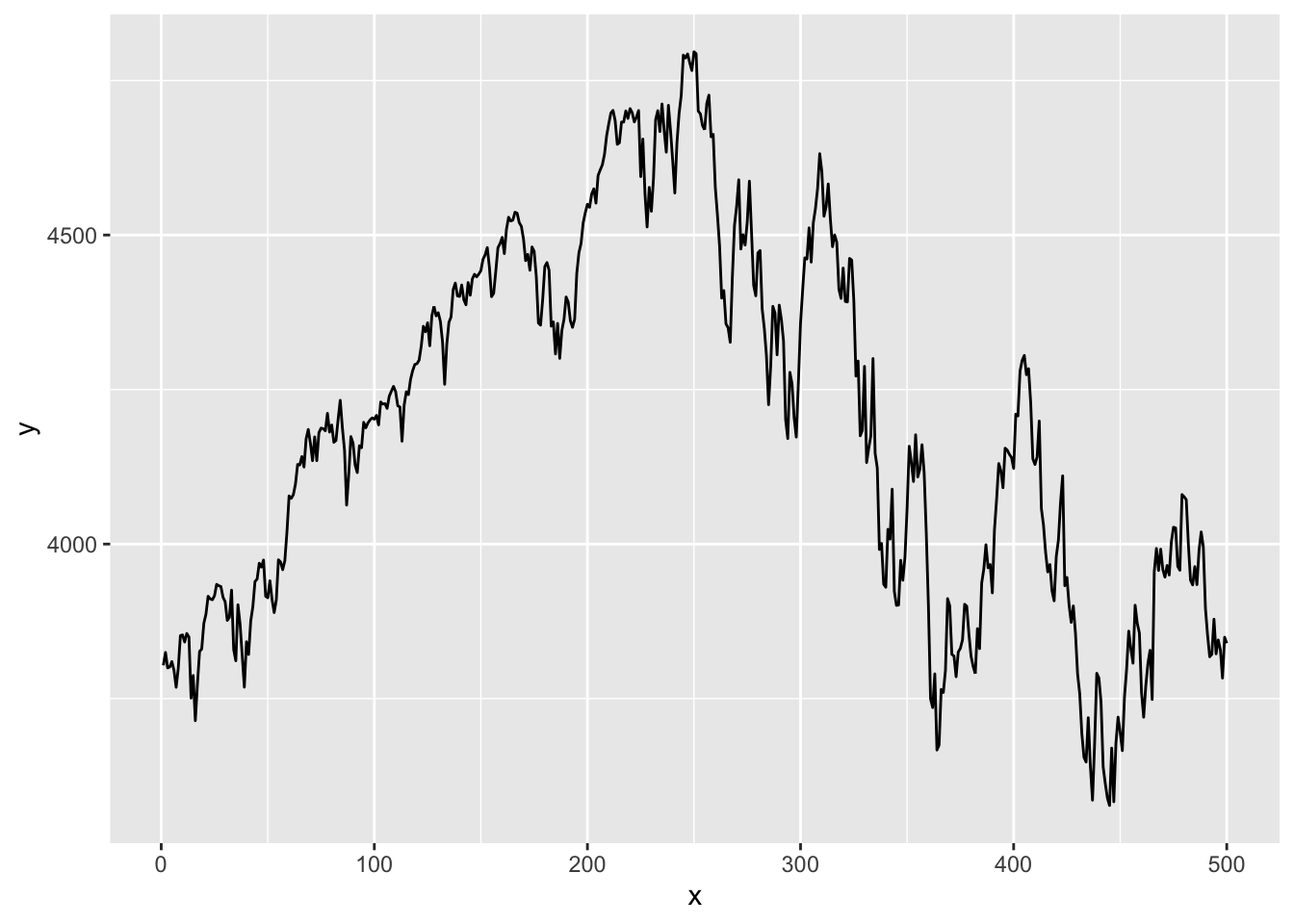
One thing to note is that if we want to plot our vector of SP 500 prices, we need five lines of ggplot code, whereas all we needed for base plots was plot(p). Two of these lines are for the necessary vector to the dataframe, as ggplot cannot plot vectors. We also have to add a separate column for the X-axis values. We then have to give these columns a name. The actual ggplot code is also much more detailed.
The default version of a ggplot is almost as ugly as the default base plot and needs some work to achieve an acceptable visual quality. The term ‘prettify’ is sometimes used to describe the process.
library(ggplot2)
data=as.data.frame(cbind(1:length(p),p))
names(data)=c("x","y")
x=ggplot(data=data, aes(x=x, y=y, group=1))
x=x+ geom_line()      # line plotting
x=x+ geom_line(color="deepskyblue3", size=0.8)   # set #the colour and size of the line
x=x+ theme_bw()       # Set the theme of the graph
x=x+ xlab("date")     # x-axis label
x=x+ ylab("price")    # y-axis label
x=x+ ggtitle("S&P500")# plot title
x 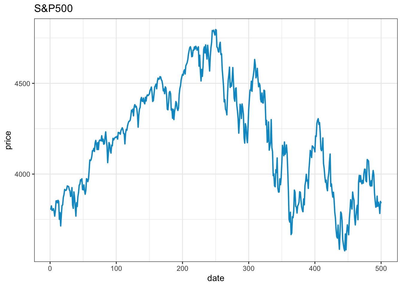
It takes about the same number of lines to make an acceptable visual quality ggplot as it takes to make a base plot. Removing the top and right frame lines requires considerably more code.
10.0.1 Saving ggplot
ggsave("myplot.pdf")
ggsave("myplot.png")
or one of “eps”, “ps”, “tex” (pictex), “pdf”, “jpeg”, “tiff”, “png”, “bmp”, “svg” or “wmf”
10.1 Base plots vs. ggplot2
ggplot2 is recommended in most cases.
Some people have very strong opinions on which is better, ggplot2 or base plots. The general consensus on the Internet is that one should use ggplot2, but some people maintain that one should only use base plots. As is usually the case, it is not that clear-cut.
For the types of plots we make in these notes, the code to make base plots is shorter and simpler than the equivalent ggplot2 code, while the plots have about the same visual quality. Furthermore, base plots are built into R, unlike ggplot2, and we generally use the default. That is why we mostly use base plots here.
However, that does not mean one should always use base plots. The ecosystem around ggplot2 is much richer and more powerful, so one can easily make a plot with ggplot2 that is either impossible or very complicated to do with base plots.
Base plots do have advantages in some cases.
- They are simpler to use than the alternatives;
ggplot2is more buggy. We have one complicatedggplot2in a workflow where it is not possible to run the R code more than once, as it crashesggplot2. We have to restart the session. But, it is impossible to make that particular plot with base plots;- Base plots have an advantage when it comes to \(\LaTeX\) documents since we can make them so that they use the same text font as the document itself, which is not possible with
ggplot2without considerable manual work for each figure. - It is really hard to make sub-tickmarks with
ggplots. We found a comment by one of its designers saying that they thought one should not use sub-tickmarks; hence, they are not directly supported. Unfortunately, there are very good reasons to have sub-tick marks in the types of applications we do in these notes. See Figure 10.1.
| Feature | Base R Plots | ggplot2 |
|---|---|---|
| Ease of Use | Simple for quick plots | Requires learning the grammar |
| Default Aesthetics | Basic, less polished | Modern, visually appealing |
| Customization | High but manual | High and more intuitive with themes |
| Data input | Vectors, matrices, or data frames | Data frames/tibbles only |
| Layered plotting | Not inherently supported | Built-in layering via + syntax |
| Faceting/subplots | Requires par() and layout() |
Simple with facet_wrap() or facet_grid() |
| Publication-ready | Needs extra tweaking | Ready by default |
| Speed for simple plots | Fast and lightweight | Slight overhead |
| Community support | Extensive but older resources | Large community with ongoing updates |
| Stability | Very stable | Can be buggy |