library(ggplot2)
library(lubridate)
library(zoo)
library(reshape2)10 Plots
Effective data visualisation is important for financial analysis, helping analysts identify patterns, outliers and relationships that might otherwise remain hidden in numerical data. R provides excellent plotting capabilities through both its built-in graphics system and additional packages.
R offers two main approaches to creating plots: base plots, which come built into R, and external libraries such as ggplot2 that provide additional functionality and styling options. Both approaches can produce publication-quality graphics suitable for reports, presentations and academic papers.
This chapter focuses on the fundamental plotting techniques most relevant to financial data analysis. For additional examples and inspiration, the R Graph Gallery provides a comprehensive collection of visualisation examples with reproducible code.
Time series plotting techniques, which require specialised consideration for financial data, are covered separately in Chapter 11.
10.1 Data and libraries
source('common/functions.r')The data we use are processed returns on the S&P 500 index, and for convenience, we put them into variables y and p. We also use the last 500 observations of the stock prices.
data=ProcessRawData()

y=tail(data$sp500$y,500)
p=tail(data$sp500$p,500)

Price=tail(data$Price,500)
Return=tail(data$Return,500)
10.2 Base plots
10.2.1 Simple plot
The simplest possible plot we can make is by just calling the plot() command.
plot(p)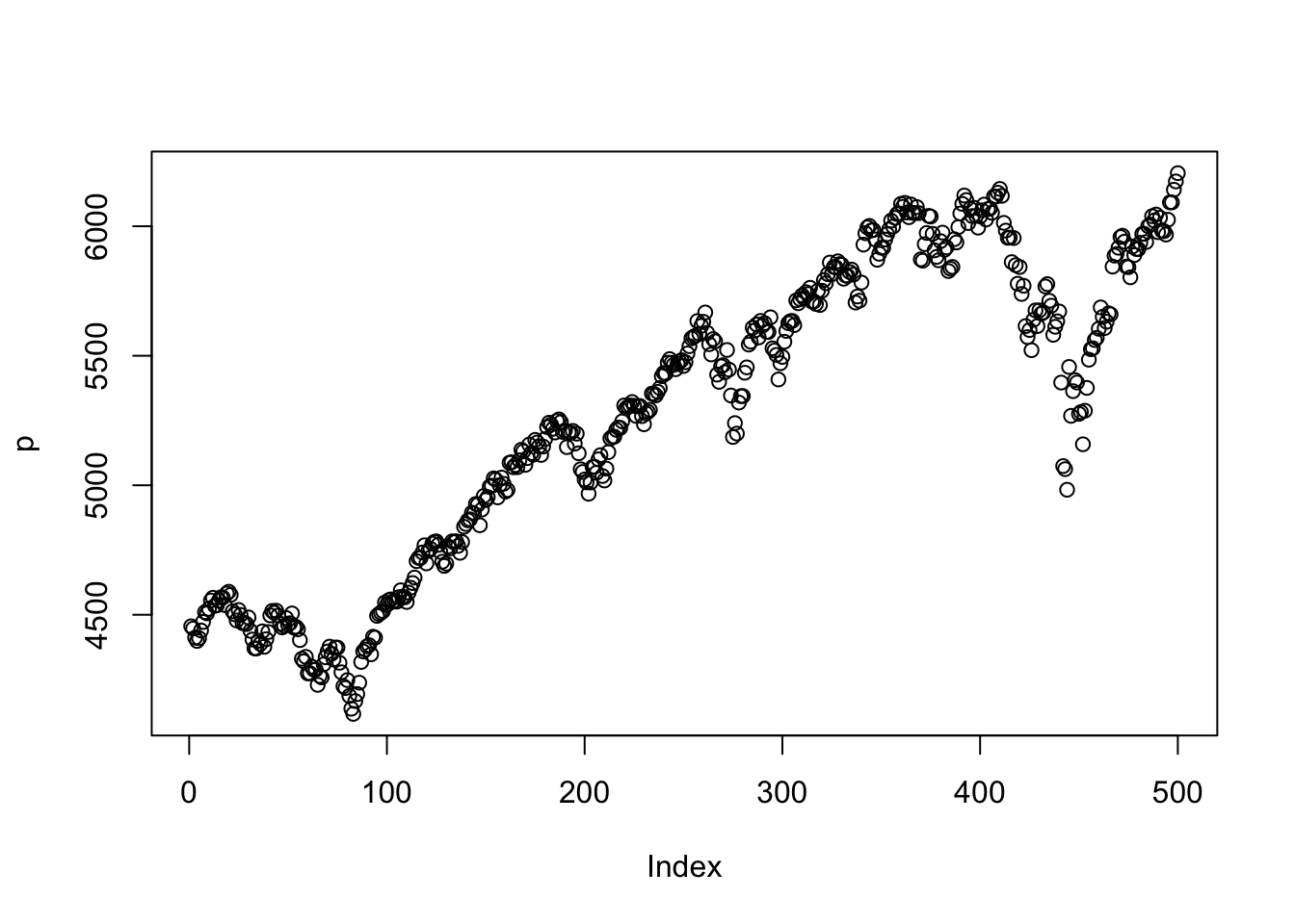
The ggplot2 version is below. We need to convert p to a data frame for ggplot2.
# Create a data frame for ggplot2
df = data.frame(day = 1:length(p), price = p)
ggplot(df, aes(x = day, y = price)) +
  geom_line(color = "red", linewidth = 1)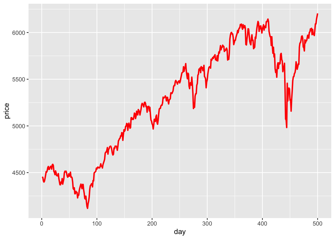
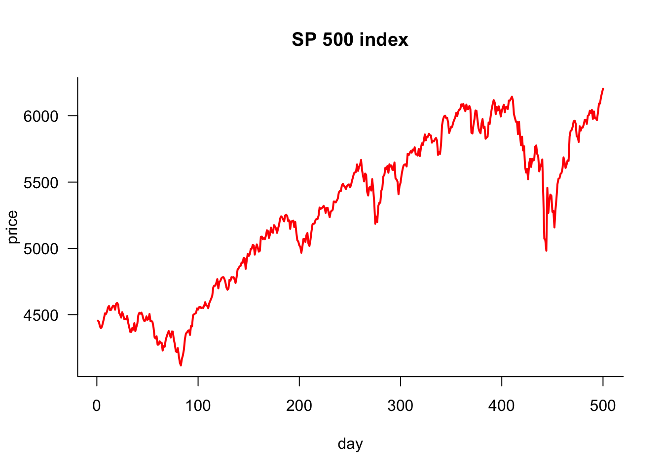
10.2.2 Simple plot improved
This plot could be more attractive, but it can easily be improved. We want to do the following:
- plot lines, not dots (circles)
- use a different colour
- change the thickness of the line
- change the labels on the X and Y axis
- make the axis L-shaped
- give it a title
- rotate the labels on the y-axis
plot(p,
     type='l',            # line plot
     col='red',           # colour of line
     lwd=2,               # width of line
     xlab="day",          # x axis label
     ylab='price',        # y axis label
     main="SP 500 index", # main plot label
     las=1,               # rotate y-axis text
     bty='l'              # use a L shaped frame
)
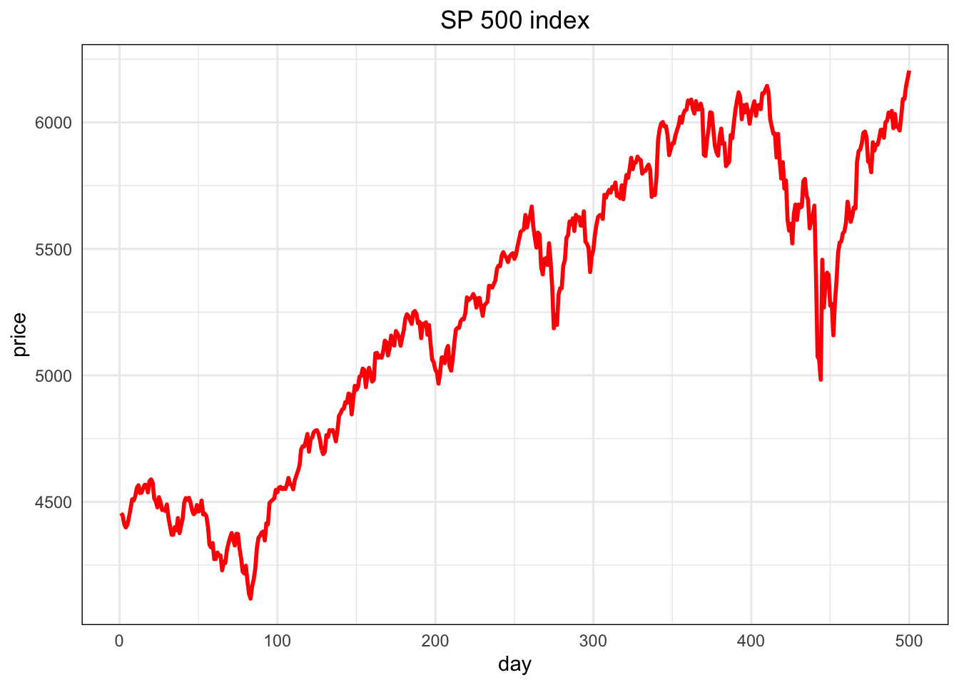
The ggplot2 version is below. We need to convert p to a data frame for ggplot2.
# Create a data frame for ggplot2
df = data.frame(day = 1:length(p), price = p)
ggplot(df, aes(x = day, y = price)) +
  geom_line(color = "red", linewidth = 1) +                # Use linewidth instead of size
  labs(title = "SP 500 index", x = "day", y = "price") +   # Axis labels and title
  theme_minimal() +                                        # Minimal theme for cleaner look
  theme(
    axis.text.y = element_text(angle = 0),                 # Equivalent to las = 1 (horizontal y-axis text)
    plot.title = element_text(hjust = 0.5),                # Center align title
    panel.border = element_rect(color = "black", fill = NA) # Add a border around the plot
  )
10.2.3 Plotting parameters
If we want to control the plot’s layout, we need to set plotting parameters that stay fixed until they are changed. The command to do that is par().
10.2.4 Plot two variables
If we want to plot two variables side-by-side, use themfrow= argument to par():
par(mfrow=c(1,2))
plot(p)
plot(y)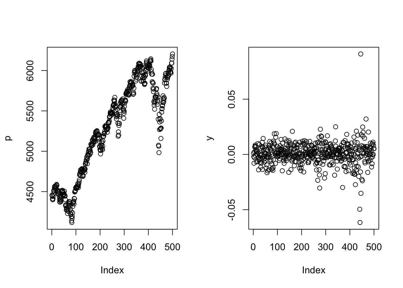
And one above the other:
par(mfrow=c(2,1))
plot(p)
plot(y)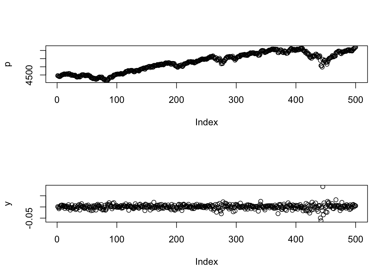
and even a \(2\times 2\):
par(mfrow=c(2,2))
plot(p)
plot(y)
plot(cos(p))
plot(sin(seq(0,2*pi,length=100)))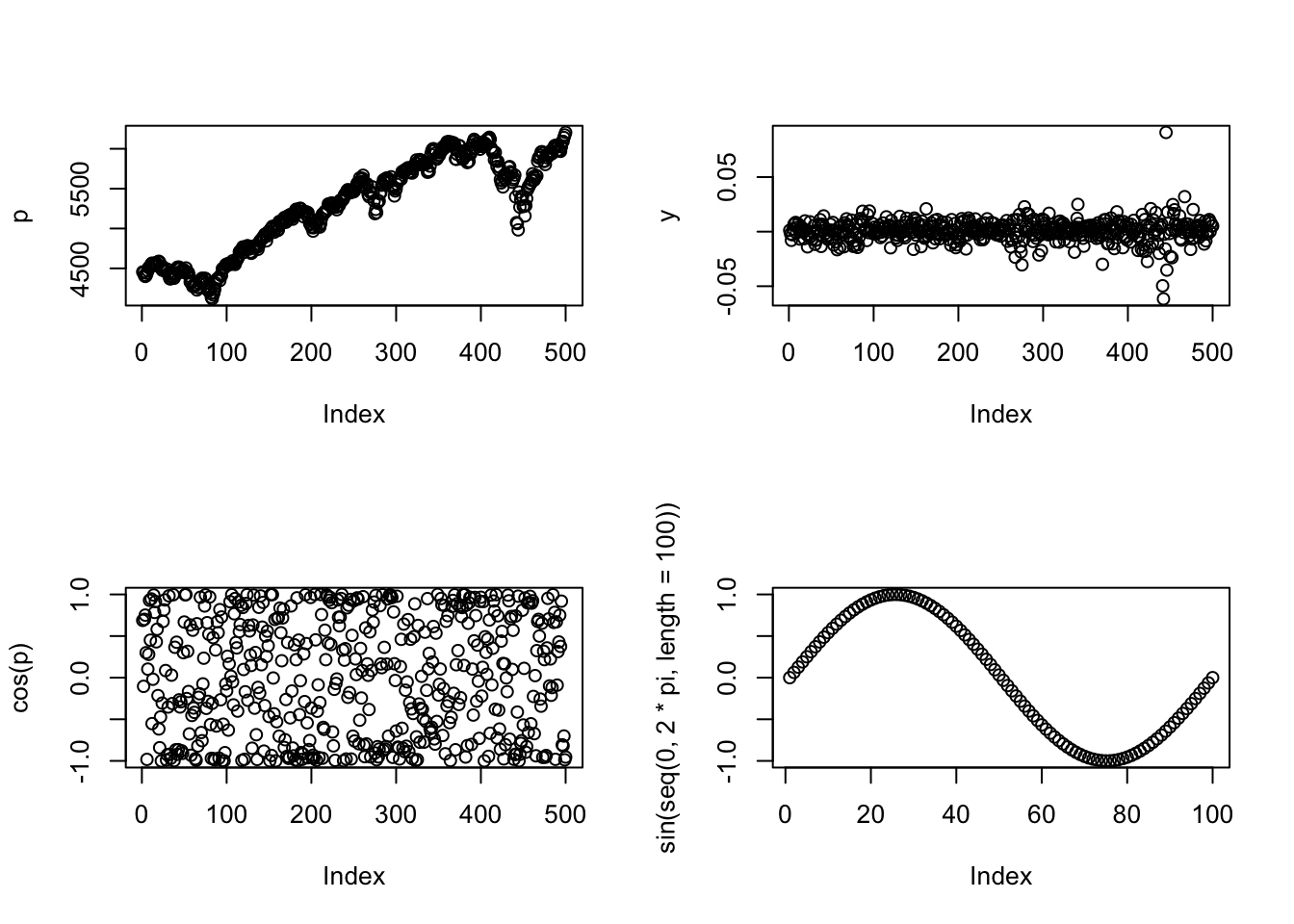
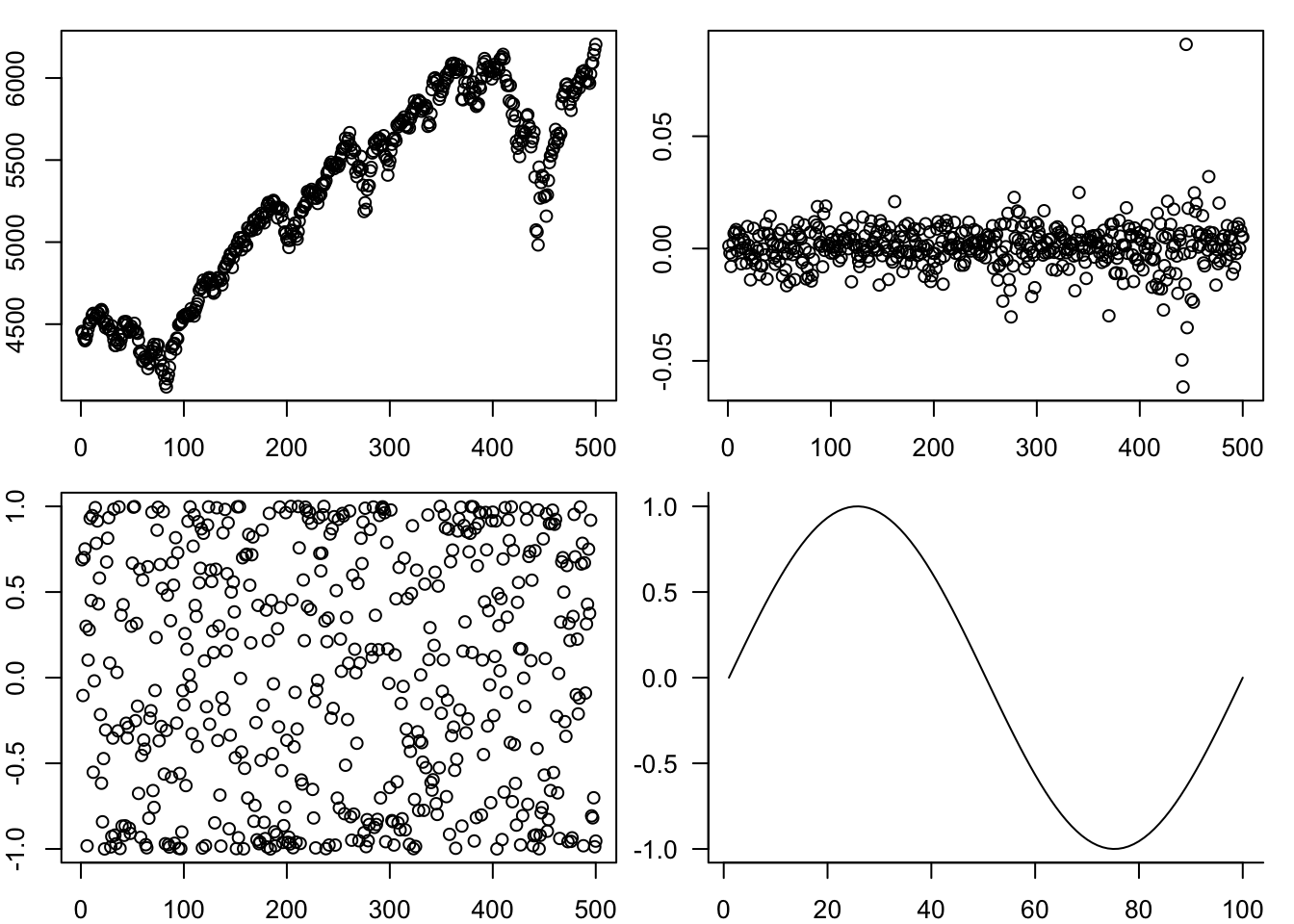
One way to customise this is to change the space between the plots by the margin argument, mar
par(mfrow=c(2,2),mar=c(2,2,1,1))
plot(p)
plot(y)
plot(cos(p))
plot(sin(seq(0,2*pi,length=100)),
     type='l',
     las=1,
     xlab="",
     ylab="",
     bty='l'
)
10.2.5 Labelling plots with text, lines and arrows
We often put text labels, lines and arrows onto a plot. This is easy to do.
par(mar=c(3,3,2,0))
plot(p,
     type='l',            # line plot
     col='red',           # colour of line
     lwd=2,               # width of line
     xlab="day",          # x axis label
     ylab='price',        # y axis label
     main="SP 500 index", # main plot label
     las=1,               # rotate y-axis text
     bty='las'            # use a L shaped frame
)
text(1,4600,"The highest price",pos=4)
arrows(100,4650,230,4800)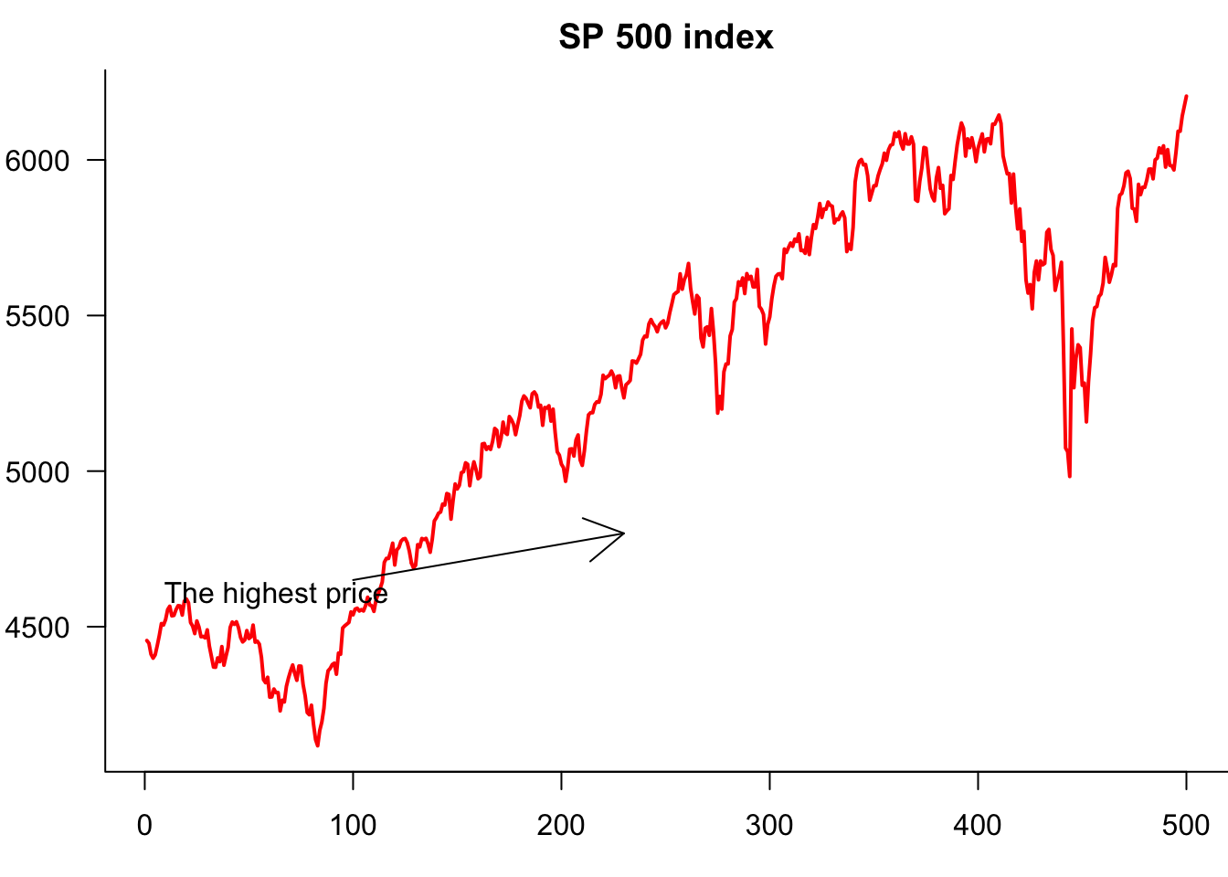
10.2.6 Legends
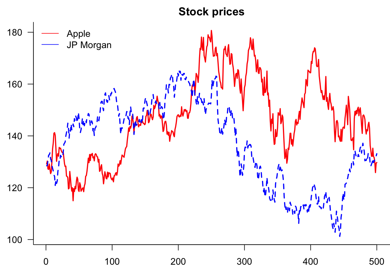
If the plot has more than one variable, we usually want to add legends using the legend() command. Note that the first argument is the location, which can either be a string, as shown below, or coordinates.
Note that we are actually creating one plot with the plot() and then separately adding a line to it.
par(mar=c(3,3,2,0))
plot(Price$AAPL,
     type='l',            # line plot
     col='red',           # colour of line
     lwd=2,               # width of line
     xlab="day",          # x axis label
     ylab='price',        # y axis label
     main="Stock prices", # main plot label
     las=1,               # rotate y-axis text
     bty='las'            # use a L shaped frame
)
lines(Price$JPM,col="blue")
legend(
     "topleft",
     legend=c("Apple","JP Morgan"),
     col=c("red","blue"),
     lty=1,
     bty='n'
)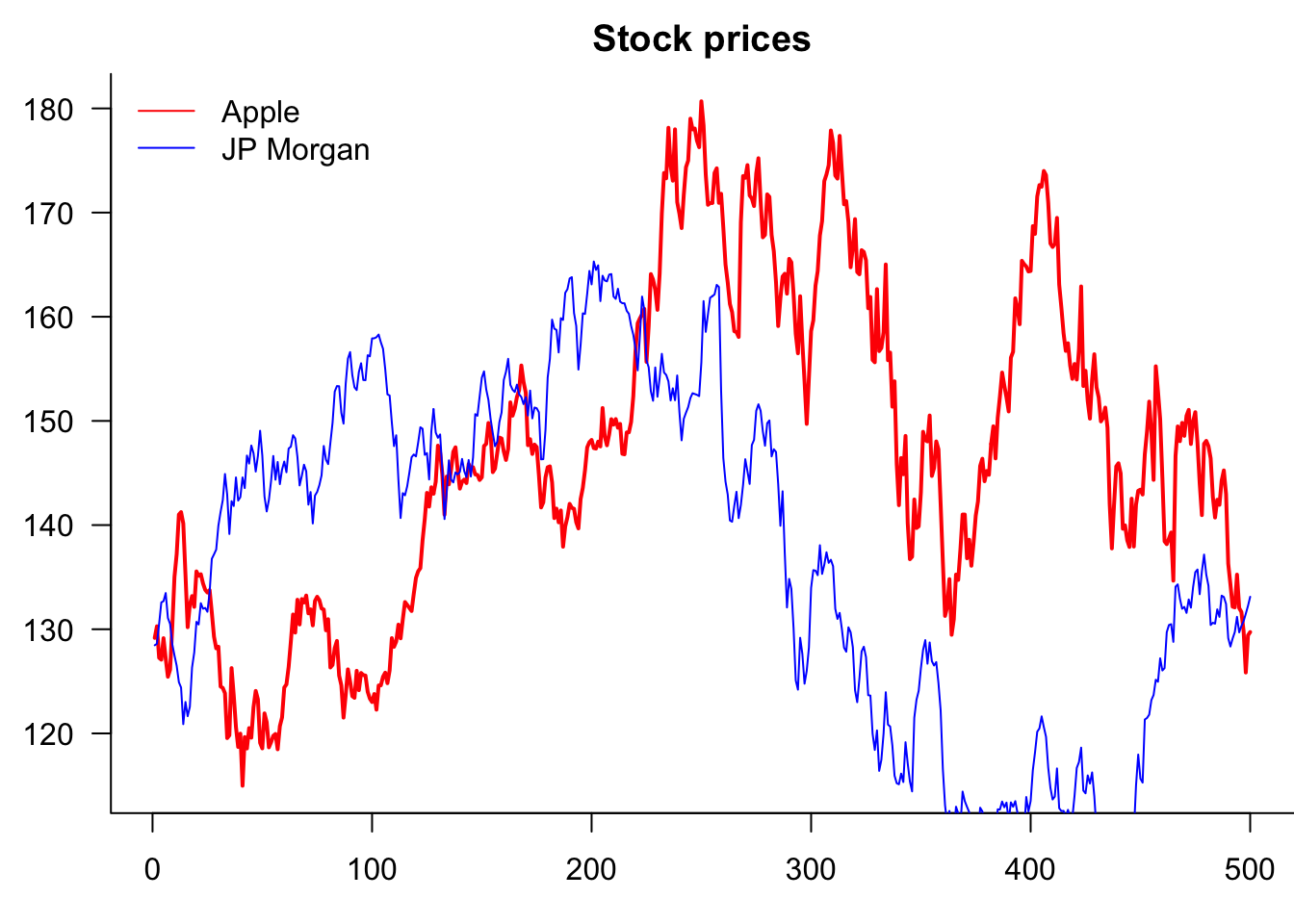
Notice that the JP Morgan line is clipped at the top. This happens because the first plot() command sets the y-axis range based only on AAPL data, ignoring the JP Morgan values.
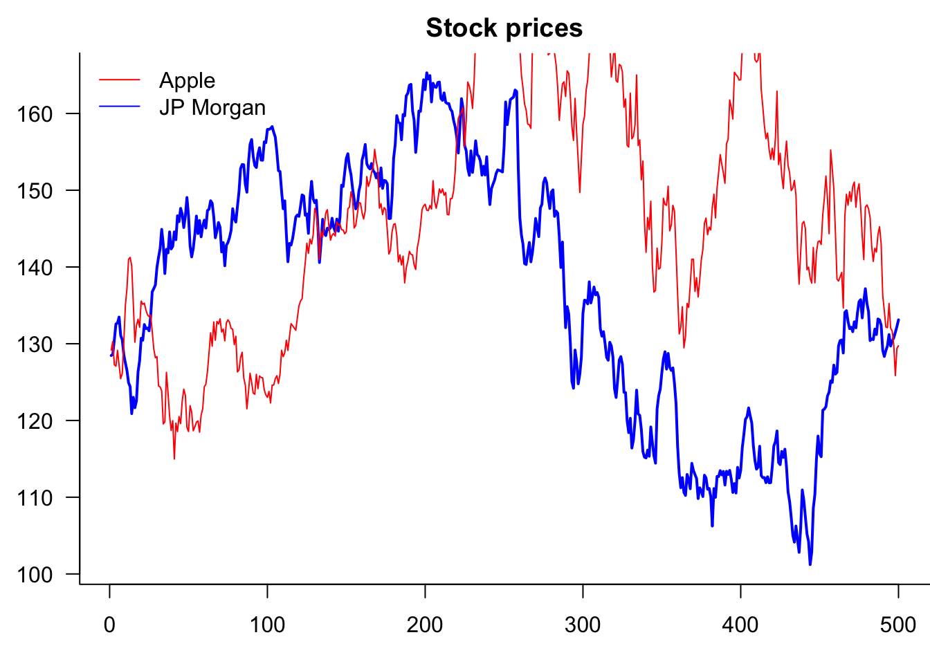
10.2.6.1 Solutions
Option 1: Change the plotting order (plot the series with the larger range first)
par(mar=c(3,3,2,0))
plot(Price$JPM,
     type='l',            # line plot
     col='blue',          # colour of line
     lwd=2,               # width of line
     xlab="day",          # x axis label
     ylab='price',        # y axis label
     main="Stock prices", # main plot label
     las=1,               # rotate y-axis text
     bty='l'              # use a L shaped frame
)
lines(Price$AAPL, col="red")
legend(
     "topleft",
     legend=c("Apple","JP Morgan"),
     col=c("red","blue"),
     lty=1,
     bty='n'
)
Option 2: Set explicit y-axis limits using ylim
par(mar=c(3,3,2,0))
plot(Price$AAPL,
     type='l',            # line plot
     col='red',           # colour of line
     lwd=2,               # width of line
     xlab="day",          # x axis label
     ylab='price',        # y axis label
     main="Stock prices", # main plot label
     las=1,               # rotate y-axis text
     bty='las',           # use a L shaped frame
     ylim = range(c(Price$AAPL, Price$JPM), na.rm = TRUE)
)
lines(Price$JPM, col="blue")
legend(
     "topleft",
     legend=c("Apple","JP Morgan"),
     col=c("red","blue"),
     lty=1,
     bty='n'
)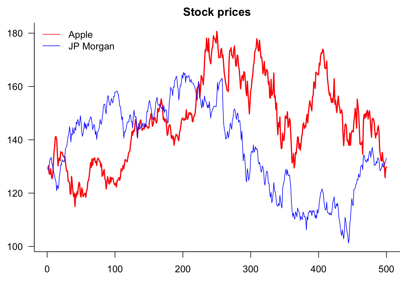
Best practice: Use range() to automatically calculate appropriate limits, as shown above. This works for any number of series and handles missing values properly.
10.2.7 Using matplot for multiple series
par(mar=c(3,3,2,0))
matplot(Price[,c("AAPL","JPM")],
     type='l',            # line plot
     col=c("red","blue"), # colour of line
     lwd=2,               # width of line
     xlab="day",          # x axis label
     ylab='price',        # y axis label
     main="Stock prices", # main plot label
     las=1,               # rotate y-axis text
     bty='l'              # use a L shaped frame
)
legend(
     "topleft",
     legend=c("Apple","JP Morgan"),
     col=c("red","blue"),
     lty=1,
     bty='n'
)
10.2.8 Saving base plots
After the plots are generated in R, you can export and include them in your academic paper or slides. It is never a good idea to include screenshots in your writing, as they look unprofessional and are usually blurred. Instead, it is recommended to export plots from R by choosing appropriate image formats, such as PNG, JPEG, TIFF, SVG, EPS, PDF, etc.
Different image formats have different characteristics.
Graphics devices for BMP, JPEG, PNG and TIFF format bitmap files.
- PDF, or Portable Document Format, is widely used. PDF plots are in high resolution and can be scaled without loss of quality.
- SVG (Scalable Vector Graphics). SVG plots are high-resolution and can be scaled without loss of quality.
- EPS (Encapsulated PostScript) are also vector-based and are good alternatives to PDF.
- PNG or JPEG. However, these bitmap formats are not scalable—PNG and JPEG plots are likely to be blurred and lose details once scaled up.
- tiff. It is particularly useful if you want to take an image in Photoshop.
The selection of image formats depends on which word processor/text editor you are using. If you are using Word or PowerPoint, SVG is the recommended format. Importing SVG plots into Word and PowerPoint is simple: export the plot from R, and then in Word/PowerPoint, select Insert > Pictures > This Device. Navigate to the directory where the plot is saved, and then choose the one you want to insert. You can easily scale plots in Word/PowerPoint to proper sizes – SVG graphs are infinitely expandable without losing any resolution. They are also very suitable for web pages.
If you are writing with \(\LaTeX\), PDF and EPS are preferred because the \(\LaTeX\) back-end does not support SVG directly. Plots can be easily imported using \includegraphics{filename} command with graphicx package loaded in the preamble. Although it is not impossible to include SVG plots in \(\LaTeX\), there are prerequisites for them to work and can sometimes cause errors.
In RStudio, you can export the graphs from the bottom right preview panel. Click the Export icon, and you can select from a range of image formats R supports, set a directory, change a file name, and specify the image size in the pop-up window.
Alternatively, you can save plots with the following code:
pdf("plot_name.pdf")  # specify the plot name and format
plot(sin(1:10))  # generate your plot here
dev.off() # close the plot devicepng("plot_name.png") # specify the plot name and format
plot(...) # generate your plot here
dev.off() # close the plot devicelibrary(svglite)
svglite("myplot.svg", width = 4, height = 4)
plot(...)
dev.off()11 ggplot2
It is easy to make better-looking plots with the ggplot2; see ggplot2.tidyverse.org. The BBC and New York Times, for example, use it. Compared with base R plots, ggplot commands are different. ggplot starts by calling ggplot(data, aes(...)), where data represents the dataset and aes() captures the variables.
ggplot then draws the graph layer by layer, with a plus sign at the end of each line indicating a new layer is added. For example, geom_area(fill=..., alpha=...) shades the area under the curve, where alpha is the degree of transparency. By default, ggplots have a grey background and white grids. This can be customised, with several themes available. Below is a time series plot of the S&P500 index.
data=as.data.frame(cbind(1:length(p),p))
names(data)=c("x","y")
x=ggplot(data=data, aes(x=x, y=y, group=1))
x=x + geom_line()
x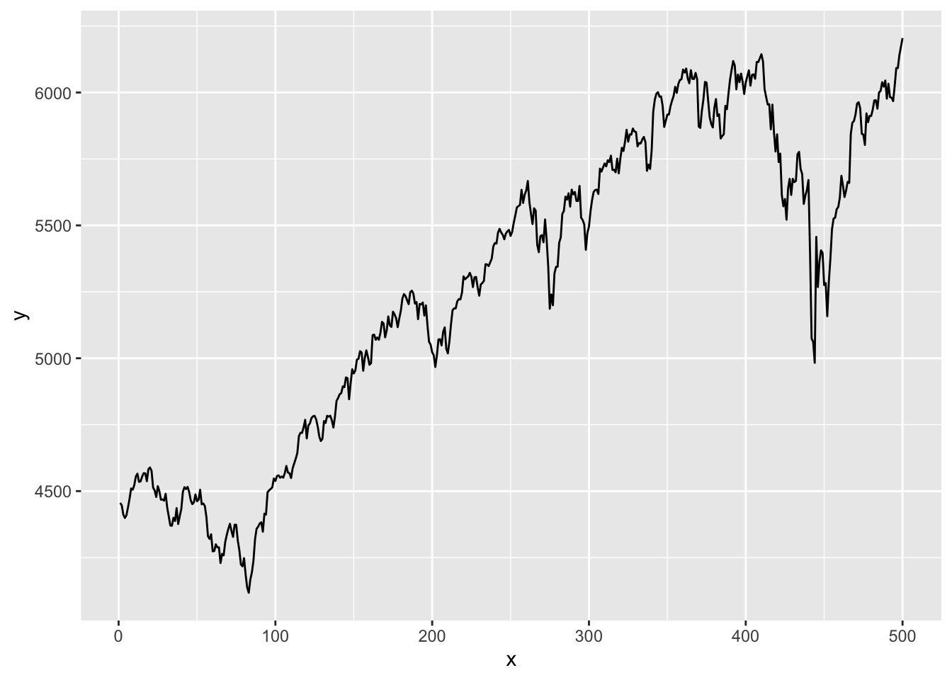
One thing to note is that if we want to plot our vector of S&P 500 prices, we need five lines of ggplot code, whereas all we needed for base plots was plot(p). Two of these lines are for the necessary conversion from vector to dataframe, as ggplot cannot plot vectors. We also have to add a separate column for the X-axis values. We then have to give these columns a name. The actual ggplot code is also much more detailed.
The default version of a ggplot is almost as plain as the default base plot and needs some work to achieve an acceptable visual quality. The term ‘prettify’ is sometimes used to describe the process.
data=as.data.frame(cbind(1:length(p),p))
names(data)=c("x","y")
x=ggplot(data=data, aes(x=x, y=y, group=1))
x=x+ geom_line()      # line plotting
x=x+ geom_line(color="deepskyblue3", linewidth=0.8)   # set the colour and size of the line
x=x+ theme_bw()       # Set the theme of the graph
x=x+ xlab("date")     # x-axis label
x=x+ ylab("price")    # y-axis label
x=x+ ggtitle("S&P 500")# plot title
x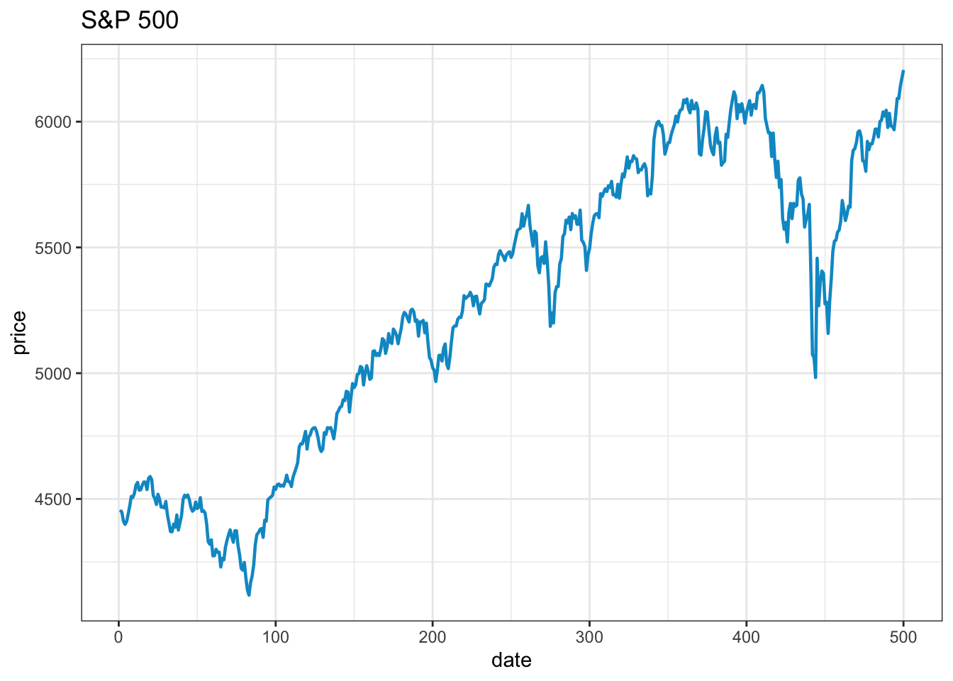
It takes about the same number of lines to make an acceptable visual quality ggplot as it takes to make a base plot. Removing the top and right frame lines requires considerably more code.
11.0.1 Saving ggplot
ggsave("myplot.pdf")
ggsave("myplot.png")
or one of “ps”, “tex” (pictex), “pdf”, “jpeg”, “tiff”, “png”, “bmp”, “svg” or “wmf”
Note the eps will not usually work.
11.1 Base plots vs. ggplot2
Both base plots and ggplot2 have their place in data analysis, and the choice often depends on your specific needs and context.
11.1.1 When to use base plots
Base plots work well for:
- Quick exploratory analysis — Simple syntax like
plot(x, y)for rapid data exploration - Simple, standard plots — Straightforward visualisations without complex layering
- Minimal dependencies — Built into R, no additional packages required
- Teaching basics — Fewer concepts to learn initially
11.1.2 When to use ggplot2
ggplot2 excels for:
- Complex, multi-layered plots — Easy to add multiple data series, annotations, and facets
- Consistent styling — Themes ensure professional, publication-ready appearance
- Data reshaping integration — Works seamlessly with tidy data principles
- Advanced visualisations — Rich ecosystem of extensions for specialised plots
11.1.3 Practical considerations
For the plots in these notes, both approaches produce similar results. Base plots require fewer lines of code for simple cases, whilst ggplot2 offers more sophisticated options for complex visualisations.
However, ggplot2 has limitations. In particular, it does not work well with eps plots, which we need to use. That is the main reason we usually to not use ggplot2.
The choice often comes down to:
- Flexibility —
ggplot2can do more; - Project requirements — Some organisations have preferences;
- Collaboration needs — Team consistency matters;
- Output format — Different formats may favour different approaches;
- Complexity — Simple plots may not justify
ggplot2’s overhead.
Rather than viewing this as an either/or decision, many analysts use both tools depending on the task at hand.
| Feature | Base R Plots | ggplot2 |
|---|---|---|
| Ease of Use | Simple for quick plots | Requires learning the grammar |
| Default Aesthetics | Basic, less polished | Modern, visually appealing |
| Customization | High but manual | High and more intuitive with themes |
| Data input | Vectors, matrices, or data frames | Data frames/tibbles only |
| Layered plotting | Not inherently supported | Built-in layering via + syntax |
| Faceting/subplots | Requires par() and layout() |
Simple with facet_wrap() or facet_grid() |
| Publication-ready | Needs extra tweaking | Ready by default |
| Speed for simple plots | Fast and lightweight | Slight overhead |
| Community support | Extensive but older resources | Large community with ongoing updates |
| Stability | Very stable | Can be buggy |