# Step 1: Basic plot
ggplot(df, aes(x = day, y = price)) +
  geom_line()

# Step 2: Add styling
ggplot(df, aes(x = day, y = price)) +
  geom_line(colour = "steelblue") +
  theme_minimal()

# Step 3: Add labels
ggplot(df, aes(x = day, y = price)) +
  geom_line(colour = "steelblue") +
  theme_minimal() +
labs(title = "S&P 500", x = "Day", y = "Price")12 Plots
Data visualisation reveals patterns, outliers and relationships that raw numbers obscure.
Each programming language has its own native plotting libraries. R has base graphics, Python has matplotlib and Julia has Plots.jl. These work well but have different syntax, making it difficult to transfer skills between languages.
The ggplot2 package, originally developed for R, implemented a “grammar of graphics” approach that has become widely adopted. Implementations now exist for Python (plotnine) and Julia (TidierPlots.jl), with nearly identical syntax across all three languages, though some advanced features may not yet be available in newer implementations. This grammar is now widely used for statistical graphics, so we use it here.
This chapter covers the core plotting techniques most relevant to financial data analysis using ggplot2. For additional examples and inspiration, the R Graph Gallery and Python Graph Gallery provide large collections of visualisation examples.
We cover time series plotting separately because financial data need their own treatment, in Chapter 13.
12.1 The grammar of graphics
The ggplot2 package is based on Leland Wilkinson’s The Grammar of Graphics1, which treats plots as compositions of independent components rather than monolithic chart types. Instead of calling a “line chart” or “bar chart” function, we build plots by combining:
- The data frame containing variables to plot.
- Aesthetics (
aes) map data variables to visual properties such as position, colour, size and shape. - Geometries (
geom_*) are the visual elements that represent data, for example points, lines, bars and areas. - Scales control how data values map to aesthetic values, such as axis limits and colour palettes.
- Facets split data into multiple panels.
- Themes control non-data visual elements such as the background, grid lines and fonts.
These components combine with the + operator, adding layers to the plot. A minimal plot requires only data, aesthetics and a geometry:
ggplot(data, aes(x = xvar, y = yvar)) + geom_line()ggplot(data, aes(x="xvar", y="yvar")) + geom_line()ggplot(data, @aes(x = xvar, y = yvar)) + geom_line()The components are:
ggplot(data, ...)initialises the plot with a data frameaes(...)maps columns to the x-axis and y-axis (note: Python uses quoted strings, Julia uses the@aesmacro)+adds another layer to the plotgeom_line()draws the data as a line
The aes() function creates a mapping between data and visual properties. Variables inside aes() come from the data frame. Values outside aes() are fixed. For example, aes(colour = stock) colours lines by the stock variable, while geom_line(colour = "red") makes all lines red.
This layered approach differs from imperative plotting where we issue sequential drawing commands. In ggplot2, we declare what we want and the package determines how to render it. This abstraction makes the skills transferable. plotnine and TidierPlots.jl use the same grammar with minor differences.
12.2 Learning ggplot2
Learn ggplot2 in layers. Start with a bare plot and add one element at a time.
12.2.1 Start simple, then layer
Build plots incrementally rather than writing everything at once:
This iterative approach makes debugging easier. If a plot breaks, we know which layer caused the problem.
12.2.2 Finding the right geom
The geometry determines the plot type. Common geometries for financial data:
| Geometry | Use case |
|---|---|
geom_line() |
Time series, price paths |
geom_point() |
Scatter plots, outlier detection |
geom_histogram() |
Return distributions |
geom_density() |
Smooth distribution estimates |
geom_boxplot() |
Comparing distributions across groups |
geom_bar() |
Categorical comparisons |
geom_ribbon() |
Confidence bands, ranges |
geom_area() |
Cumulative values, stacked series |
12.2.3 Resources
- Hadley Wickham’s ggplot2: Elegant Graphics for Data Analysis2 is freely available online.
- The ggplot2 cheatsheet from Posit provides a quick reference.
- r-graph-gallery.com has examples with code for nearly every plot type.
- Most
ggplot2questions have already been asked and answered on Stack Overflow.
12.2.4 Reading error messages
Common errors and their causes:
object 'x' not found— variable name misspelled or not in the data framegeom_line requires the following missing aesthetics: y— missing a required aesthetic mappingDiscrete value supplied to continuous scale— trying to use a categorical variable where a numeric is expected
When errors occur, check that column names match exactly and that variable types are appropriate for the geometry.
12.3 Data and libraries
Each language needs its grammar-of-graphics package, plus the data we plot throughout.
library(ggplot2)
library(reshape2)
source("common/functions.r", chdir = TRUE)
import sys
import os
sys.path.insert(0, 'common')
from functions import ProcessRawData
from plotnine import ggplot, aes, geom_line, geom_histogram
from plotnine import labs, theme_minimal, theme_bw, facet_wrap, scale_color_manual
from plotnine import annotate, arrow
os.makedirs("_figs", exist_ok=True)using TidierPlots, CairoMakie
include("common/functions.jl");
isdir("_figs") || mkdir("_figs");The data we use are the last 500 observations of S&P 500 index returns and prices, held in y and p respectively. Price and Return hold the last 500 prices and returns for the individual stocks used later in the chapter.
data = ProcessRawData()

y = tail(data$sp500$y, 500)
p = tail(data$sp500$price, 500)

Price = tail(data$Price, 500)
Return = tail(data$Return, 500)

df = data.frame(day = 1:length(p), price = p, returns = y)
import sys
import pandas as pd
sys.path.insert(0, 'common')
from functions import ProcessRawData
data = ProcessRawData()
y = data['sp500']['y'].tail(500).values
p = data['sp500']['price'].tail(500).values
Price = data['Price'].tail(500).reset_index(drop=True)
Return = data['Return'].tail(500).reset_index(drop=True)
df = pd.DataFrame({
'day': range(1, len(p) + 1),
'price': p,
'returns': y
})using TidierPlots, CairoMakie
include("common/functions.jl");
data = ProcessRawData();
y = data["sp500"].y[end-499:end];
p = data["sp500"].price[end-499:end];
Price = data["Price"][end-499:end, :];
Return = data["Return"][end-499:end, :];
df = DataFrame(
day = 1:length(p),
price = p,
returns = y
);12.4 Simple plot
The simplest plot shows a single variable. We specify the data, map variables to aesthetics with aes() and add a geometry layer.
ggplot(df, aes(x = day, y = price)) +
  geom_line()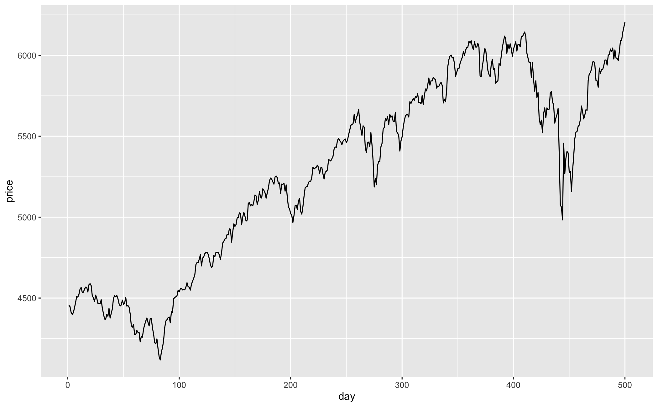
fig = (ggplot(df, aes(x="day", y="price"))
 + geom_line())
fig.save("_figs/simple_py.png", width=6, height=4, dpi=100, verbose=False)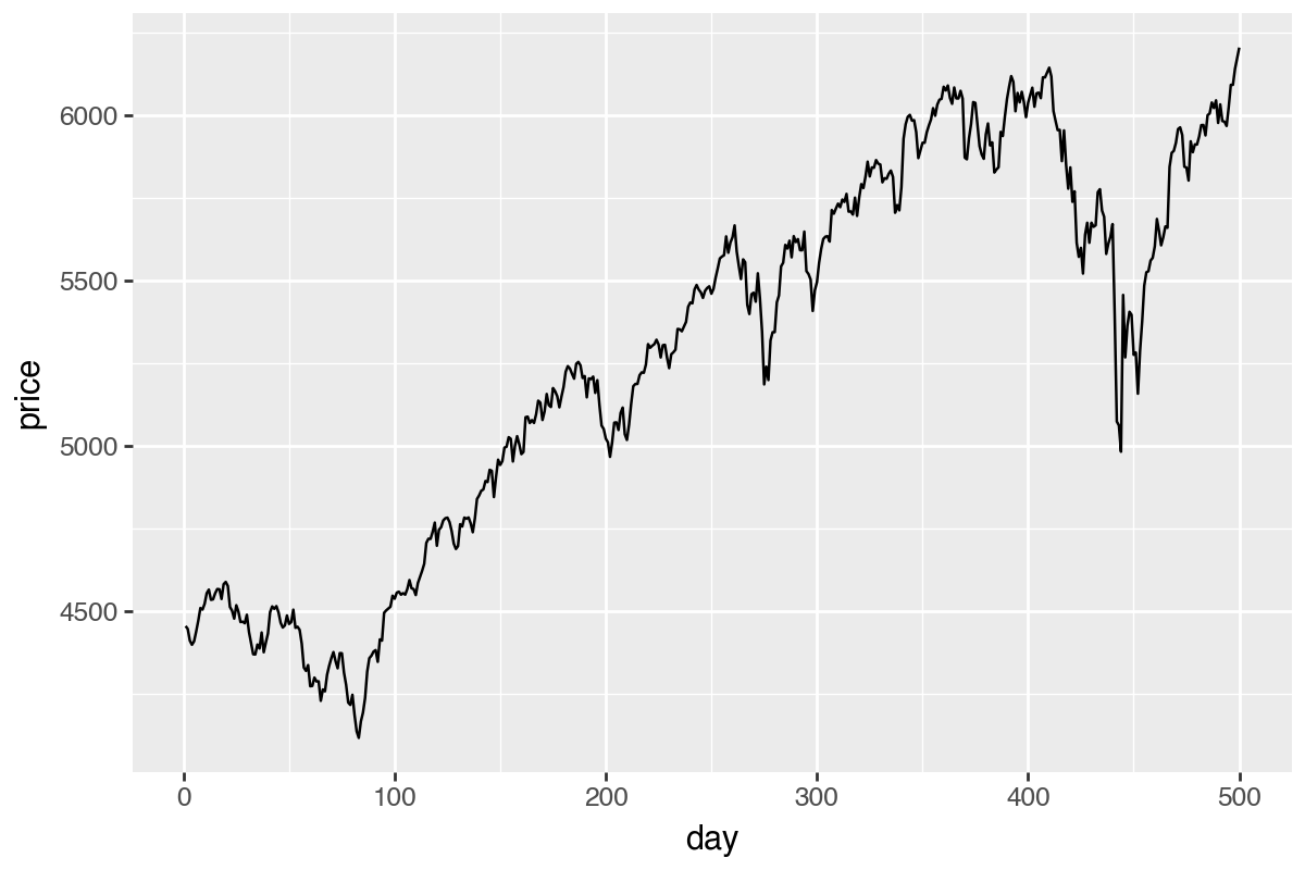
using TidierPlots, CairoMakie
include("common/functions.jl");

data = ProcessRawData();
p_data = data["sp500"].price[end-499:end];
df = DataFrame(day = 1:length(p_data), price = p_data);

p = ggplot(df, @aes(x = day, y = price)) +
    geom_line();
ggsave("_figs/simple_jl.png", p);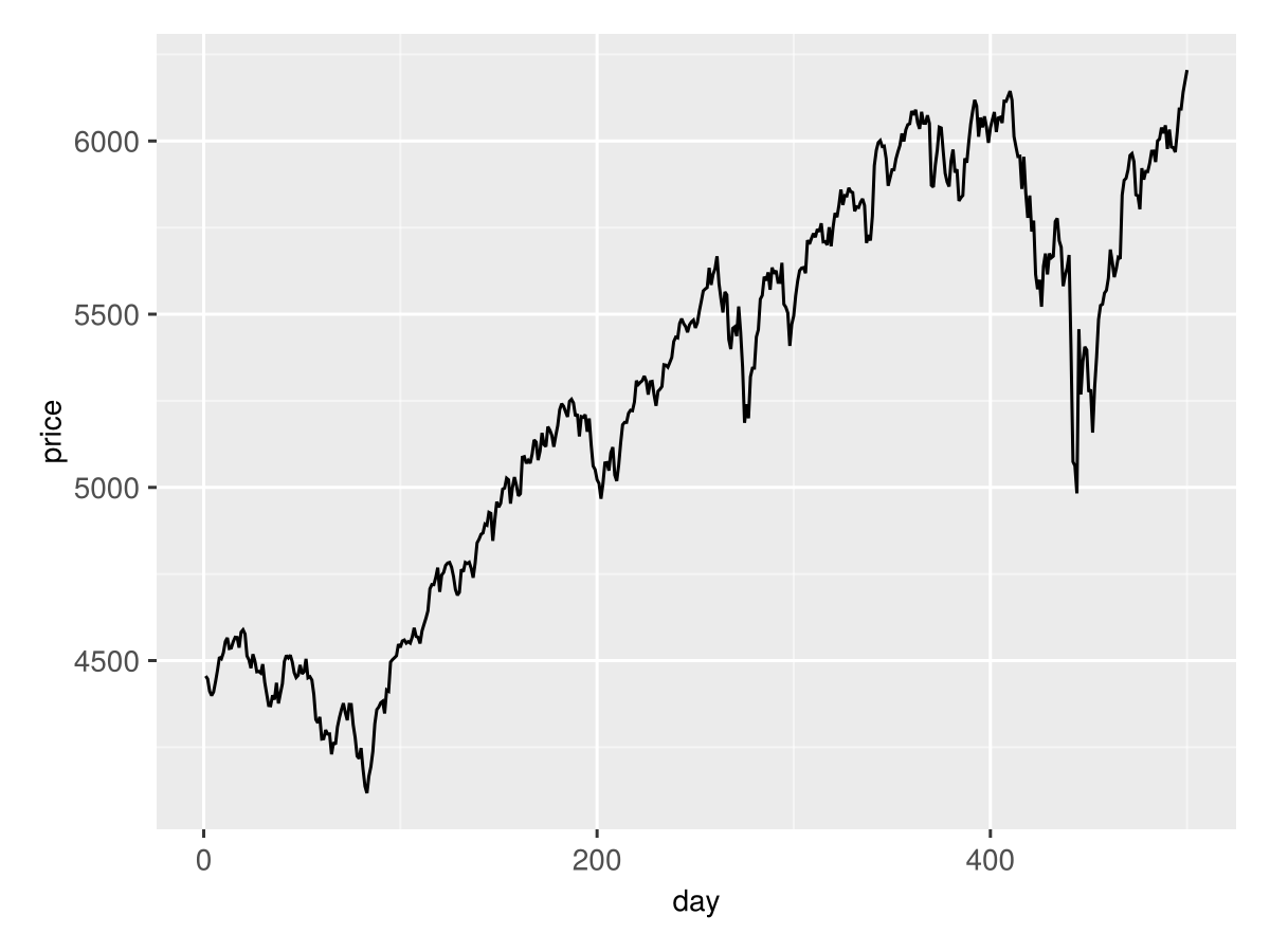
12.5 Styling plots
The default plot is functional but plain. We can improve it by:
- Changing the line colour and thickness
- Adding axis labels and a title
- Applying a theme
ggplot(df, aes(x = day, y = price)) +
  geom_line(colour = "red", linewidth = 1) +
  labs(title = "S&P 500 Index", x = "Day", y = "Price") +
  theme_minimal()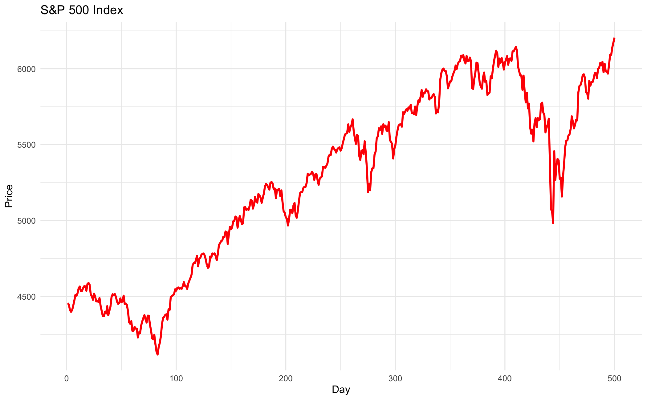
fig = (ggplot(df, aes(x="day", y="price"))
 + geom_line(colour="red", size=1)
 + labs(title="S&P 500 Index", x="Day", y="Price")
 + theme_minimal())
fig.save("_figs/styled_py.png", width=6, height=4, dpi=100, verbose=False)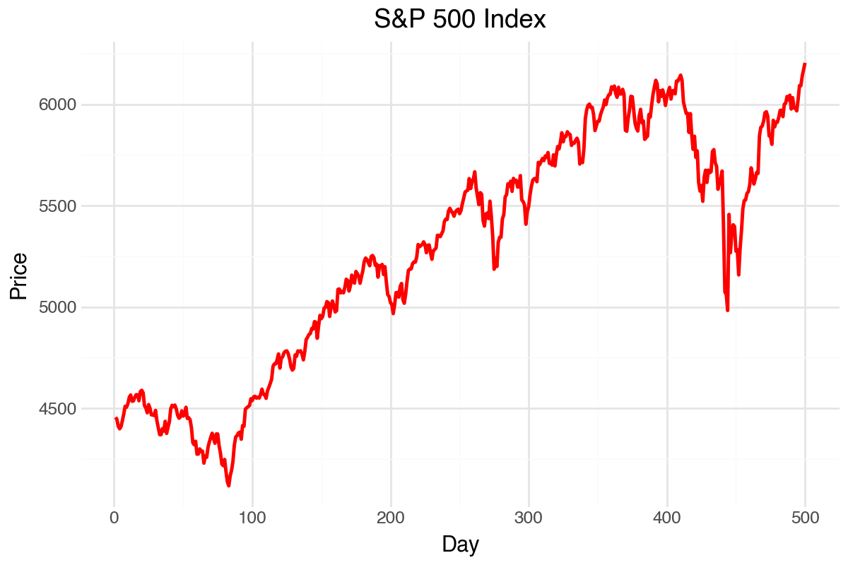
using TidierPlots, CairoMakie
include("common/functions.jl");

data = ProcessRawData();
p_data = data["sp500"].price[end-499:end];
df = DataFrame(day = 1:length(p_data), price = p_data);

p = ggplot(df, @aes(x = day, y = price)) +
    geom_line(color = "red", linewidth = 1) +
    labs(title = "S&P 500 Index", x = "Day", y = "Price") +
    theme_minimal();
ggsave("_figs/styled_jl.png", p);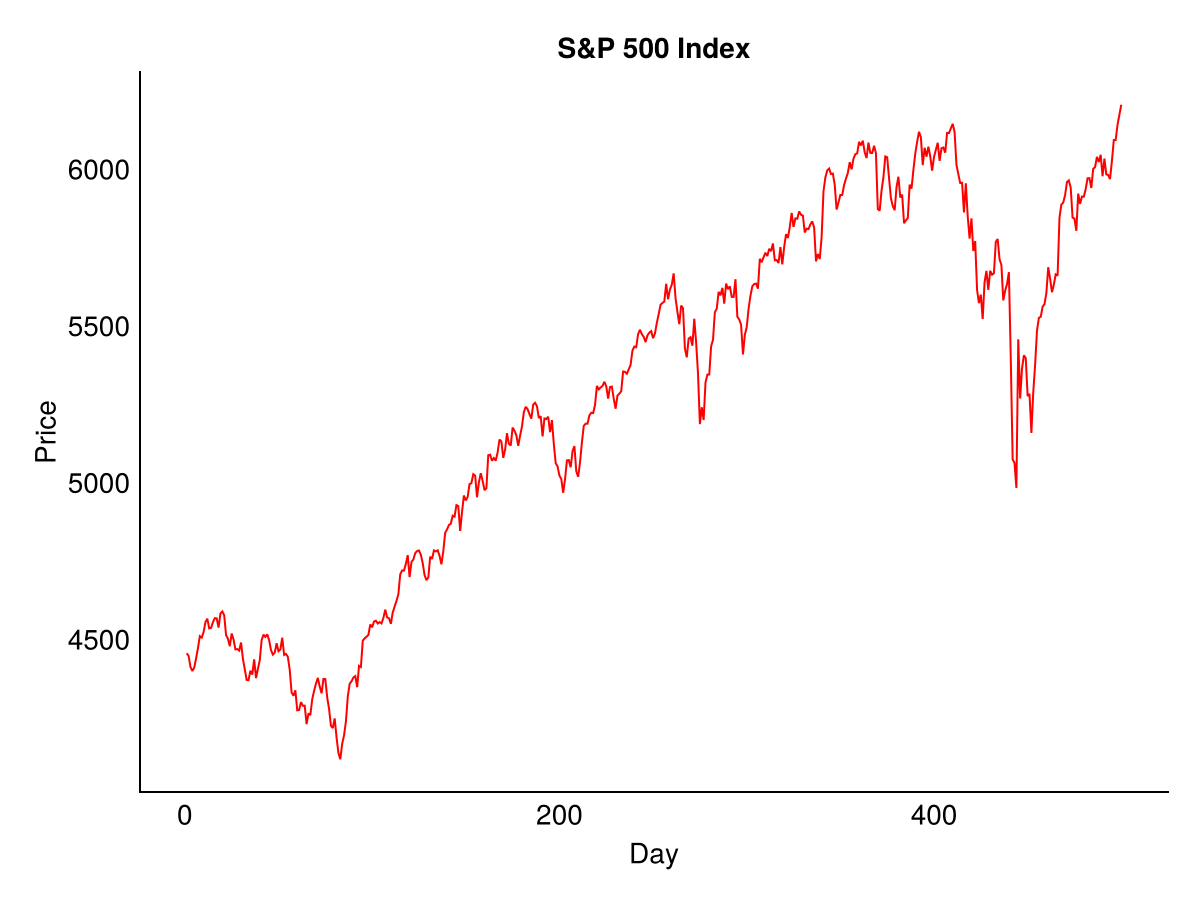
The labs() function sets labels for axes and title. The theme_minimal() function applies a clean visual style. Other themes include theme_bw(), theme_classic() and theme_light().
12.6 Histograms
Histograms show the distribution of a variable.
ggplot(df, aes(x = returns)) +
  geom_histogram(bins = 30, fill = "steelblue", colour = "white") +
  labs(title = "Distribution of Returns", x = "Returns", y = "Count") +
  theme_minimal()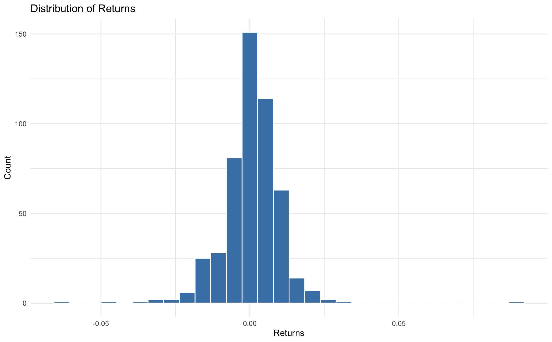
fig = (ggplot(df, aes(x="returns"))
 + geom_histogram(bins=30, fill="steelblue", colour="white")
 + labs(title="Distribution of Returns", x="Returns", y="Count")
 + theme_minimal())
fig.save("_figs/hist_py.png", width=6, height=4, dpi=100, verbose=False)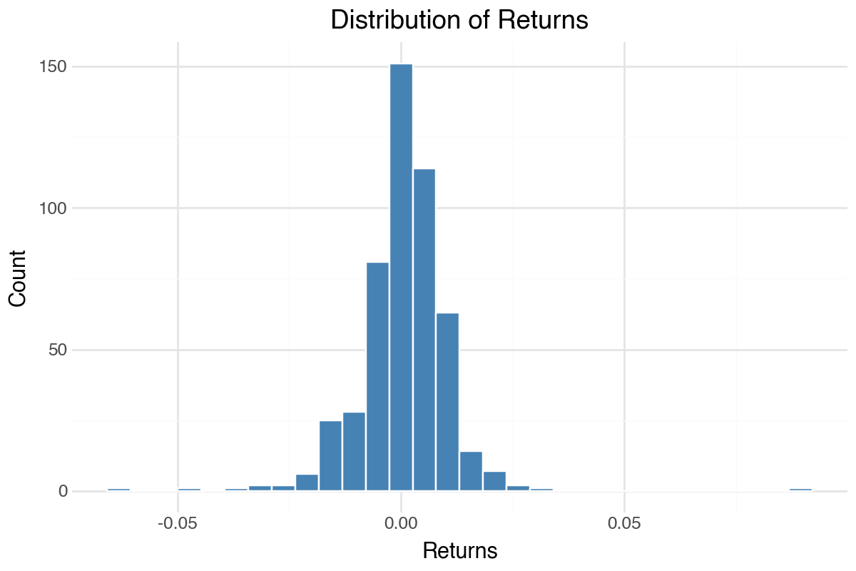
using TidierPlots, CairoMakie
include("common/functions.jl");

data = ProcessRawData();
y_data = data["sp500"].y[end-499:end];
df = DataFrame(returns = y_data);

p = ggplot(df, @aes(x = returns)) +
    geom_histogram(bins = 30, fill = "steelblue", color = "white") +
    labs(title = "Distribution of Returns", x = "Returns", y = "Count") +
    theme_minimal();
ggsave("_figs/hist_jl.png", p);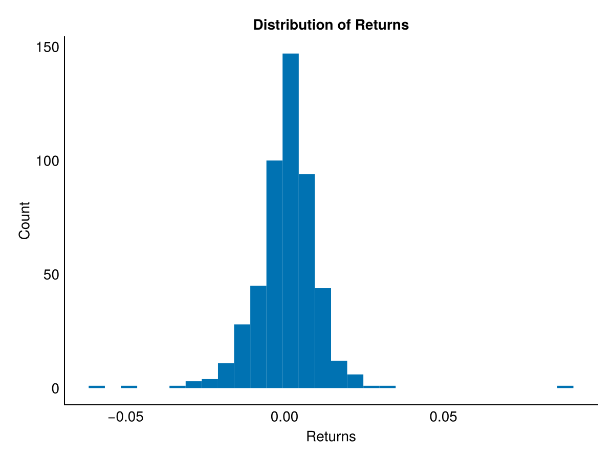
12.7 Multiple panels
To show multiple plots side by side, we use faceting. This requires reshaping the data into long format, where each row represents a single observation of a single variable.
df_long = reshape2::melt(df, id.vars = "day", measure.vars = c("price", "returns"))

ggplot(df_long, aes(x = day, y = value)) +
  geom_line(colour = "steelblue") +
  facet_wrap(~ variable, scales = "free_y", ncol = 1) +
  labs(x = "Day", y = "") +
  theme_bw()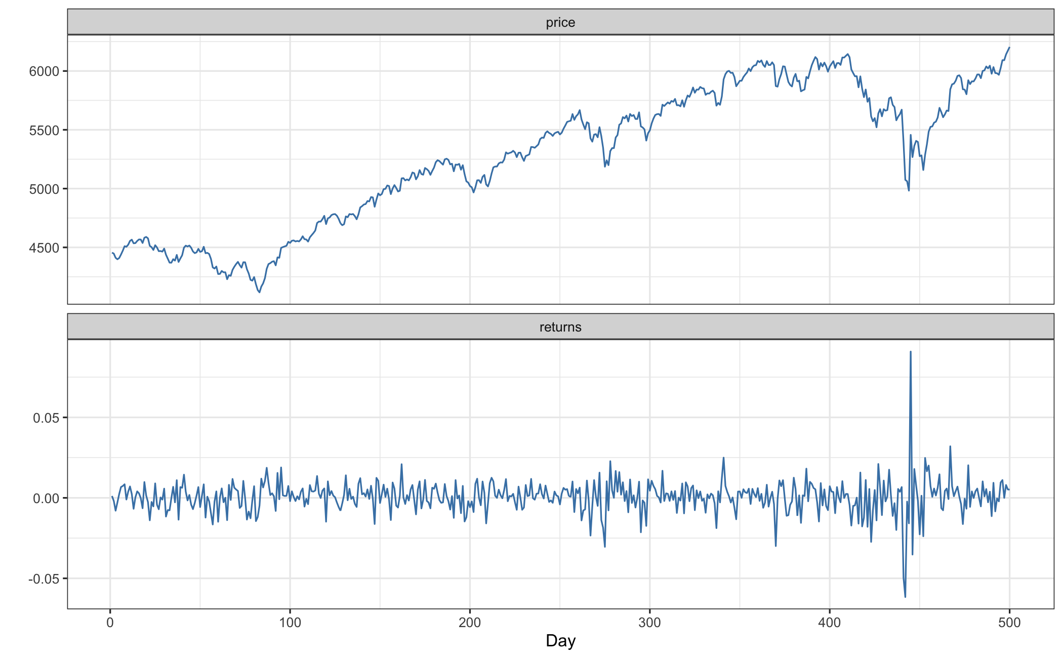
df_long = df.melt(id_vars="day", value_vars=["price", "returns"],
                  var_name="variable", value_name="value")

fig = (ggplot(df_long, aes(x="day", y="value"))
 + geom_line(colour="steelblue")
 + facet_wrap("~ variable", scales="free_y", ncol=1)
 + labs(x="Day", y="")
 + theme_bw())
fig.save("_figs/facet_py.png", width=6, height=6, dpi=100, verbose=False)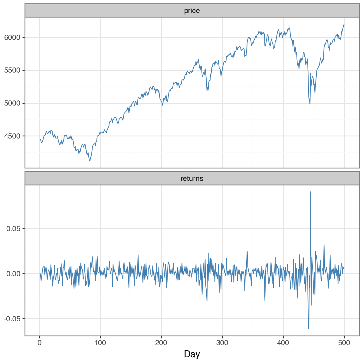
using TidierPlots, CairoMakie
include("common/functions.jl");

data = ProcessRawData();
p_data = data["sp500"].price[end-499:end];
y_data = data["sp500"].y[end-499:end];
df = DataFrame(day = 1:length(p_data), price = p_data, returns = y_data);

df_long = stack(df, [:price, :returns], :day, variable_name = :variable, value_name = :value);

p = ggplot(df_long, @aes(x = day, y = value)) +
    geom_line(color = "steelblue") +
    facet_wrap(:variable, scales = "free_y", ncol = 1) +
    labs(x = "Day", y = "") +
    theme_minimal();
ggsave("_figs/facet_jl.png", p);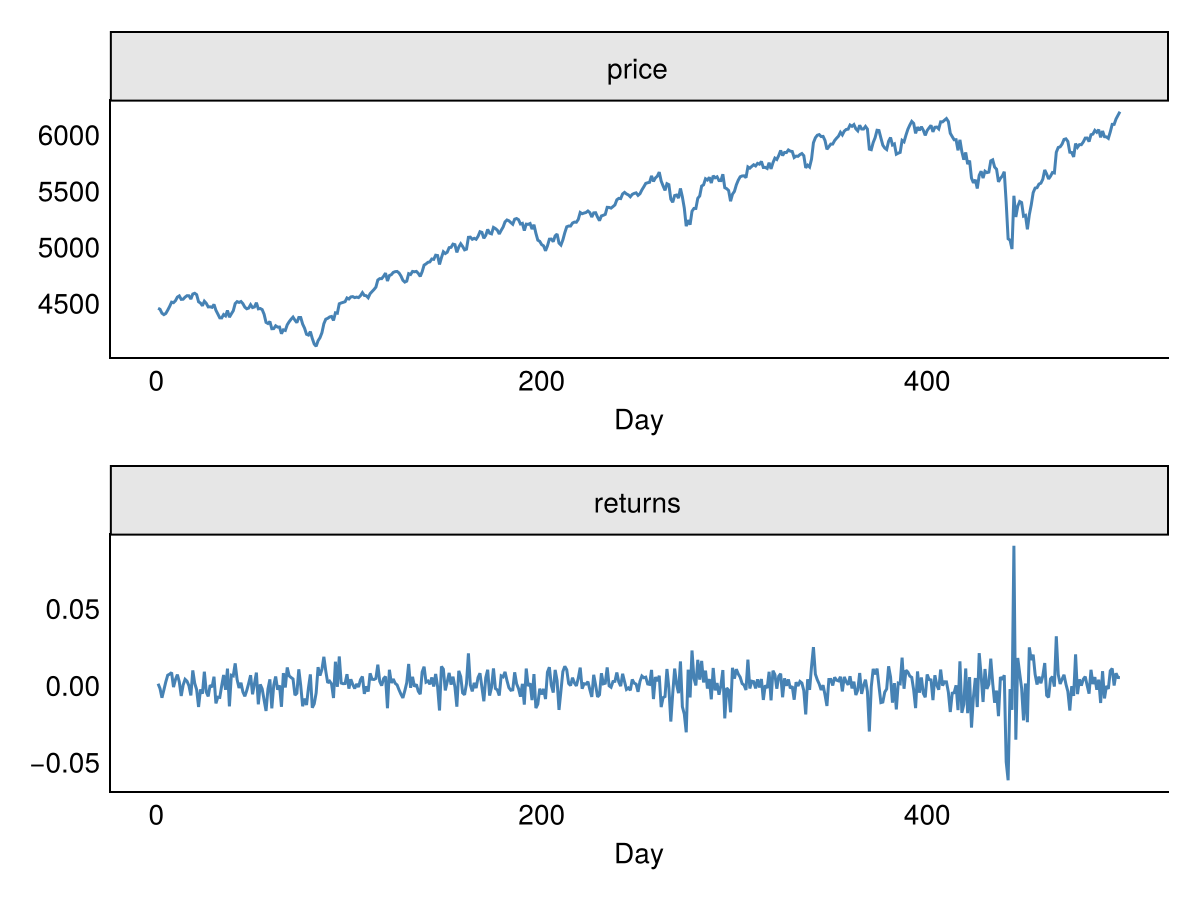
The facet_wrap() function creates separate panels for each level of the variable. The scales = "free_y" argument allows each panel to have its own y-axis scale. Julia uses theme_minimal() here because TidierPlots, built on Makie, has no theme_bw() equivalent — theme_bw is not defined in Makie or TidierPlots 0.10.0.
12.8 Multiple series on one plot
To plot multiple series on the same axes, we reshape to long format and map colour to the series variable.
stocks = data.frame(
  day = 1:nrow(Price),
  AAPL = Price$AAPL,
  JPM = Price$JPM
)
stocks_long = reshape2::melt(stocks, id.vars = "day", variable.name = "stock", value.name = "price")

ggplot(stocks_long, aes(x = day, y = price, colour = stock)) +
  geom_line(linewidth = 0.8) +
  labs(title = "Stock Prices", x = "Day", y = "Price", colour = "Stock") +
  scale_color_manual(values = c("AAPL" = "red", "JPM" = "blue")) +
  theme_minimal()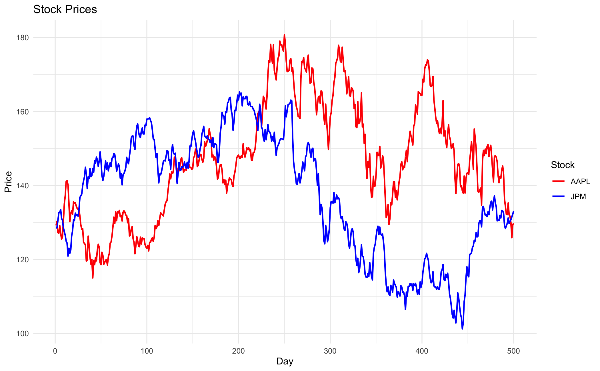
stocks_df = pd.DataFrame({
    'day': range(1, len(Price) + 1),
    'AAPL': Price['AAPL'].values,
    'JPM': Price['JPM'].values
})
stocks_long = stocks_df.melt(id_vars="day", value_vars=["AAPL", "JPM"],
                              var_name="stock", value_name="price")

fig = (ggplot(stocks_long, aes(x="day", y="price", colour="stock"))
 + geom_line(size=0.8)
 + labs(title="Stock Prices", x="Day", y="Price", colour="Stock")
 + scale_color_manual(values={"AAPL": "red", "JPM": "blue"})
 + theme_minimal())
fig.save("_figs/multi_py.png", width=6, height=4, dpi=100, verbose=False)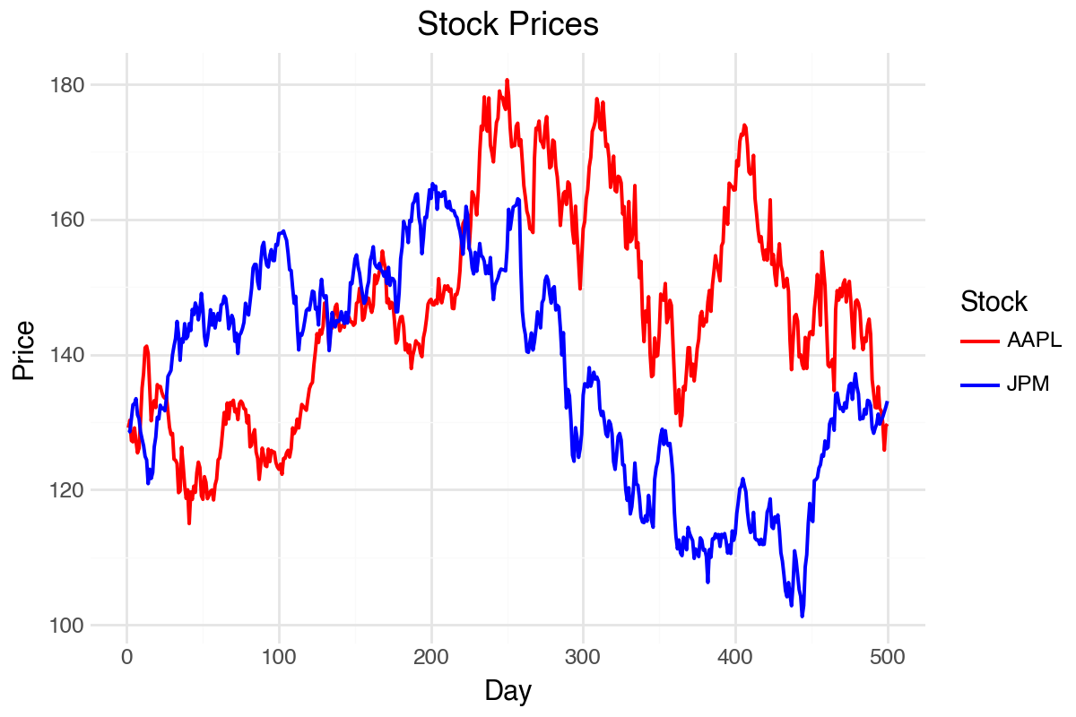
using TidierPlots, CairoMakie
include("common/functions.jl");

data = ProcessRawData();
Price = data["Price"][end-499:end, :];

stocks_df = DataFrame(
    day = 1:nrow(Price),
    AAPL = Price.AAPL,
    JPM = Price.JPM
);
stocks_long = stack(stocks_df, [:AAPL, :JPM], :day, variable_name = :stock, value_name = :price);

p = ggplot(stocks_long, @aes(x = day, y = price, color = stock)) +
    geom_line(linewidth = 0.8) +
    labs(title = "Stock Prices", x = "Day", y = "Price") +
    scale_color_manual(values = ["red", "blue"], name = "Stock") +
    theme_minimal();
ggsave("_figs/multi_jl.png", p);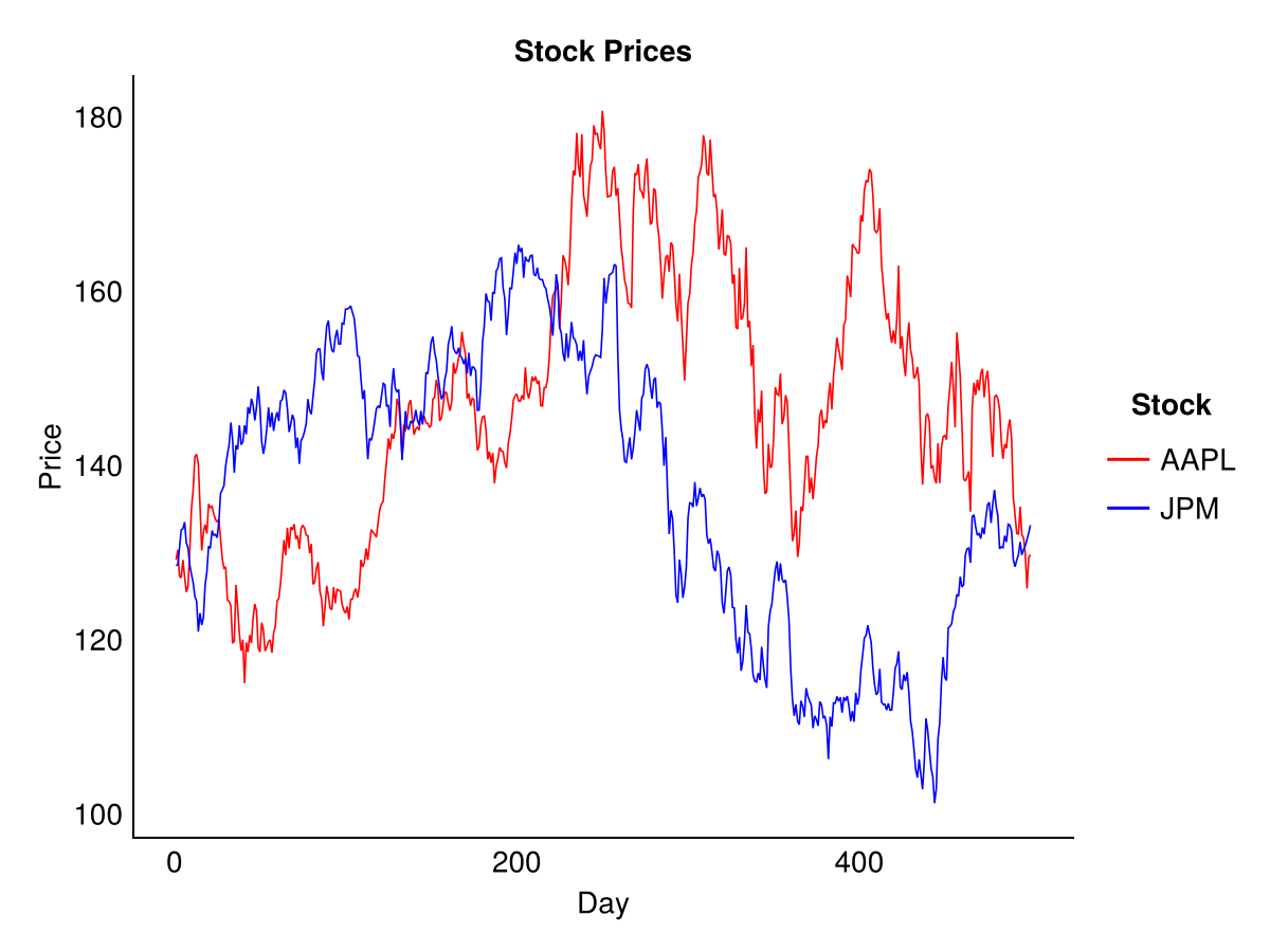
The legend is created automatically when colour is mapped to a variable. The scale_color_manual() function allows custom colour assignments. In Julia, scale_color_manual() assigns values by category level order rather than by name, so the colours must be listed in the same order as the factor levels (here alphabetical: AAPL then JPM).
12.9 Annotations
In R and Python, we can add text and other annotations to highlight features of interest using annotate().
ggplot(df, aes(x = day, y = price)) +
  geom_line(colour = "red", linewidth = 1) +
  annotate("text", x = 50, y = max(df$price) - 100, label = "Peak price", hjust = 0) +
  annotate("segment", x = 100, xend = which.max(df$price),
           y = max(df$price) - 50, yend = max(df$price),
           arrow = arrow(length = unit(0.2, "cm"))) +
  labs(title = "S&P 500 Index", x = "Day", y = "Price") +
  theme_minimal()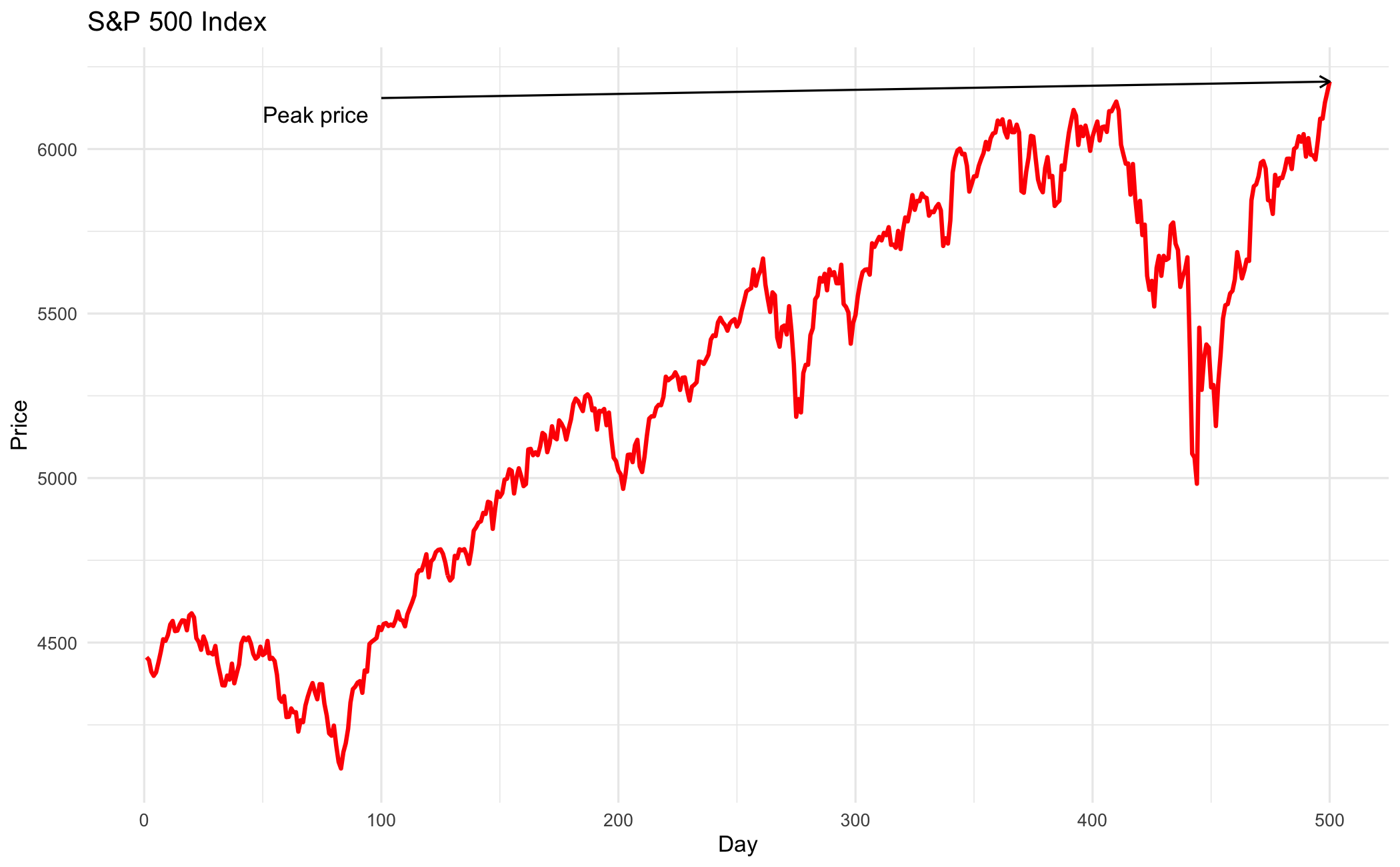
peak_idx = df['price'].idxmax()
peak_price = df['price'].max()

fig = (ggplot(df, aes(x="day", y="price"))
 + geom_line(colour="red", size=1)
 + annotate("text", x=50, y=peak_price - 100, label="Peak price", ha="left")
 + annotate("segment", x=100, xend=peak_idx + 1,
            y=peak_price - 50, yend=peak_price,
            arrow=arrow(length=0.2))
 + labs(title="S&P 500 Index", x="Day", y="Price")
 + theme_minimal())
fig.save("_figs/annotate_py.png", width=6, height=4, dpi=100, verbose=False)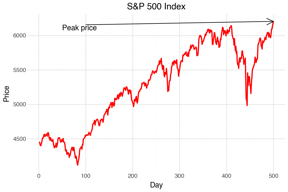
using TidierPlots, CairoMakie
include("common/functions.jl");

data = ProcessRawData();
p_data = data["sp500"].price[end-499:end];
df = DataFrame(day = 1:length(p_data), price = p_data);

peak_price = maximum(p_data);
label_df = DataFrame(x = [50], y = [peak_price - 100], text = ["Peak price"]);

p = ggplot(df, @aes(x = day, y = price)) +
    geom_line(color = "red", linewidth = 1) +
    geom_text(data = label_df, @aes(x = x, y = y, text = text), align = (:left, :center)) +
    labs(title = "S&P 500 Index", x = "Day", y = "Price") +
    theme_minimal();
ggsave("_figs/annotate_jl.png", p);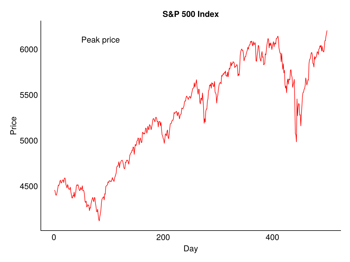
Note: TidierPlots.jl supports the text label via geom_text(), but not the arrow — geom_segment() is not exported, so arrow annotations need Makie directly.
12.10 Advanced styling
Default themes get us started. They do not finish the job. If the plot matters, we need to control the details.
12.10.1 Custom theme elements
The theme() function controls individual plot elements:
ggplot(df, aes(x = day, y = price)) +
  geom_line(colour = "steelblue", linewidth = 0.8) +
  labs(title = "S&P 500 Index", x = "Day", y = "Price") +
  theme_minimal() +
  theme(
    plot.title = element_text(size = 14, face = "bold"),
    axis.title = element_text(size = 10),
    axis.text = element_text(size = 9),
    panel.grid.minor = element_blank(),
    panel.grid.major = element_line(linewidth = 0.3)
  )
from plotnine import theme, element_text, element_blank, element_line
fig = (ggplot(df, aes(x="day", y="price"))
+ geom_line(colour="steelblue", size=0.8)
+ labs(title="S&P 500 Index", x="Day", y="Price")
+ theme_minimal()
+ theme(
plot_title=element_text(size=14, face="bold"),
axis_title=element_text(size=10),
axis_text=element_text(size=9),
panel_grid_minor=element_blank(),
panel_grid_major=element_line(size=0.3)
))TidierPlots 0.10.0’s theme() does not implement element_text() or element_blank(). It forwards its keyword arguments directly as Makie Axis attribute names (for example titlesize), so the per-element control shown in the R and Python tabs has no direct Julia equivalent.
Common element_text() arguments include size, face (“bold”, “italic”), colour, hjust (horizontal justification) and angle. Use element_blank() to remove elements entirely.
12.10.2 Colour palettes
For categorical variables, scale_colour_brewer() provides access to ColorBrewer palettes, some of which are designed to be colour-blind friendly:
ggplot(stocks_long, aes(x = day, y = price, colour = stock)) +
  geom_line() +
  scale_colour_brewer(palette = "Set1")
from plotnine import scale_colour_brewer
fig = (ggplot(stocks_long, aes(x="day", y="price", colour="stock"))
+ geom_line()
+ scale_colour_brewer(type="qual", palette="Set1"))TidierPlots 0.10.0 does not support ColorBrewer palettes — scale_color_brewer() is not exported by the package. Discrete colour scales take a ColorSchemes.jl palette name instead, for example:
p = ggplot(stocks_long, @aes(x = day, y = price, color = stock)) +
    geom_line() +
    scale_colour_discrete(palette = :Set1_9);
For continuous variables, scale_colour_gradient() or scale_colour_viridis_c() work well.
12.10.3 Axis formatting
Control axis breaks and labels with scale_x_continuous() and scale_y_continuous():
ggplot(df, aes(x = day, y = price)) +
  geom_line() +
  scale_y_continuous(
    breaks = seq(3000, 5000, by = 500),
    labels = scales::comma
  ) +
  scale_x_continuous(breaks = seq(0, 500, by = 100))
from plotnine import scale_x_continuous, scale_y_continuous
fig = (ggplot(df, aes(x="day", y="price"))
+ geom_line()
+ scale_y_continuous(breaks=range(3000, 5001, 500))
+ scale_x_continuous(breaks=range(0, 501, 100)))In TidierPlots 0.10.0, scale_x_continuous() and scale_y_continuous() translate only name, trans, reversed and labels into axis options — a breaks argument is accepted but silently dropped, so tick positions cannot be set this way.
12.10.4 Legend positioning
Move or remove legends with theme():
# Move legend inside plot
theme(legend.position = "inside", legend.position.inside = c(0.9, 0.2))

# Move to bottom
theme(legend.position = "bottom")

# Remove legend
theme(legend.position = "none")
# Move to bottom
theme(legend_position="bottom")
# Remove legend
theme(legend_position="none")TidierPlots 0.10.0 has no legend-placement control. theme() forwards its keywords directly to Makie’s Axis attributes, and legend_position is not one of them — passing it raises Invalid attribute legend_position for block type Axis. guides() only chooses between a legend and a colourbar per scale, not where the legend sits.
12.11 Saving plots
Plots are saved with ggsave() in R and Julia and with the save() method in Python. Both infer the output format from the file extension.
p = ggplot(df, aes(x = day, y = price)) + geom_line()

ggsave("myplot.pdf", p, width = 6, height = 4)
ggsave("myplot.png", p, width = 6, height = 4, dpi = 300)
ggsave("myplot.svg", p, width = 6, height = 4)
fig = (ggplot(df, aes(x="day", y="price")) + geom_line())
fig.save("myplot.pdf", width=6, height=4)
fig.save("myplot.png", width=6, height=4, dpi=300)
fig.save("myplot.svg", width=6, height=4)p = ggplot(df, @aes(x = day, y = price)) + geom_line();
ggsave("myplot.pdf", p);
ggsave("myplot.png", p);
ggsave("myplot.svg", p);12.11.1 Format recommendations
- SVG is a vector format that resizes without loss — use it for Word and PowerPoint, imported via
Insert > Pictures > This Device. - PDF is a vector format that scales perfectly — use it for LaTeX, imported with
\includegraphics{filename}and thegraphicxpackage. - PNG works well on screen. For print, export at about 300 dots per inch.
- Avoid JPEG for plots — lossy compression creates artefacts around lines and text.
12.12 Summary
The ggplot2 grammar builds plots in layers:
- Start with
ggplot(data, aes(...))to specify data and aesthetic mappings - Add geometry layers like
geom_line()orgeom_histogram() - Customise with
labs()for labels andtheme_*()for styling - Use
facet_wrap()for multiple panels - Save with
ggsave()
This same pattern applies in Python (plotnine) and Julia (TidierPlots.jl), making it straightforward to transfer plotting skills between languages.
Leland Wilkinson, The Grammar of Graphics, 2nd ed., Springer, 2005.↩︎
Hadley Wickham, Danielle Navarro and Thomas Lin Pedersen, ggplot2: Elegant Graphics for Data Analysis, 3rd ed., ggplot2-book.org.↩︎