library(ggplot2)
library(lubridate)
library(zoo)
library(reshape2)
source("common/functions.r", chdir = TRUE)13 Time series
Every volatility model and risk forecast in this book depends on correctly ordered, properly aligned observations. A time series is a sequence of data points indexed by time. In finance, nearly all data takes this form. Stock prices, returns, interest rates, volatility measures and trading volumes are all recorded at specific moments. The temporal ordering matters, because current values depend on past values. So does the spacing between observations.
Time series data presents several practical challenges. Markets close on weekends and holidays, creating gaps in daily data. Data may be tick-by-tick, daily, monthly or annual, and converting between frequencies requires care. Global markets operate in different time zones, complicating cross-market analysis. Leap years, daylight saving time and varying month lengths affect date arithmetic.
The practical solution is to keep data as simple numeric vectors and only convert to proper time series objects when needed — typically for plotting, reporting and aggregation.
Each language handles dates and time series differently:
- R uses
Dateobjects with packages likelubridatefor parsing andzooorxtsfor time series operations - Python relies on
pandaswith itsDatetimeIndexandresample()method for aggregation - Julia uses the standard library
Datesmodule withDataFramefiltering for subsetting
The underlying concepts are the same across languages, though the syntax differs. This chapter covers date handling, time series plotting and common operations like lagging, differencing and aggregation. For general plotting concepts, see Chapter 12.
13.1 Data and libraries
Time series work needs a date-aware container in each language — zoo in R, pandas in Python, DataFrames with Dates in Julia.
import sys
import os
import numpy as np
import pandas as pd
from datetime import datetime
sys.path.insert(0, 'common')
from functions import ProcessRawData
from plotnine import ggplot, aes, geom_line, labs, theme_minimal, scale_y_log10, theme

os.makedirs("_figs", exist_ok=True)
using Dates, Statistics
using TidierPlots, CairoMakie
include("common/functions.jl");
isdir("_figs") || mkdir("_figs");data = ProcessRawData()
sp500 = data$sp500
sp500tr = data$sp500tr
Price = data$Price
Return = data$Return
Ticker = data$Tickerdata = ProcessRawData()
sp500 = data['sp500']
sp500tr = data['sp500tr']
Price = data['Price']
Return = data['Return']
Ticker = data['Ticker']data = ProcessRawData();
sp500 = data["sp500"];
sp500tr = data["sp500tr"];
Price = data["Price"];
Return = data["Return"];
Ticker = data["Ticker"];13.2 Date handling
ProcessRawData() already returns sp500 with a typed R date.ts column, so the R tab below only inspects it. Python and Julia still hold the raw integer date, so those tabs convert it to a proper date object. See Chapter 5 for details on date parsing functions and format patterns.
tail(sp500, 2) date price y date.ts y.ts
8938 20250627 6173.07 0.005205431 2025-06-27 0.005205431
8939 20250630 6204.95 0.005151078 2025-06-30 0.005151078sp500['date_ts'] = pd.to_datetime(sp500['date'], format='%Y%m%d')
print(sp500.tail(2)) date price y date_ts
8936 20250627 6173.07 0.005205 2025-06-27
8937 20250630 6204.95 0.005151 2025-06-30sp500.date_ts = Date.(string.(sp500.date), dateformat"yyyymmdd");
println(last(sp500, 2))2×4 DataFrame
Row │ date price y date_ts
│ Int64 Float64 Float64? Date
─────┼───────────────────────────────────────────
1 │ 20250627 6173.07 0.00520543 2025-06-27
2 │ 20250630 6204.95 0.00515108 2025-06-3013.3 Plotting time series
13.3.1 Without dates
Plot the S&P 500 against observation number first. That strips away the calendar and lets us inspect the shape of the series.
df = data.frame(day = 1:nrow(sp500), price = sp500$price)

ggplot(df, aes(x = day, y = price)) +
  geom_line(colour = "blue", linewidth = 0.8) +
  labs(title = "The S&P 500 index", x = "Day", y = "Price") +
  theme_minimal()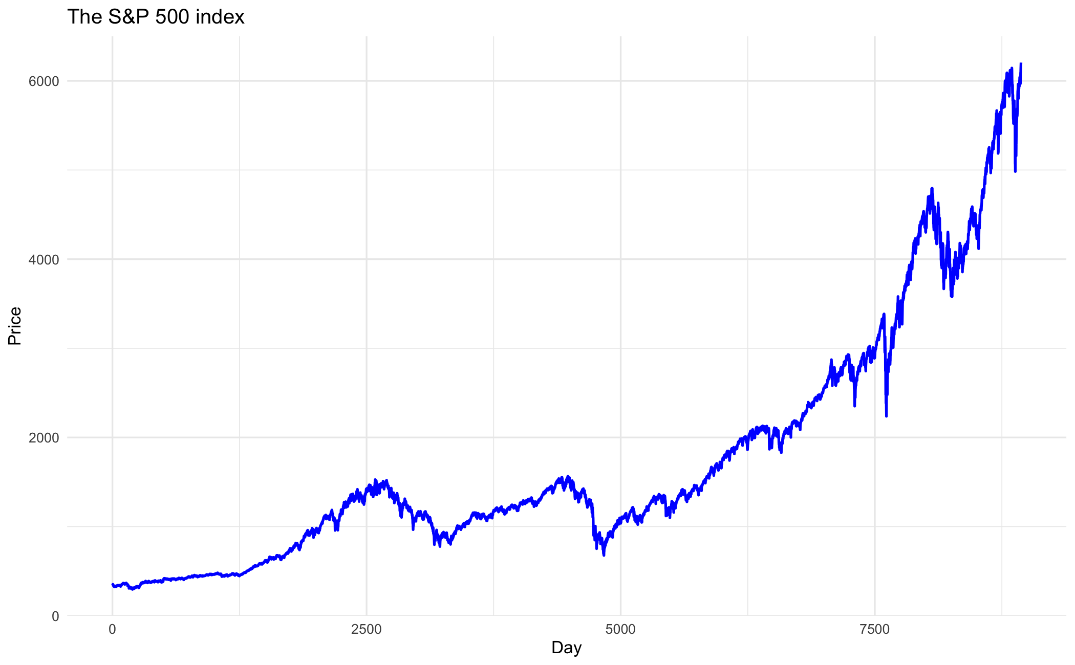
df = pd.DataFrame({'day': range(1, len(sp500) + 1), 'price': sp500['price'].values})

p = (ggplot(df, aes(x="day", y="price"))
 + geom_line(colour="blue", size=0.8)
 + labs(title="The S&P 500 index", x="Day", y="Price")
 + theme_minimal())
p.save("_figs/ts_simple_py.png", width=6, height=4, dpi=100, verbose=False)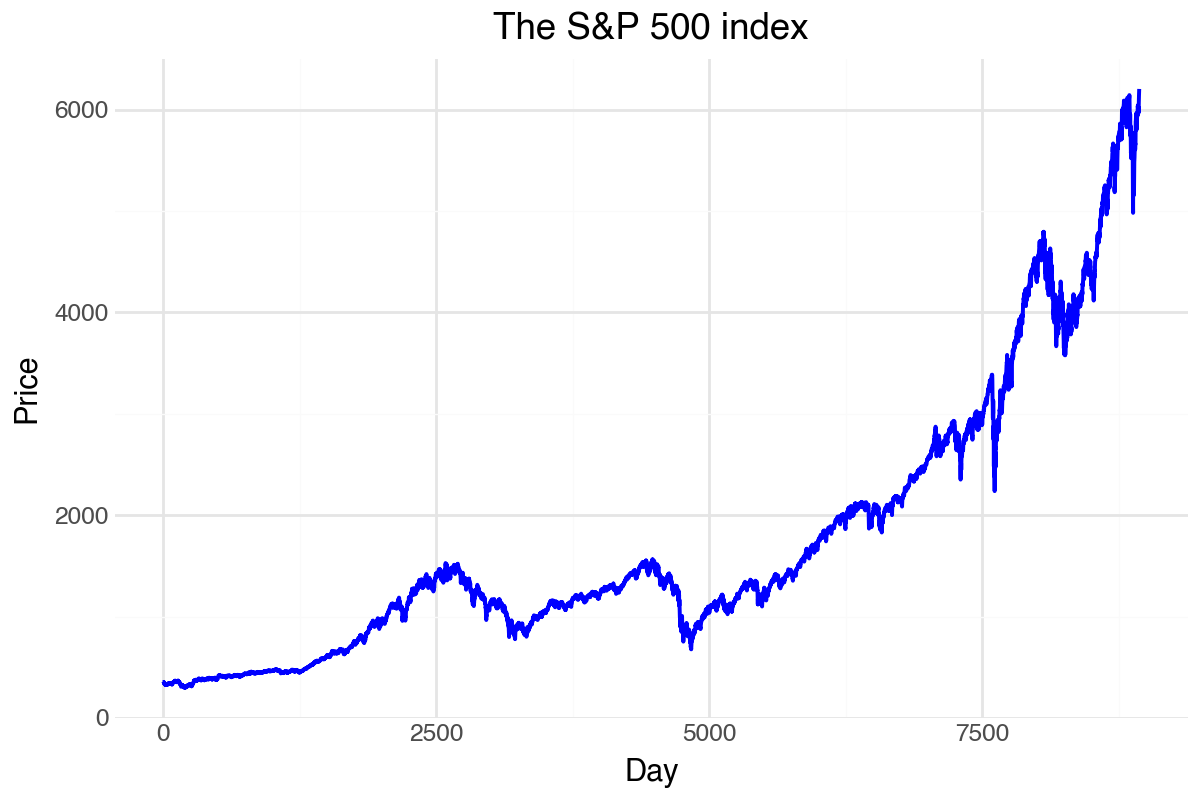
df = DataFrame(day = 1:nrow(sp500), price = sp500.price);

p = ggplot(df, @aes(x = day, y = price)) +
    geom_line(color = "blue", linewidth = 0.8) +
    labs(title = "The S&P 500 index", x = "Day", y = "Price") +
    theme_minimal();
ggsave("_figs/ts_simple_jl.png", p);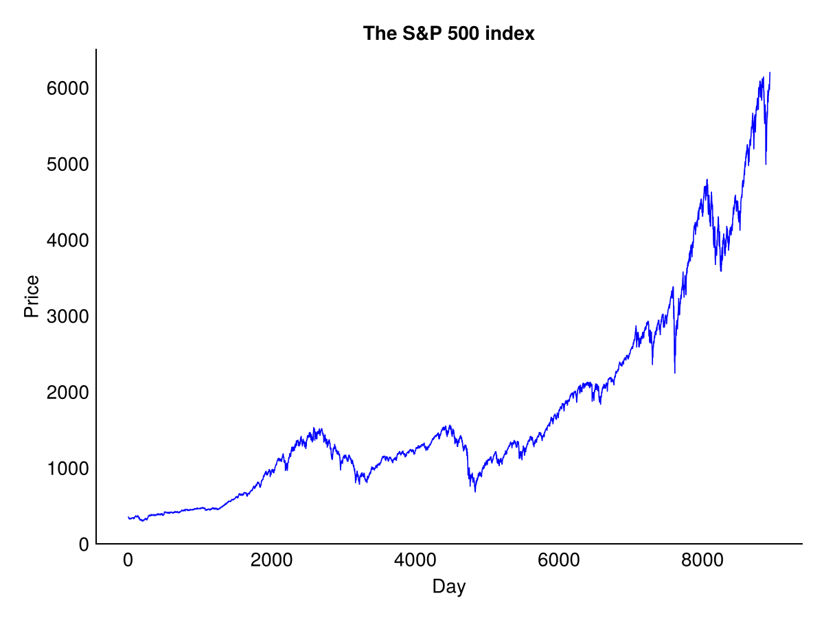
13.3.2 With dates
A time series plot becomes far more informative when the x-axis shows actual dates.
ggplot(sp500, aes(x = date.ts, y = price)) +
  geom_line(colour = "blue", linewidth = 0.8) +
  labs(title = "The S&P 500 index", x = "Date", y = "Price") +
  theme_minimal()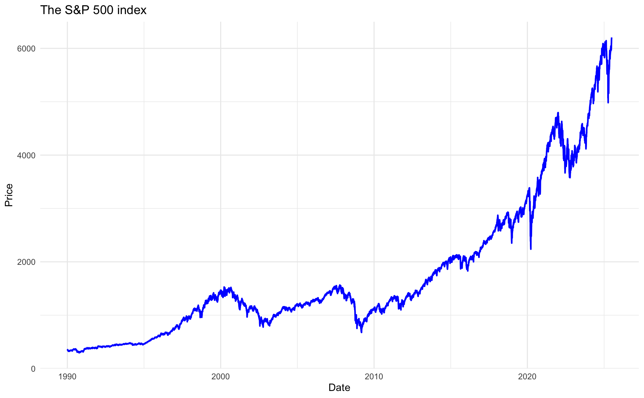
You can make it a log plot by using scale_y_log10():
ggplot(sp500, aes(x = date.ts, y = price)) +
  geom_line(colour = "blue", linewidth = 0.8) +
  scale_y_log10() +
  labs(title = "The S&P 500 index", x = "Date", y = "Price") +
  theme_minimal()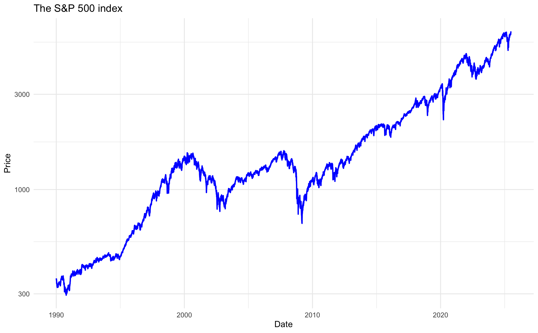
We can customise the x-axis with date breaks. This axis customisation is shown in R only.
ggplot(sp500, aes(x = date.ts, y = price)) +
  geom_line(colour = "blue", linewidth = 0.8) +
  scale_x_date(date_breaks = "2 years", date_labels = "%Y") +
  labs(title = "The S&P 500 index", x = "Date", y = "Price") +
  theme_minimal()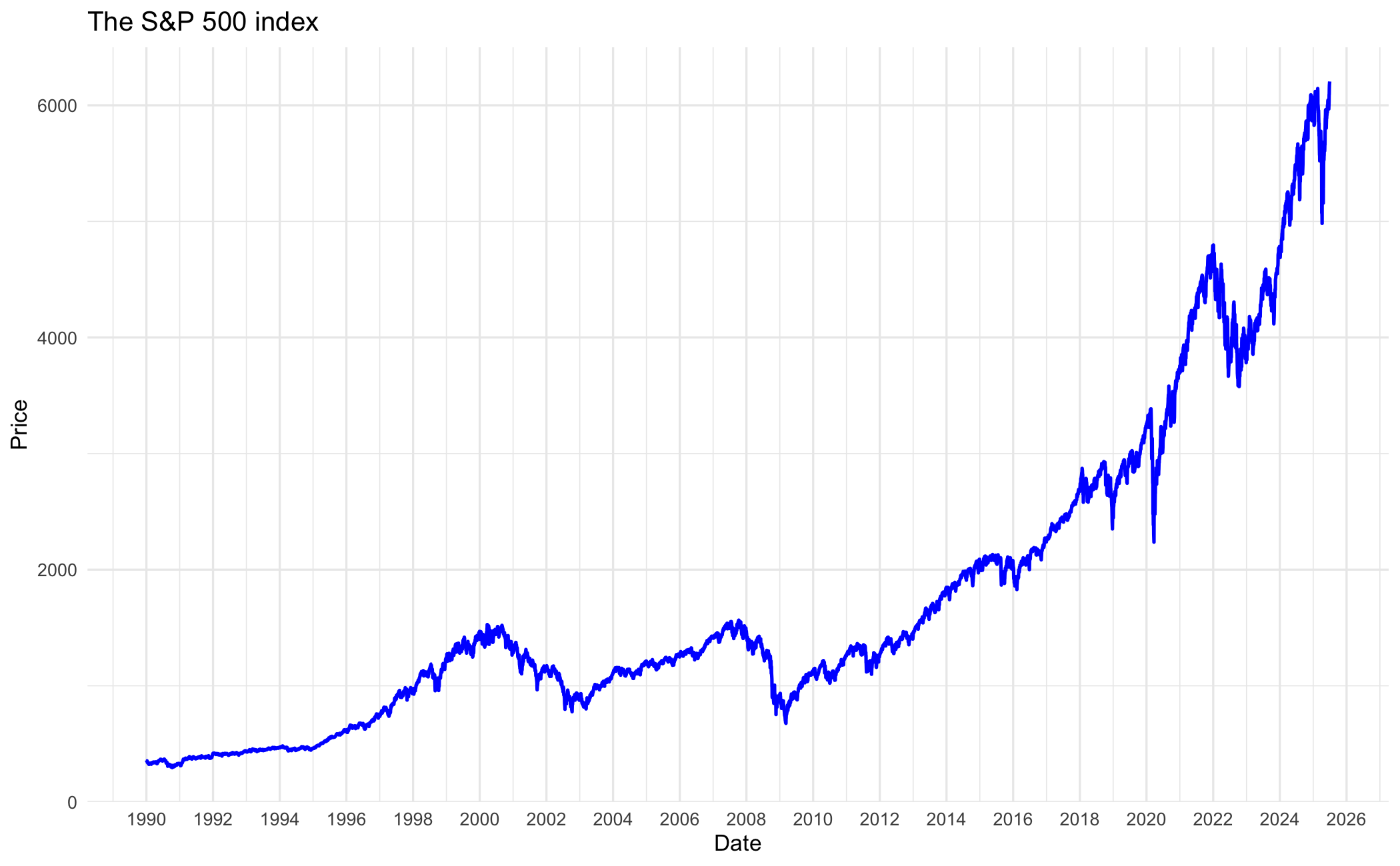
p = (ggplot(sp500, aes(x="date_ts", y="price"))
 + geom_line(colour="blue", size=0.8)
 + labs(title="The S&P 500 index", x="Date", y="Price")
 + theme_minimal())
p.save("_figs/ts_dates_py.png", width=6, height=4, dpi=100, verbose=False)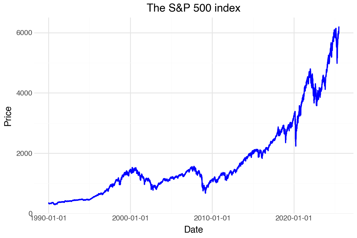
You can make it a log plot by using scale_y_log10():
p = (ggplot(sp500, aes(x="date_ts", y="price"))
 + geom_line(colour="blue", size=0.8)
 + scale_y_log10()
 + labs(title="The S&P 500 index", x="Date", y="Price")
 + theme_minimal())
p.save("_figs/ts_log_py.png", width=6, height=4, dpi=100, verbose=False)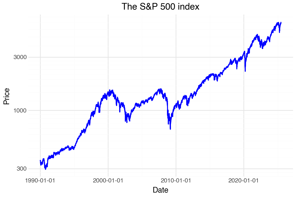
p = ggplot(sp500, @aes(x = date_ts, y = price)) +
    geom_line(color = "blue", linewidth = 0.8) +
    labs(title = "The S&P 500 index", x = "Date", y = "Price") +
    theme_minimal();
ggsave("_figs/ts_dates_jl.png", p);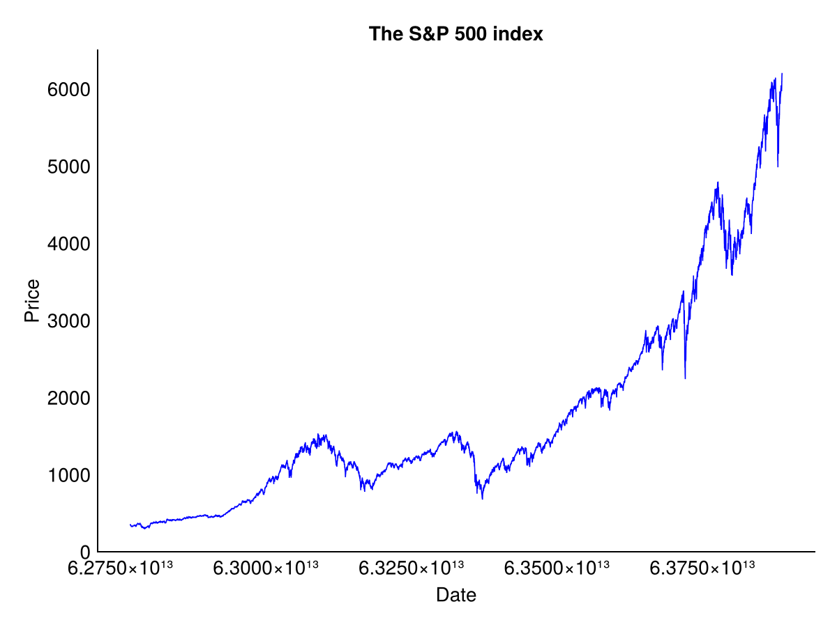
13.3.3 Returns
Each language keeps the return series attached to its date.
ProcessRawData() already returns sp500$y.ts as a date-indexed zoo series.
df_returns = data.frame(
  date = index(sp500$y.ts),
  returns = as.numeric(sp500$y.ts)
)

ggplot(df_returns, aes(x = date, y = returns)) +
  geom_line(colour = "steelblue", linewidth = 0.3) +
  labs(title = "S&P 500 Daily Return", x = "Date", y = "Return") +
  theme_minimal()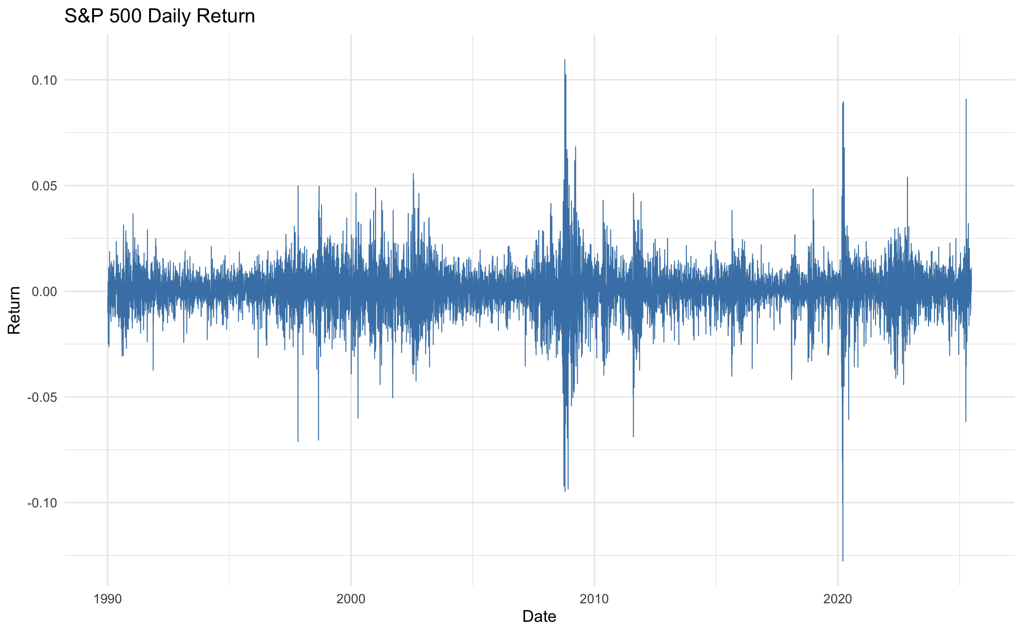
p = (ggplot(sp500, aes(x="date_ts", y="y"))
 + geom_line(colour="steelblue", size=0.3)
 + labs(title="S&P 500 Daily Return", x="Date", y="Return")
 + theme_minimal())
p.save("_figs/ts_returns_py.png", width=6, height=4, dpi=100, verbose=False)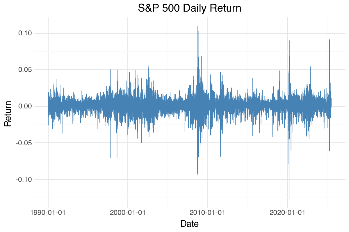
p = ggplot(sp500, @aes(x = date_ts, y = y)) +
    geom_line(color = "steelblue", linewidth = 0.3) +
    labs(title = "S&P 500 Daily Return", x = "Date", y = "Return") +
    theme_minimal();
ggsave("_figs/ts_returns_jl.png", p);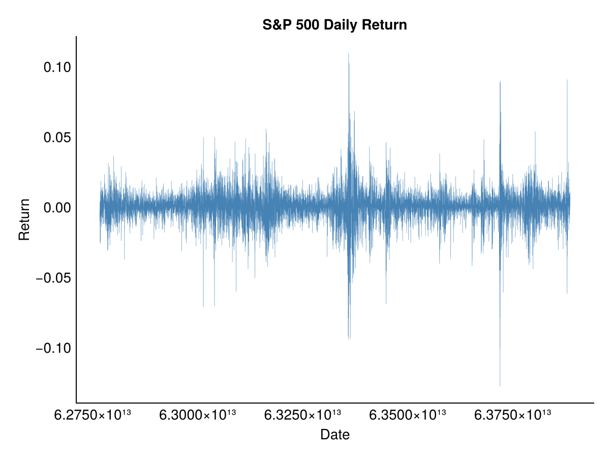
13.3.4 Multivariate
For multivariate time series, we reshape the data to long format and use colour mapping.
price_long = melt(Price, id.vars = "date", measure.vars = Ticker,
                  variable.name = "stock", value.name = "price")

ggplot(price_long, aes(x = date, y = price, colour = stock)) +
  geom_line(linewidth = 0.5) +
  labs(x = "Date", y = "Price", colour = "Stock") +
  theme_minimal()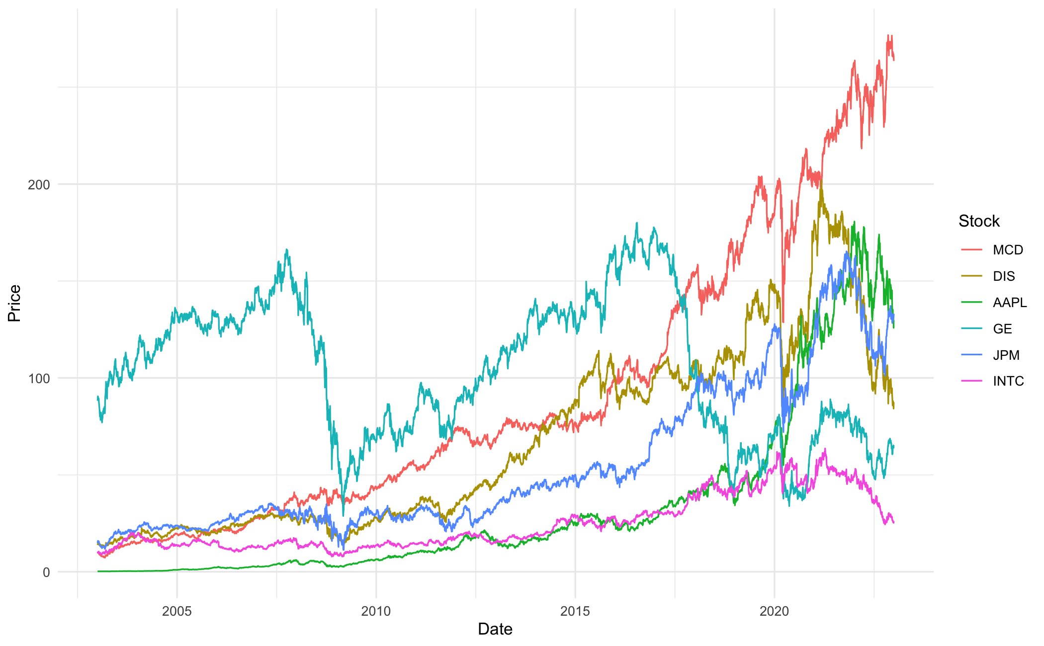
To compare stock performance, renormalise each series to start at 1:
pn = Price
for (i in Ticker) {
  pn[[i]] = pn[[i]] / pn[[i]][1]
}

pn_long = melt(pn, id.vars = "date", measure.vars = Ticker,
               variable.name = "stock", value.name = "price")

ggplot(pn_long, aes(x = date, y = price, colour = stock)) +
  geom_line(linewidth = 0.5) +
  labs(x = "Date", y = "Price (normalised)", colour = "Stock") +
  theme_minimal() +
  theme(legend.position = "top")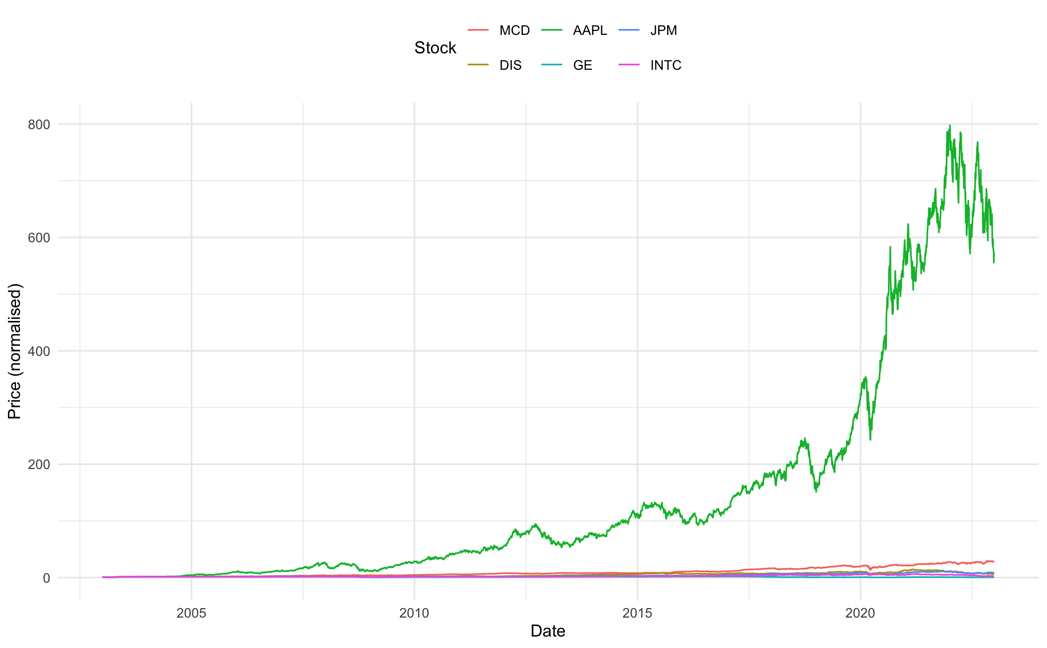
A log scale makes relative performance easier to compare:
ggplot(pn_long, aes(x = date, y = price, colour = stock)) +
  geom_line(linewidth = 0.5) +
  scale_y_log10() +
  labs(x = "Date", y = "Price (normalised)", colour = "Stock") +
  theme_minimal() +
  theme(legend.position = "top")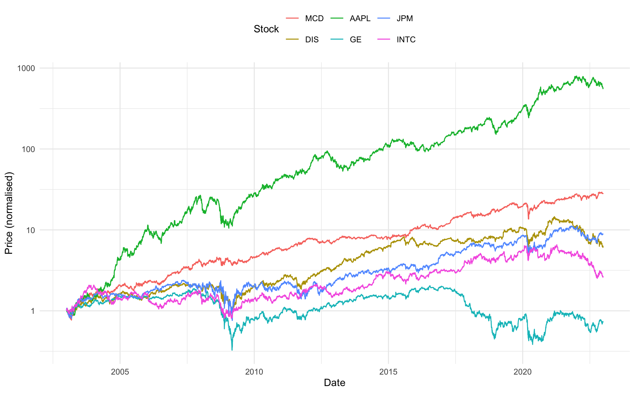
Price and Ticker are already loaded, and Price['date'] is already a typed date column, so this section reuses them directly.
price_long = Price.melt(id_vars='date', value_vars=Ticker,
                        var_name='stock', value_name='price')

p = (ggplot(price_long, aes(x="date", y="price", colour="stock"))
 + geom_line(size=0.5)
 + labs(x="Date", y="Price", colour="Stock")
 + theme_minimal())
p.save("_figs/ts_multi_py.png", width=7, height=4, dpi=100, verbose=False)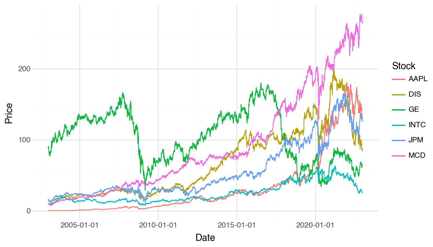
Renormalised to start at 1:
pn = Price.copy()
for col in Ticker:
    pn[col] = pn[col] / pn[col].iloc[0]

pn_long = pn.melt(id_vars='date', value_vars=Ticker,
                  var_name='stock', value_name='price')

p = (ggplot(pn_long, aes(x="date", y="price", colour="stock"))
 + geom_line(size=0.5)
 + labs(x="Date", y="Price (normalised)", colour="Stock")
 + theme_minimal()
 + theme(legend_position="top"))
p.save("_figs/ts_norm_lin_py.png", width=7, height=4, dpi=100, verbose=False)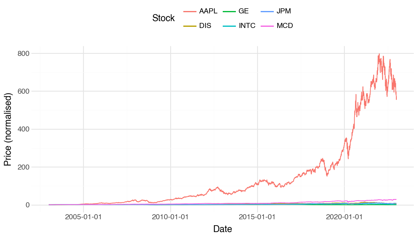
A log scale makes relative performance easier to compare:
p = (ggplot(pn_long, aes(x="date", y="price", colour="stock"))
 + geom_line(size=0.5)
 + scale_y_log10()
 + labs(x="Date", y="Price (normalised)", colour="Stock")
 + theme_minimal()
 + theme(legend_position="top"))
p.save("_figs/ts_norm_py.png", width=7, height=4, dpi=100, verbose=False)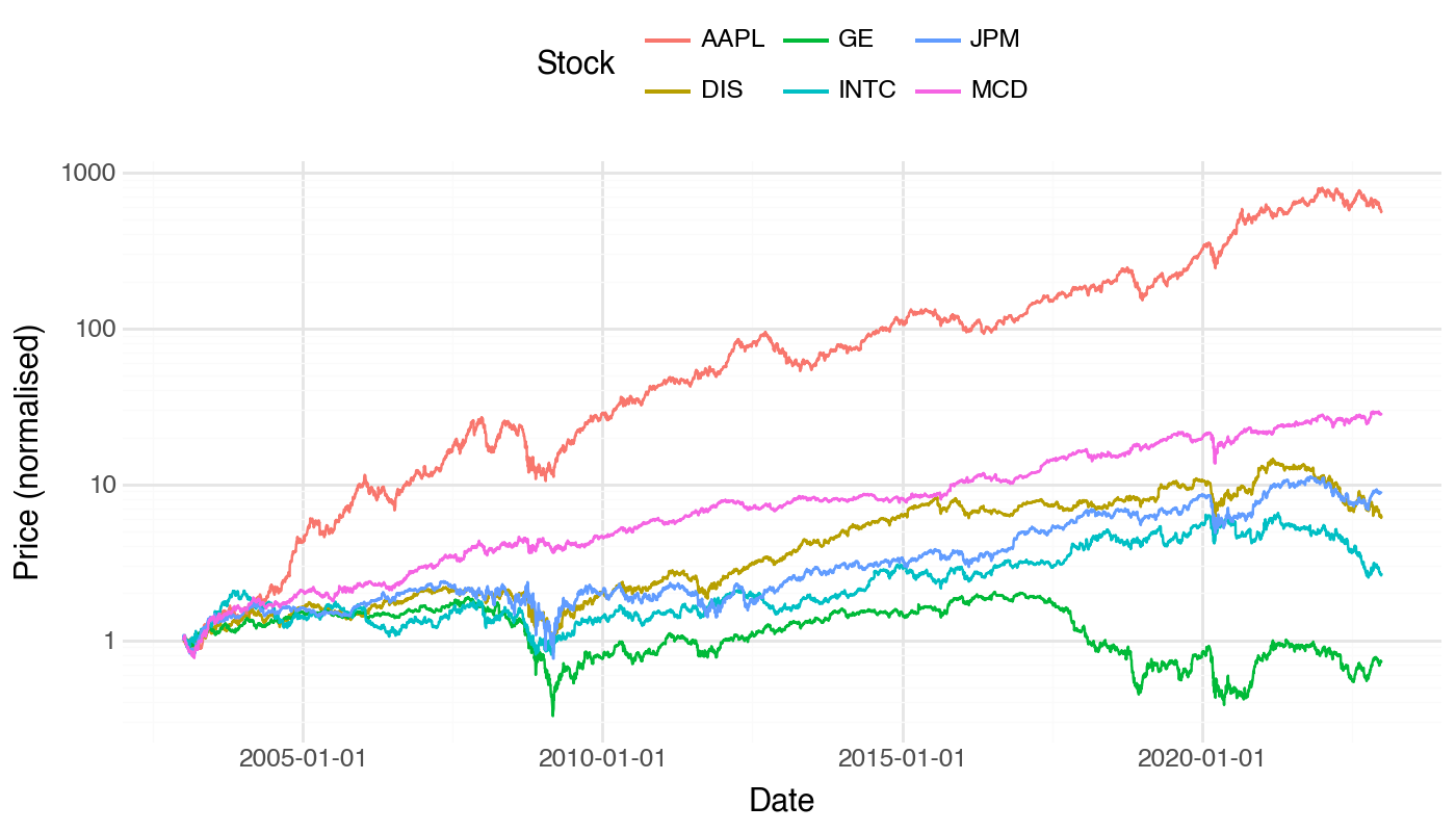
Price.date is already a typed Date column, so no conversion is needed here.
price_long = stack(Price, Ticker, [:date], variable_name = :stock, value_name = :price);

p = ggplot(price_long, @aes(x = date, y = price, color = stock)) +
    geom_line(linewidth = 0.5) +
    labs(x = "Date", y = "Price") +
    theme_minimal();
ggsave("_figs/ts_multi_jl.png", p);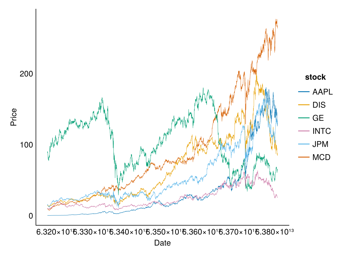
To compare stock performance, renormalise each series to start at 1:
using DataFrames, TidierPlots
pn = deepcopy(Price);
for t in Ticker
    pn[!, t] = pn[!, t] ./ pn[1, t]
end

pn_long = stack(pn, Ticker, [:date], variable_name = :stock, value_name = :price);

p = ggplot(pn_long, @aes(x = date, y = price, color = stock)) +
    geom_line(linewidth = 0.5) +
    labs(x = "Date", y = "Price (normalised)") +
    theme_minimal();
ggsave("_figs/ts_norm_lin_jl.png", p);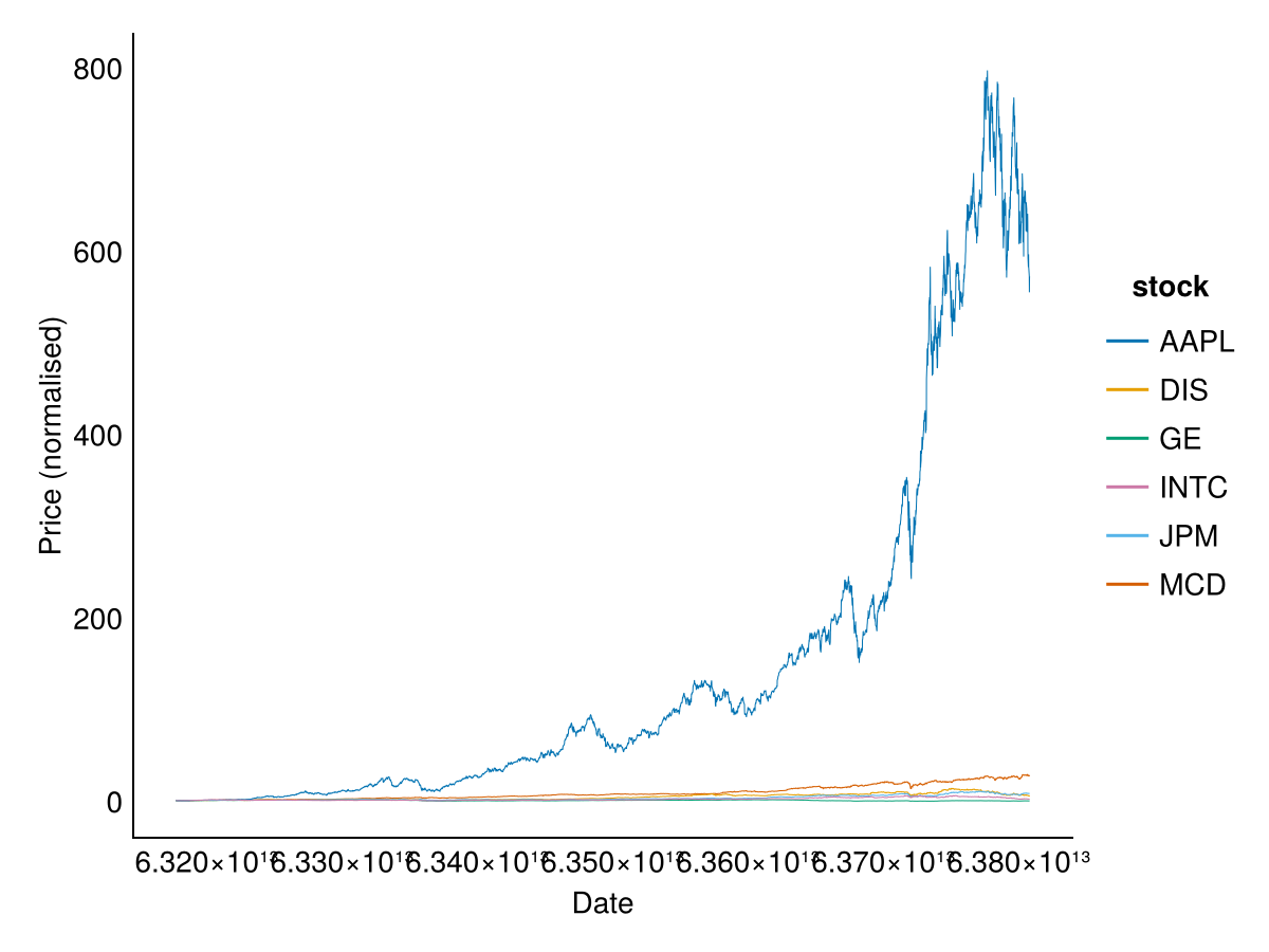
A log scale makes relative performance easier to compare:
using TidierPlots
p = ggplot(pn_long, @aes(x = date, y = price, color = stock)) +
    geom_line(linewidth = 0.5) +
    scale_y_log10() +
    labs(x = "Date", y = "Price (normalised)") +
    theme_minimal();
ggsave("_figs/ts_norm_jl.png", p);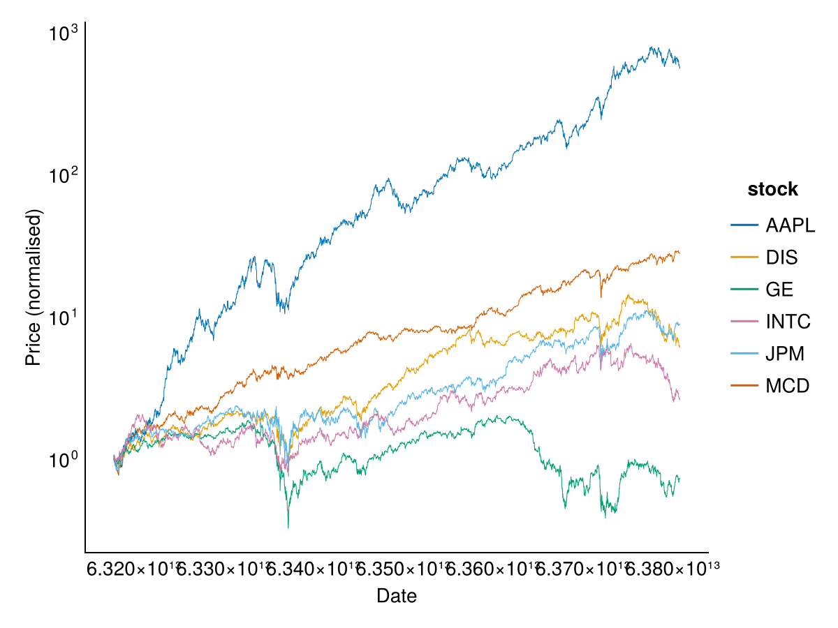
In this dataset, AAPL’s price rises roughly 570-fold over the sample period.
13.4 Time series operations
Each language provides tools for common time series operations like lagging, differencing, subsetting and aggregation. In R, the zoo package provides a mature, date-indexed time series class. In Python, pandas DataFrame objects can use dates as the index. Julia uses standard DataFrame operations with the Dates module.
13.4.1 Lag
The lag operation shifts a series forward or backward in time. Conventions differ across languages and even across R packages:
- R’s
zoo::lagfollows the time series convention where positivekmoves future values to earlier dates (a lead), and negativekmoves past values to later dates (a true lag). This is the opposite of what many users expect. - Python’s
shift(n)with positivenmoves each value to a later date (a true lag), insertingNaNat the start. - R’s
dplyr::lag()matches the Pythonshift()convention, solag(x, 2)returns the value from 2 periods earlier.
Because zoo::lag with positive k produces a lead rather than a lag, we demonstrate both directions below.
head(sp500$y.ts, 5) 1990-01-03 1990-01-04 1990-01-05 1990-01-08 1990-01-09
-0.002588908 -0.008650307 -0.009804139 0.004504321 -0.011856666With zoo::lag, positive k is a lead (shifts the time index backward so future values appear at earlier dates):
head(lag(sp500$y.ts, k = 2), 5) 1990-01-03 1990-01-04 1990-01-05 1990-01-08 1990-01-09
-0.009804139 0.004504321 -0.011856666 -0.006629097 0.003506557To get a true lag (past values at later dates), use negative k:
head(lag(sp500$y.ts, k = -2), 5) 1990-01-05 1990-01-08 1990-01-09 1990-01-10 1990-01-11
-0.002588908 -0.008650307 -0.009804139 0.004504321 -0.011856666pandas shift() with a positive argument produces a true lag — each value moves to a later position, and NaN fills the start:
print(sp500['y'].head())
print(sp500['y'].shift(2).head())
0 -0.002589
1 -0.008650
2 -0.009804
3 0.004504
4 -0.011857
Name: y, dtype: float64
0 NaN
1 NaN
2 -0.002589
3 -0.008650
4 -0.009804
Name: y, dtype: float64Julia does not have a built-in lag function, but we can create lagged values using vector operations:
println(first(sp500.y, 5))

# Lag by 2 periods (prepend missing values)
lagged = [fill(missing, 2); sp500.y[1:end-2]];
println(first(lagged, 5))
Union{Missing, Float64}[-0.002588908120090494, -0.008650306588847911, -0.009804138598848766, 0.004504320707883203, -0.01185666638695082]
Union{Missing, Float64}[missing, missing, -0.002588908120090494, -0.008650306588847911, -0.009804138598848766]13.4.2 Difference
The diff function computes the lagged difference of a series: \(x_t - x_{t-1}\).
head(diff(sp500$y.ts, lag = 1, na.pad = TRUE), 5) 1990-01-03 1990-01-04 1990-01-05 1990-01-08 1990-01-09
NA -0.006061398 -0.001153832 0.014308459 -0.016360987print(sp500['y'].diff().head())0 NaN
1 -0.006061
2 -0.001154
3 0.014308
4 -0.016361
Name: y, dtype: float64println(first([missing; diff(sp500.y)], 5))Union{Missing, Float64}[missing, -0.006061398468757417, -0.0011538320100008548, 0.014308459306731969, -0.016360987094834023]13.4.3 Subset by date
To isolate a stress episode, subset the series by date. February to April 2020 captures the COVID-19 sell-off:
sub_y.ts = window(sp500$y.ts, start = ymd("20200201"), end = ymd("20200401"))

df_covid = data.frame(
  date = index(sub_y.ts),
  returns = as.numeric(sub_y.ts)
)

ggplot(df_covid, aes(x = date, y = returns)) +
  geom_line(colour = "mediumblue", linewidth = 0.8) +
  labs(title = "Returns in COVID-19", x = "Date", y = "Returns") +
  theme_minimal()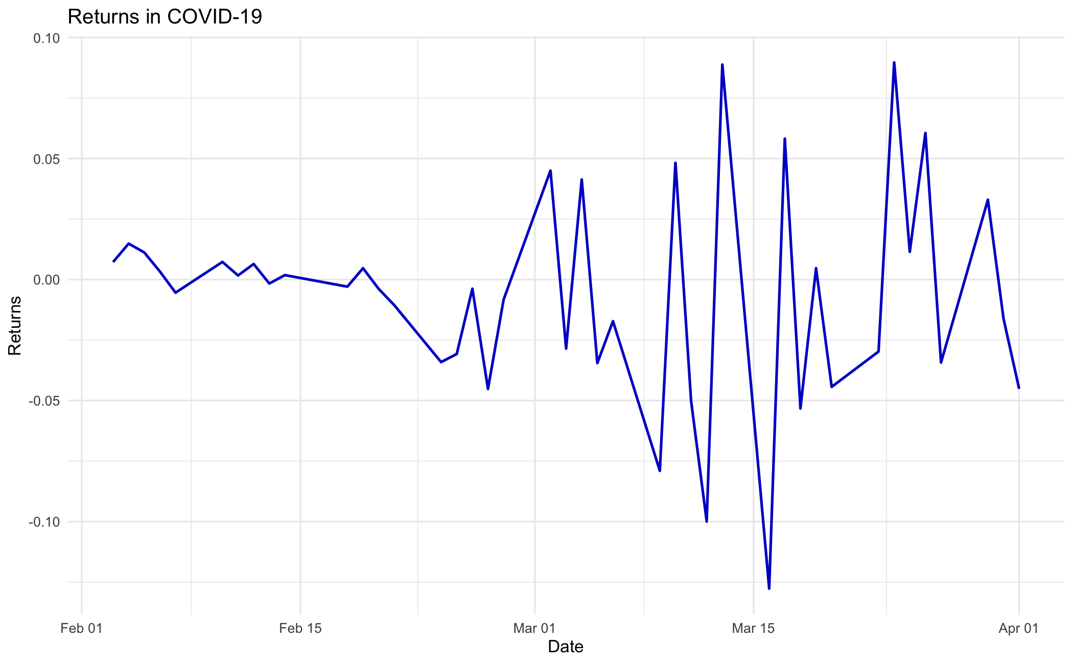
covid = sp500[(sp500['date_ts'] >= '2020-02-01') & (sp500['date_ts'] <= '2020-04-01')]

p = (ggplot(covid, aes(x="date_ts", y="y"))
 + geom_line(colour="mediumblue", size=0.8)
 + labs(title="Returns in COVID-19", x="Date", y="Returns")
 + theme_minimal())
p.save("_figs/ts_covid_py.png", width=6, height=4, dpi=100, verbose=False)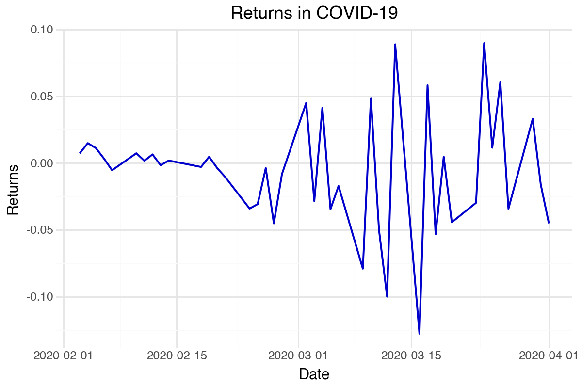
covid = sp500[(sp500.date_ts .>= Date(2020, 2, 1)) .& (sp500.date_ts .<= Date(2020, 4, 1)), :];

p = ggplot(covid, @aes(x = date_ts, y = y)) +
    geom_line(color = "mediumblue", linewidth = 0.8) +
    labs(title = "Returns in COVID-19", x = "Date", y = "Returns") +
    theme_minimal();
ggsave("_figs/ts_covid_jl.png", p);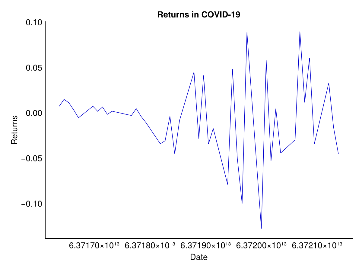
13.4.4 Aggregate
We often need to aggregate time series data to a lower frequency. For example, calculate the monthly mean return or the within-month volatility of daily returns. Both series share the same monthly index, so combining them into one frame keeps the alignment intact.
monthly_mean = aggregate(sp500$y.ts, as.yearmon, mean)
monthly_vol = aggregate(sp500$y.ts, as.yearmon, sd)

monthly = data.frame(
  yearmonth = index(monthly_mean),
  mean_return = as.numeric(monthly_mean),
  volatility = as.numeric(monthly_vol)
)
head(monthly, 5)
yearmonth mean_return volatility
1 Jan 1990 -0.0042353175 0.010561799
2 Feb 1990 0.0004475109 0.007468453
3 Mar 1990 0.0010893429 0.006909350
4 Apr 1990 -0.0013627584 0.007005099
5 May 1990 0.0040000414 0.006865567This plot of monthly mean return against monthly volatility is shown in R only.
ggplot(monthly, aes(x = mean_return, y = volatility)) +
  geom_point(colour = "red", size = 2) +
  geom_smooth(method = "lm", se = FALSE, colour = "green", linewidth = 1.5) +
  scale_x_continuous(labels = scales::percent) +
  scale_y_continuous(labels = scales::percent) +
  labs(
    title = "S&P 500 monthly mean and volatility",
    x = "Mean",
    y = "Volatility"
  ) +
  theme_minimal()
`geom_smooth()` using formula = 'y ~ x'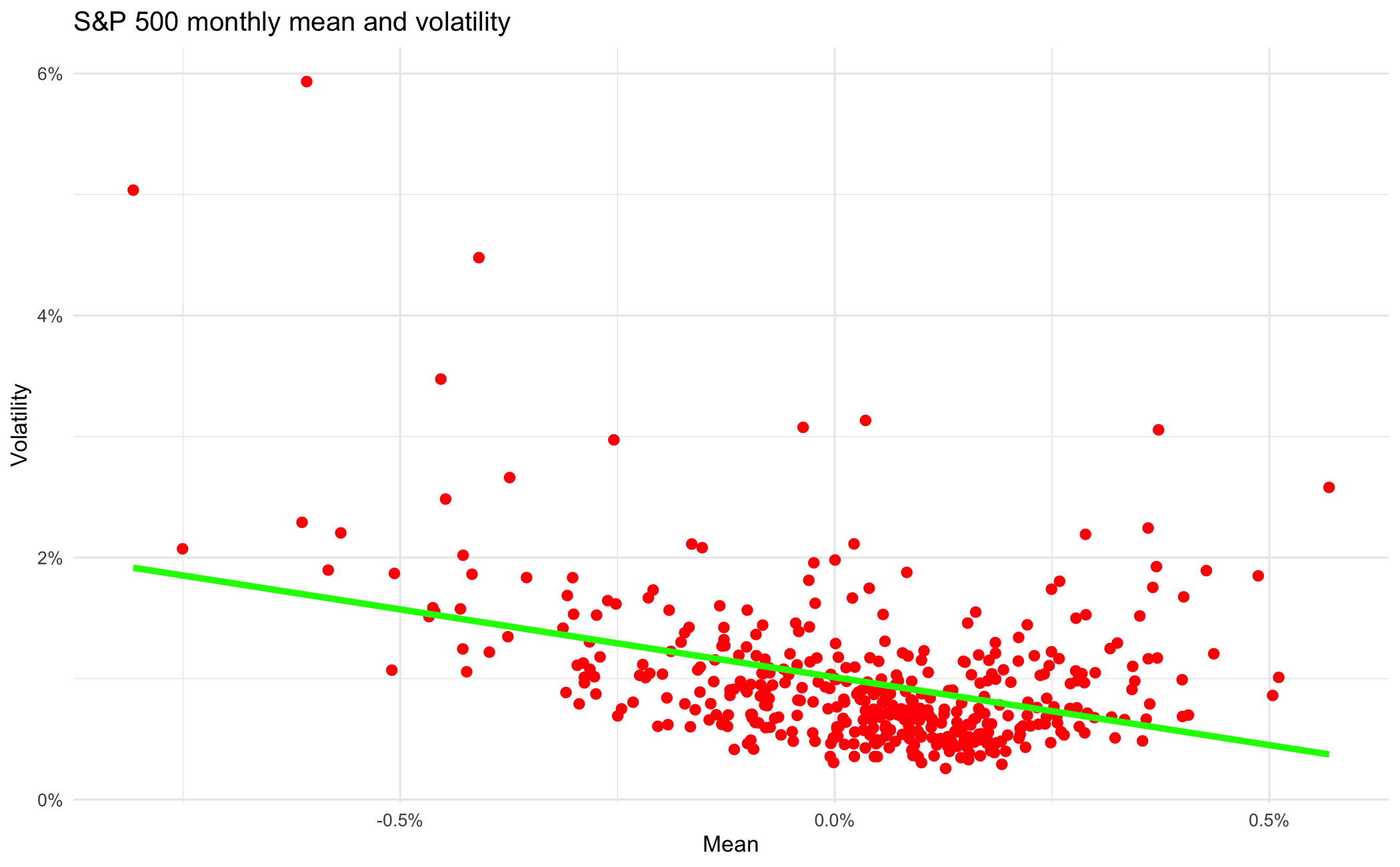
pandas resample() aggregates time series data:
sp500_ts = sp500.set_index('date_ts')
monthly = pd.DataFrame({
    'mean_return': sp500_ts['y'].resample('ME').mean(),
    'volatility': sp500_ts['y'].resample('ME').std()
})
print(monthly.head())
mean_return volatility
date_ts
1990-01-31 -0.004235 0.010562
1990-02-28 0.000448 0.007468
1990-03-31 0.001089 0.006909
1990-04-30 -0.001363 0.007005
1990-05-31 0.004000 0.006866Use groupby and combine from DataFrames for aggregation:
sp500.yearmonth = Dates.format.(sp500.date_ts, "yyyy-mm");

monthly = combine(groupby(sp500, :yearmonth),
    :y => mean => :mean_return,
    :y => std => :volatility
);

println(first(monthly, 5))
5×3 DataFrame
Row │ yearmonth mean_return volatility
│ String Float64 Float64
─────┼─────────────────────────────────────
1 │ 1990-01 -0.00423532 0.0105618
2 │ 1990-02 0.000447511 0.00746845
3 │ 1990-03 0.00108934 0.00690935
4 │ 1990-04 -0.00136276 0.0070051
5 │ 1990-05 0.00400004 0.0068655713.5 Summary
The operations in this chapter — date parsing, plotting, lagging, differencing, subsetting and aggregation — are the ones every later chapter assumes.
Differencing logged prices is how the return series is built in Chapter 11. Date-aligned subsetting is what lets Chapter 27 isolate the Covid window and read violations against it. Aggregation to a lower frequency is how a daily model gets compared with a monthly one. None of this is difficult, and all of it is unforgiving — a series that is out of order, or misaligned against its dates by one row, produces a volatility estimate that looks entirely reasonable and is wrong.